


PIXELS
Posts

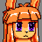
I like it ! But her tits look weird. I actually think it may be the edge of her shirt and how "flat" it is.

post=213082
SorceressKyrsty, you just need to use more colors that's all, or perhaps manage them better, you only have like four shades of gray/blue for a predominantly gray/blue sprite and like six shades of red for just the tiny red parts... and all in all you're only using like 20 colors while K-hos' sprite has many more.
But yeah, whenever you have the time, it would be nice to see that sprite shine a little more.
_
Aaand, well, I'm gonna post here some rtp faceset remakes I did for some contests someplace else...
Hope you like'em!


Nice work :D Is it the same place as El-Sato was about the RTP faceset remake?
post=213280
I like it ! But her tits look weird. I actually think it may be the edge of her shirt and how "flat" it is.
Hmm, I don't quite get what you mean here. I can make changes to it though, just want to know what it is I need to fix.


post=213369post=213280Hmm, I don't quite get what you mean here. I can make changes to it though, just want to know what it is I need to fix.
I like it ! But her tits look weird. I actually think it may be the edge of her shirt and how "flat" it is.
I just noticed the perspective of the bottom edge of the shirt doesn't match the top too.

Since the rest of the scene is in an orthographic isometric perspective. I'm also noticing this on the guy too, his chest is facing at you in the screen when the rest of his body faces the isometric down-left. And you can see both his eyes with one smaller, yet on the girl you see one eye in the middle (however, this is correct if she's looking off to the side away from the wall or guy if that is intentional).

Nice work :D Is it the same place as El-Sato was about the RTP faceset remake?
Thanks, Nessiah! and yeah, a nice tiny corner of the spanish rm community called Imaginarium.
Currently the rtp facesets remake is over, but if you feel curious you can see all the entries: here.
_

Ocean, that's amazing! ...But is it finished? I love the color scheme and the background mostly, it's a very detailed and relaxing scene; but what I don't like is how the characters stick out so much, is like if they were just pasted on top to the background, was that intentional? also, there are many parts on their lineart that look rather sloppy, like in the guy's right shoulder...

Tried to take the comments into account and fix it a bit. Very sleepy so I might have missed something, which can be gotten around to.
Everyone calls it Isometric but I didn't even think of it in that way. Oh well!
Very nice. I like it - the only problem I have left with it is the middle part of the wall is a bit too thick. It should curve inward more especially at the median.

What's all this about her shirt? I just thought it had one strap :V
post=213479Tried to take the comments into account and fix it a bit. Very sleepy so I might have missed something, which can be gotten around to.
Everyone calls it Isometric but I didn't even think of it in that way. Oh well!
You were right to have the characters in strong colors before, because now they sort of fade away from being in the focus in this picture.
I agree with Wolfcoder. With the contrast of the characters and the background the same, it looks like the entire thing is overexposed and they get lost. Where the earlier one the more saturated colors on the characters kind of balanced it out
Regardless that's extremely good. It doesn't look isometric to me, but it does look more like maybe a point and click adventure game than an RPG Maker game so I kinda get where it comes from.
Regardless that's extremely good. It doesn't look isometric to me, but it does look more like maybe a point and click adventure game than an RPG Maker game so I kinda get where it comes from.
I'm keeping it with the characters standing out, I like for sprites to be visible against a background anyway. I'll just make some minor changes that only people really staring in closely will be able to tell.
The pic was just a gift for a friend, not really meant for any game. It was an interesting thing to work on, might try it again someday! :D
The pic was just a gift for a friend, not really meant for any game. It was an interesting thing to work on, might try it again someday! :D
Yeah, it's not correct optical physics for them to have more contrast and saturation, but it's very important and you see this in pretty much any commercial sprite-based game (3D environment or not).

I was looking through my pictures and came across the first version of my DeviantART avatar. I thought it sucked from the very beginning, so I think it's horrible now, so I decided to fix some colours, adjust the contrast and fix his stupid hair.
Might animate later, better animation than the first one this time, I think.
Still some hair I want to fix though =w=

Might animate later, better animation than the first one this time, I think.
Still some hair I want to fix though =w=

