


ART FART
Posts
Pages:
1

Hm, I think my old topic was nuked, so heres a new one to annoy everyone with my arts. (sorry)

First Silas design that I tossed out because I wasn't in like with it.

The Silas design that I went with because I didn't really have the time to be nit-picking. XD Haha. There are many terrible flaws in this picture and I hope you'll find it in your soul to forgive them.
' w ' '''' and that's all I have for now...everything else is pretty old and...well..anagram-y.
Edit: Image resize to the rescue. OTL
First Silas design that I tossed out because I wasn't in like with it.
The Silas design that I went with because I didn't really have the time to be nit-picking. XD Haha. There are many terrible flaws in this picture and I hope you'll find it in your soul to forgive them.
' w ' '''' and that's all I have for now...everything else is pretty old and...well..anagram-y.
Edit: Image resize to the rescue. OTL
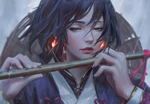
I really like the colors and design generally, and the glyphs are a nice touch. It's actually really sweet picture, but the wings just seem kinda pointless, being small like that. And that bow looks unusable. The handcover should leave more room for the hand. People often make weapons pretty, but it's disappointing how often they same time make the weapons pointless and unusable.
Do you have a profile in DA? It'd be cool to see more of your stuff. Though you should just post it all here! :p
Do you have a profile in DA? It'd be cool to see more of your stuff. Though you should just post it all here! :p
Haha, yeah the bow actually is designed that it doubles as something similar to a blade and is more of a concentration medium for him to use 'airrows'. He doesn't actually use physical arrows. BUT, I won't pretend that I know much about the actual anatomy of Bows and Arrows so I shall keep that in mind next time I try my hand at weapons!
The wings, I agree are pretty pointless...but they were actually characteristics of the 'Luminae' race for an RP on DA that I made this design for. Haha. If it were up to me...he totally wouldn't have so many pairs.
I do have a DA, that I fail to keep updated regularly but here: celectis@DA
I try to update my blog: Marimobun@blogger more often however, if you're interested.
Great stuff and design, except their body proportions are kind of weird, maybe its just because of those clothes.

author=Rei-
I really like the colors and design generally, and the glyphs are a nice touch. It's actually really sweet picture, but the wings just seem kinda pointless, being small like that. And that bow looks unusable. The handcover should leave more room for the hand. People often make weapons pretty, but it's disappointing how often they same time make the weapons pointless and unusable.
I love it.
Wings do not have to be solely for flight. Seraphs have six wings - two to fly, four to cover themselves with. (He does lack a pair big enough for flight, but you know what? He has THREE PAIRS of wings - I'm pretty sure I can give that a "fantasy!" pass. Your wings aren't big enough to fly? Add a few more pairs, and you're good to go.)
Unless you have archery experience the bow looks fine. Fantasy is fashion, not function...
There are such things as flightless birds. A race of angel-type humans who evolved for ground life could have functionless wings therefore.
author=Versaliaauthor=Rei-I love it.
I really like the colors and design generally, and the glyphs are a nice touch. It's actually really sweet picture, but the wings just seem kinda pointless, being small like that. And that bow looks unusable. The handcover should leave more room for the hand. People often make weapons pretty, but it's disappointing how often they same time make the weapons pointless and unusable.
Wings do not have to be solely for flight. Seraphs have six wings - two to fly, four to cover themselves with. (He does lack a pair big enough for flight, but you know what? He has THREE PAIRS of wings - I'm pretty sure I can give that a "fantasy!" pass. Your wings aren't big enough to fly? Add a few more pairs, and you're good to go.)
Unless you have archery experience the bow looks fine. Fantasy is fashion, not function...
You don't have to jump in for her defense if I have comments which aren't necessarily positive.
It was not only the size of the wings that I disliked, but the detail as well. The way they're drawn doesn't just seem to match the quality of the rest of the picture. Also, I commented on the bow because I think it is silly when you compare it to the hands of the character and realize he couldn't possibly even hold a grip of it, because the cover comes in the way of the hand - it's a con to the picture, a minus. I didn't point it out because I'd dislike the picture, but to give the artist something constructive, and even if she'd be already aware of the existing problem, pointing it out to her wouldn't be useless.
I like the pic, and I'm sure it has taken a lot of effort. I don't like the intuition I'm getting of your attitude which your post conveys, though, but complaining more about it would be derailing this thread.
Anyway, I'm looking forward to more of your art, marimo. I spend most of my time at work in DA usually. Concept art is musically very inspiring.
ps. If you want me to explain my problem with the wings further, it is that they lack detail as in texture. Some of the clothes do too, but they're cloth, and say if it was silk for example, it would be natural there isn't much texture. However wings consist of feathers which are living fabric and tend to have a bit different structure than a smooth surface. Therefore, if you compare the wings to the clothes, they may seem similar and correct in style, but if you want to take the logical approach, then it'd be more correct for the wings to have slightly more detail just as what natural wings and feathers look like.
I'm glad you actually explicated about what your problem was with the wings, since you made absolutely no reference to detailing and quality in your first post. Clarity and concision FTW.
I disagree with the complaint about size, you know - the one you actually mentioned- but not about the detail comparison.
I disagree with the complaint about size, you know - the one you actually mentioned- but not about the detail comparison.
Well, the wings were the most obvious part of the picture that felt out of place for me and the first thing in them that caught my attention and felt incorrect, was their size. As a person who knows next to nothing about Seraphs, I suppose my initial reaction was to connect the problem of the wings to the shape rather than the pattern, as it's easier to notice. However, by further examining I realized the actual problem with how the feathers look may be with their details rather than their actual shape and size.
Result's still that if there's something to improve in the picture, in my opinion it's probably in the wings. I apologize I wasn't able to spot the my exact problem with them first.
Result's still that if there's something to improve in the picture, in my opinion it's probably in the wings. I apologize I wasn't able to spot the my exact problem with them first.
@Bonehead11: Thanks!! And yeah, my grasp on anatomy still needs a lot of work Haha. I'm sure they're weird because there's something off about them. This requires research! Thanks for bringing it up!
Thanks for the input guys~! I'm not exactly sure if these Luminae fly yet, but one of the traits were that they had small, weak wings. I'm not sure if they do fly at all...but I believe it's somehow supposed to be more for accurate movement. Or...something like that...haha. I'm not completely in the know for the specifics yet.
Also, yeah. I am actually aware of the lack of details in a lot of the things but this image is truthfully only 50% done...and it was for an RP group that has a low priority in my list of things to do. I'll definitely keep your critiques in mind when I do revisit this image tho. : D Thanks again Versalia, Rei- and Dudesoft! <3
P.S. FFFF YEAH SUIKODEN V.
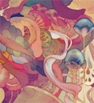
looks awesome! i admire your sense of colour.
i don't think the anatomy is a problem to be honest, the head on the second one is possibly a little big but other than that..yeah, it's good! :)
i don't think the anatomy is a problem to be honest, the head on the second one is possibly a little big but other than that..yeah, it's good! :)
Yeah the average head ratio for a teenager is 7 to their height an adult 8 a super-hero 9 but like boobs said
( chuckle... ) the colorings ace down.
You using Photoshop with a G-tab? Or?
Still this looks like someone I could imagine in a Fable game.
( chuckle... ) the colorings ace down.
You using Photoshop with a G-tab? Or?
Still this looks like someone I could imagine in a Fable game.
author=Emanzi...yeah...don't call me that
Yeah the average head ratio for a teenager is 7 to their height an adult 8 a super-hero 9 but like boobs said
( chuckle... ).
wow i like it very nice rendering but are you sure there are enough glowing bits
the face is a little too long i think even by anime standards it makes the head look super large in comp. to the body
the face is a little too long i think even by anime standards it makes the head look super large in comp. to the body
Thanks everyone!
@Emanzi: I use Photoshop CS5 with intuos 4 and I'm incredibly flattered you'd say that haha. I WISH I WERE THAT AWESOME??
@oh_no_im_melting: Yeah, I think the face seems a bit long because I drew his hair a bit big! Haha. AND NOES NOT ENOUGH GLOWY BITS--and well actually, it's a bit overwhelming, I'll give you that, but apparently more glowy = more strength for these creatures!
Well to share what I've been working on:
I did Adalyn's portrait from Oshun's game: Adalyn

I've also been working on Lavitz's portrait for Anagram!

I finished one other portrait for anagram but I don't like it enough yet.
@Emanzi: I use Photoshop CS5 with intuos 4 and I'm incredibly flattered you'd say that haha. I WISH I WERE THAT AWESOME??
@oh_no_im_melting: Yeah, I think the face seems a bit long because I drew his hair a bit big! Haha. AND NOES NOT ENOUGH GLOWY BITS--and well actually, it's a bit overwhelming, I'll give you that, but apparently more glowy = more strength for these creatures!
Well to share what I've been working on:
I did Adalyn's portrait from Oshun's game: Adalyn
I've also been working on Lavitz's portrait for Anagram!
I finished one other portrait for anagram but I don't like it enough yet.

woah, you use CS5? I would've SWORN you're using the the Marker tool in SAI. Are you using the brush tool (orwhat)?
Lavitz's portrait is coming along really nicely. <3
Lavitz's portrait is coming along really nicely. <3
Thanks Kyrsty!! And yeah, I only use PS. Sai is nice, but I don't really have a LOVE for it...and I use the default round brushes that come with PS. : >

author=oh_no_im_meltingI don't think anime has standards at all. xD
...the face is a little too long i think even by anime standards...
Anyway, you drawings are outstanding, Marimo! Regardless of your own modesty, I think your understanding of anatomy is great, I mean, to your level these are more like sketches than anything, but if you were to truly put all your might on them they'd be flawless. Your coloring (sp?) is also very good, even when done hastily it's so smooth and detailed that it almost looks easy to replicate... which is not. I've tried. ;_;
So, all in all, a big kudos to you! =)
Awww QuQ Thanks Alterego~~~ if i were to put all of my 'might' through them...I think they'd probably take a week or two or three each..haha! I'm somewhat of a perfectionist so it's a matter of telling myself to STOP at one point. BUT! You've given me a desire to try and finish a picture with my full 'might' as you put it hahah. <3
Thanks again~
Thanks again~
Pages:
1

