


THE SCREENSHOT TOPIC RETURNS
Posts

In reverse order.
5. No. But apparently you do need a better monitor. I seriously can see this stuff from five feet away, with a computer that's 5+ years old, and obviously that bad in resolution. But what's your excuse?
4. I take advice. Or I reject it. Sometimes even a bit of both. Why were we human beings given the ability to make decisions if all we could say is "Yes, of course, you're absolutely right." Good advice, is exactly like good text, you can't just think it's good text, because other people may take one look at it and say (wait for it...) "I can't read that." How do you test good advice? You take it under advisement. You try that along with everything else you're gonna try. As a general rule, I ignore people who are outright rude to me (usually you), unless I'm certain they're right (usually Locke).
3B. I had the box. I removed it, in favor of this. I had largely monochrome default text too. I removed it too, in favor of this. As soon as I started tweaking the stuff, trying to get stuff to show up, this was the first to go. Why do you think this is? It's because I needed a solution to getting stuff to show up, and what I had before wasn't working. This text shows up on black, grey, and white, and it also matches every single one of my background. In terms of what I have for menu pointer, I narrowed it down to a box no back, or a back no box. Since every single other system I have has box, no back, I said "that's boring" and added this instead. I could add it the other way, but then it'll fade into the black, and the period still won't be visible (and then there's predominantly white background that if I lightened the insides). Or, I could do exactly what you want, and displease Locke, SnowOwl, and Millenin in the process.

This?

Or this? (And before you say yes, keep in mind there are solid white screens)

Or maybe this? (Too bad, this is the one I pick)
3A. Okay, I'm gonna break it down for you. My entire game both figurately and literally has shades of grey. Any solid color, from white to black, that contrasts with black will blend neatly into the white and fade away. I therefore need a third color, and need it less solid (shadowed/gradient/whatever) in order to account for the fact that my text may run into this or the other background which it can't be seen against.
Solid white text? You like that? Sure, go ahead and read this.

What? You can't read it? Because, guess what? Thanks to my menus being transparent, the textboxes are too.
2. I never said it was... look, forget what I said. The point is, having not noticed my text was particularly bad until well into game test and production ("okay, some people are calling it unreadable," to "holy crap everyone who sees my game, comments on the text"), I learned to adjust my eyes unconsciously to pick out the shape rather than color of the text. It really is not that hard for me to read, and it's very hard on the other hand to figure out if other people will be able to read it. So, I churn out some text or other, nope, they can't read it either. You think you've got a text you can read? Great, give it to me, I'll put it in as text style 4 on my system menu. It seriously is that simple. Or, you can whine and complain about it, and sabotage any free time I have trying to figure out what you want. But let's face it, you don't care about my game or me, and pandering to what you want is likely to be a bad idea as far as the quality of the game and what I want out of it. If text really were the only issue complained about, I'd have higher stuff in terms of reviews. But there are other problems. Stop getting hung up on the one, and move on.
1. Was there some point? My game is literally, figuratively, and thematically in shades of grey. It's even part of the opening. I could argue until I'm blue in the face, but unless you have constructive to give (like blue BG should go on yellow text)... you know, it's senseless arguing with you. You say you've played "enough to know" of my game, but I'm not convinced you have. The last 10 or so upgrades, I've edited one or the other text, nobody noticed, commented, cared, or seemed to appreciate it. What then, was all those for?
If it wasn't for me, then there wasn't one. So, if you come to criticize, without even the decency of telling me what I can do to improve, I see you as stealing my creation, and turning it into something ugly. And you wonder why I'm mad?
...Now, Locke, about that textbox for the opening, 50% a good transparency?

Agh, now it's kind dark. And yea, off center.

author=Corfaisus
1. You recently claimed that nothing about your game was "black and white" figuratively speaking, that everything was some shade of grey and there was no wrong or right decisions, only what you do. If you don't remember saying that, I guess that's my fault for not being more clear.
2. If the text in your game is so unnecessary, just take it all out. If you don't care if people read it or not, save yourself the time and just make a platformer.
3A. If you can't understand how white text with a thick black outline to bring attention and distinction to the text is easier on the eyes and to read than bright green text with little to no outline against solid white, then that's honestly your problem.
3B. The example above makes use of a gradient text that starts fading into the background mid letter, with the period suffering the most as it is just a four-pixel dot of dark grey on a black background. The "cursor" is an ugly rectangle of pure grey instead of any sort of box or underline that's color ends up cutting into the word mid letter just as the background did before it was highlighted. Not only is this made slightly more hard to read with absolutely no justification as for why this one simple thing that'll take all of two seconds to fix and will stop people from bugging you about it until your game disappears into obscurity can't be fixed, but the font itself hits the eye in such a way as to draw attention away from it to save itself from strain. Frankly, it's like staring directly at the sun. It. hurts.
4. People have tried to help you time and time again, and you dismiss it as just you know best. This is not what this community is about, and if you don't like that, you can leave. The reason why those who you tried to contact for help denied you is most likely in your poor quality of work. They saw this as something that isn't worth investing their time into, so how can you expect more out of your intended audience?
5. I shouldn't have to "buy a better computer" to play someone's mediocre, free RPG Maker game. If you want others to seriously give a damn about playing your game, take advice to heart and don't make it detrimental to their health to even open the executable.
This is what happens when you don't give a damn about what others think or say.
Honestly bulma, as harsh as this is, this is the best criticism you will receive at this point, because giving you suggestions is like talking to a wall. This type of criticism is going to help you more than anything. Not to mention your game. We are seriously trying to help you, but you won't listen to any of it.
No, no it won't.
I respond well to only one type of criticism, open-ended "do this, and it will look like this, if you don't, well I don't care." Both coercive criticism ("You must do this.") and generalized criticism ("Your stuff is bad, but I won't actually tell you what's wrong with it") produce violent stubbornness.
Not to mention, I can't stand Corfais anyway.
I had coercive criticism all my life, btw. I'd struggle to please people (bosses, teachers, even potential friends). Then I found out in the very worst way, that what they really really wanted was for me to fit some ideal. And, of course, I saw it in my own reflection, going after girls for what desired qualities I thought they had. If there's one thing, I've learned, it's that why it's good to be liked and not hated, some people will not like you no matter what you do, so you weed out both the critics who force you to play guessing games on what you want, and those who are like "do it that way or you're a LOSER."
If there is something I need to improve, that's fine, I'll work on improving it. But ultimately, if I want a butt-ugly opening screen, and I've made it readable and workable, and everything functional has been taken care of, to have someone like him be like "Is it so hard to just have (boring monochrome text colors that don't work for every situation, given the choice I would say "that's really not me", and in most games I play them on, make me immediately cringe because they're so generic)?" Yes it is, especially when I've spent effort trying to make my own ideas work, and no they have to be exactly what someone's said.
I believe compromise is meeting people halfway. I also believe surrender is meeting people 100% and finding not only do they not like it, but the stuff they did like it now gone.
So, I'm gonna do this. I have four main fonts, and four secondary. I'm keeping the transparent menu is main option. After my shower, I'm gonna submit every single one of my other fonts, and you pick which ones have promise.
LockeZ

I'd really like to get rid of LockeZ. His play style is way too unpredictable. He's always like this too. If he ran a country, he'd just kill and imprison people at random until crime stopped.
5958
Uh "coercive criticism" is a stupid term for an unbelievably stupid idea. There are people here who are better at things you're trying to do than you are, way better, and they want to help you. But you won't listen to their help - you write pages and pages of ranting backlash against it - so they give up explaining and just tell you to do stuff instead. This is, in exactly 100% of cases, what causes the thing you don't like them doing: giving you instructions.
Anyway if you're shitty at something you should listen to instructions. You are shitty at making games and you refuse to take anyone's help or advice. As you just said, the only "advice" you will take is when people go out of their way not to tell you which option is better. Which is the opposite of advice!
You're mad that people want you to fit some ideal? Why? Isn't being ideal... the best possible thing? That is what ideal fucking means! They want to help you be the best that you can be, and they can tell you how to at least get closer to it, if not actually reach it.
Get the fuck over yourself; something being your "artistic vision" doesn't make it worth pursuing if there's a better option. There are good ideas and bad ideas.
Yeah but the thing is, if you're going to be creating work and showing it to people, you HAVE to take criticism. Everybody has their own little sob story they could tell you about how someone judged their work harshly, or this or that. Sometimes you have to bite the bullet, drop the ego, and think "maybe they're on to something with that comment. I could learn from this comment. This could be a lot better." You have to use whatever criticism people give you to your advantage and show them you can do better. We've been both harsh and completely reasonable, and you've ignored both kinds of criticism so far.
You can't just ignore people and keep posting the same thing over and over thinking you're gonna get a different result. It does not work like that. Good work takes lots and lots of practice and polish, and yes, criticism. I could show you some early early screens of Everlasting Journey that might blow your mind, but frankly, with the way you've reacted to everything else, I don't think you'd give two shits.
Here:

Use it or don't. I still had fun making it.
You can't just ignore people and keep posting the same thing over and over thinking you're gonna get a different result. It does not work like that. Good work takes lots and lots of practice and polish, and yes, criticism. I could show you some early early screens of Everlasting Journey that might blow your mind, but frankly, with the way you've reacted to everything else, I don't think you'd give two shits.
Here:
Use it or don't. I still had fun making it.
I didn't think image could be used in a decent title screen but that's pretty good. I think it would be better with a little saturation though. :)
Psssshhhh.
I actually wanted the title to stand out the most, so I ended up darkening the rock and the vines quite a bit. There's definitely room for improvement though!
I actually wanted the title to stand out the most, so I ended up darkening the rock and the vines quite a bit. There's definitely room for improvement though!
Okay, before I read Locke's post, these are my fonts.

This is my default. I use it, because I like being able to see my menus. I have to transparent it out for messages (otherwise stupid 2k3 defaults to ugly orange, or ugly black). It also has to be switched back from transparent to normal for shop menus. I've got all this rigged with events, so I'm proud of it. But it's not for everyone, so I have multiple fonts.
Solid colors literally hurt my eyes (especially red tones). And it's a game I play-test, so yes, it is important to me. So gradients it is. But if you wanna import your own system, I mean, God, there's nothing stopping you.
That said, these are the color sets.
Type 1 (probably okay for everyone, with some work)
Meh.
Solid white BG, and pretty dark main text. Unfortunately, I tested it on the black screen earlier. It blends with black. I don't know how to make this totally solid...
This.
Green on green. It's kinda pleasant for forest areas, but it might have some blend issues.
This?
Greyish crap.
This one.
Blue on blue. I suppose I could alter this one to have yellow or gold text, as Millenin says.
Type 2 (stuff that probably only I like)
I like this.
Gold and brown. It's pretty soft tones, and very high contrast.
Kinda festive.
The green and red is pretty good together as complementary colors.
And there's this one.
Seriously, just pick three, and I'll alter, change, or whatever. Artistic vision, nothing. It's about being able to enjoy my own game though. If after that, I can't do so (obnoxious colors hurting my eyes, etc), then it really isn't worth it trying to please such people. Simple as that. If I didn't care, I wouldn't react so strongly when I feel I'm being controlled (I'm paranoid, not callous).
Pepsi. Can you split off the menu as a picture, so that I can work with it (I have more options)? I'm happy with that, actually.


@bulmabriefs144: personally, I would drop the heavy use of gradients. They don't contrast well and make text hard to read (and hard to read text is bad in a game genre that depends on reading!)
kentona, that's why I have multiple text systems. So it's up to you the player, to a certain extent.
And that's why I seriously want input on the top three colors from this list, so we can have this settled what people like, because I'm just gonna pick option one from the system menu.
I like things other people may not like. I dislike things other people may love. The issue I have is with other people telling me what I should like.
Reds especially, in solid, give me a headache. But "hard" colors, in general, annoy me. I like stuff to be mild, since I have a very violent reaction to things coming across violent or forceful. I've had to deal with such people in the past, and I hate them.
My text is gradient, because it's a very "soft" message I wanna put across, that there are different ways (Christianity, Taoism, Buddhism), and each has its merits. When I have this stuff said with very firm text, it feels pushy, like that "you must do your own thing". (Which, while awesome, makes no sense)
I'm perfectly open to having alt texts, that's why I set up this menu. But I do want to keep my default, because it's my personal favorite. So pick your favorite fonts, that's fine, I'll make them custom to order. Yes, seriously.
author=bulmabriefs144
Pepsi. Can you split off the menu as a picture, so that I can work with it (I have more options)? I'm happy with that, actually.
Here you go:
http://rpgmaker.net/users/PepsiOtaku/locker/tao_titlespepsiotaku.rar
I also made you a game plus variation (based on your description), with a dash of pink! There's one with some cherry blossom flowers (which I thought would compliment the pink text), and one without.
Whoa... You're awesum! I'm gonna try this.
...Do I have to revamp my menu system, or can it work with my cursor system?
Nvm, I'll test it.
Seems to be on target. I might need to reconfig slightly for Game Plus.
...Do I have to revamp my menu system, or can it work with my cursor system?
Nvm, I'll test it.
Seems to be on target. I might need to reconfig slightly for Game Plus.

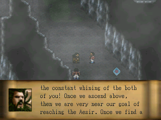
author=Dreaded
Here is a screenshot of my project. Characters included are dwarves
I like the messagebox you decided to go with.
Some things that stood out to me:
* The cave looks fairly bare. It might look better if you populate it with something. Maybe some loose rocks, unevenness in the terrain, etc..
* Nitpicky, but you use "Once we" to start two sentences in a row.


I 'd go with the two green ones at the bottom. :P

This is supposed to be a girl's house, so I am trying to make it colorful. I don't know if it looks too weird, or too small, or is there something else wrong. I want to put in a bathroom, but I don't know where it should be. :D
This is supposed to be a girl's house, so I am trying to make it colorful. I don't know if it looks too weird, or too small, or is there something else wrong. I want to put in a bathroom, but I don't know where it should be. :D

Detective, for a "girl's" house, you might want to keep the decor pretty neutral until you hit the bedroom. Use a cream or white colour wall for that lounge, and use a different colour then for the kitchen. The two matching walls make them feel like they're the same room. It'd be best to leave the crazy pinkage until the bedroom, because that is the most personalised space.
Also, try to consider that the player sprite should be the size of a real human. Think about those sofas and that "coffee table". You could fit 8 people on that thing, so it's definitely more of a conference table if anything, which wouldn't have sofas around it seating-wise.
These houses are huge, you've really gotta cut down on the space you're using. See how in this example, you could sit 8 people and take up half as much space as your lounge:
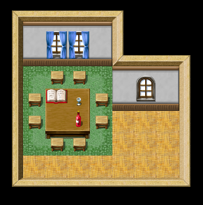
Also, the blank space to the right in the kitchen - just cut it and end the kitchen unit at the wall. I see that you're trying to make the houses fit into the perfect square, but remember that it's not always gonna be exact. Some houses have weirdly placed walls where wires/pipes are hiding underneath. My house is full of rooms with alcoves from old fireplaces that were bricked over.
You need to stop focusing on making everything so clean and perfect - imagine real people with real routines living in the house.
Also, try to consider that the player sprite should be the size of a real human. Think about those sofas and that "coffee table". You could fit 8 people on that thing, so it's definitely more of a conference table if anything, which wouldn't have sofas around it seating-wise.
These houses are huge, you've really gotta cut down on the space you're using. See how in this example, you could sit 8 people and take up half as much space as your lounge:
Also, the blank space to the right in the kitchen - just cut it and end the kitchen unit at the wall. I see that you're trying to make the houses fit into the perfect square, but remember that it's not always gonna be exact. Some houses have weirdly placed walls where wires/pipes are hiding underneath. My house is full of rooms with alcoves from old fireplaces that were bricked over.
You need to stop focusing on making everything so clean and perfect - imagine real people with real routines living in the house.
author=Mr_Detective
This is supposed to be a girl's house, so I am trying to make it colorful. I don't know if it looks too weird, or too small, or is there something else wrong. I want to put in a bathroom, but I don't know where it should be. :D
You could make both the living room and kitchen smaller?
Living room has 3 big couches, seems like a bit overkill, no? Kitchen has a ton of dead space, including that empty corner in the right. Kitchen could do with a window as well? If you can't fit the bathroom on that map, you could put it upstairs?

