


THE SCREENSHOT TOPIC RETURNS
Posts
author=Perihelion
This is just a mockup, but I'd appreciate feedback on the tileset. This is all made by me.
In-game resolution.
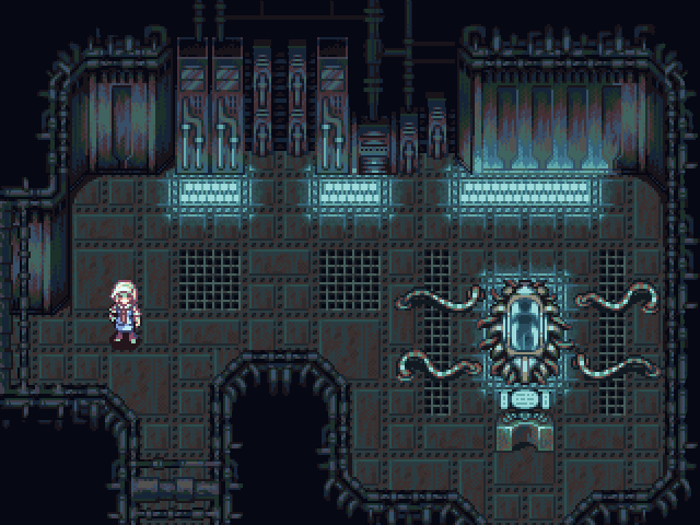
:< Whyyyy, why do you have to be so awesome? I really like the amount of animation you've put into it, with the flickering lights and the character's idling pose. At first I didn't even notice the body in the tube-- which makes for good fridge horror.


Glad you guys like it! I see what you mean about the monochrome, but I dunno, I sort of feel like it fits the atmosphere of the area. Other tilesets will be more colorful.

I haven't been keeping up with your development of Apparatus, Peri, since hbgames.org likes to boot me out and not let me log back in for whatever reason I don't feel like fixing.
Have you made any more strides in developing the engine?
Have you made any more strides in developing the engine?

@Peri
Awesome stuff! It's definitely fine as is. So you're going to build this in RM? I read that you were originally planning to do it in Game Maker, but switched over.
For anyone who wants to read about it:
http://www.hbgames.org/forums/viewtopic.php?style=26&f=78&t=73946&start=0
Awesome stuff! It's definitely fine as is. So you're going to build this in RM? I read that you were originally planning to do it in Game Maker, but switched over.
For anyone who wants to read about it:
http://www.hbgames.org/forums/viewtopic.php?style=26&f=78&t=73946&start=0
I was using Game Maker, but I've switched to RMXP because Game Maker is a horrible program. RMXP has an editor that doesn't suck and a well written, flexible, extensible script library, so it works for me. I decided to make it more of an RPG than I originally intended anyway. I haven't really done any hard development yet, but the design end is starting to shape up pretty well. Gonna write the script soon. Also, that thread is full of outdated information! The most recent information is in my subforum on .org, but I haven't posted there in a while because I've been doing mainly plot work.
I guess the reason I posted this here is because I was thinking of changing the graphical style to something more sleek and modern to match with the setting more, but that would set me back again, so I'm probably not gonna.
I guess the reason I posted this here is because I was thinking of changing the graphical style to something more sleek and modern to match with the setting more, but that would set me back again, so I'm probably not gonna.

author=Perihelion
This is just a mockup, but I'd appreciate feedback on the tileset. This is all made by me.
In-game resolution.
flickering beauty
keep going and don't ever look back


Um, several days of more or less constant work, probably. I also got lots of feedback from the wonderful people at Pixelation. It takes a long time to do but is worth it, I think. Spriting everything myself is going to make my game never come out, but as long as I'm having fun, right?
Edit: Looks like it took me the better part of a week, although I don't remember how much of that I spent working on it.
Edit: Looks like it took me the better part of a week, although I don't remember how much of that I spent working on it.


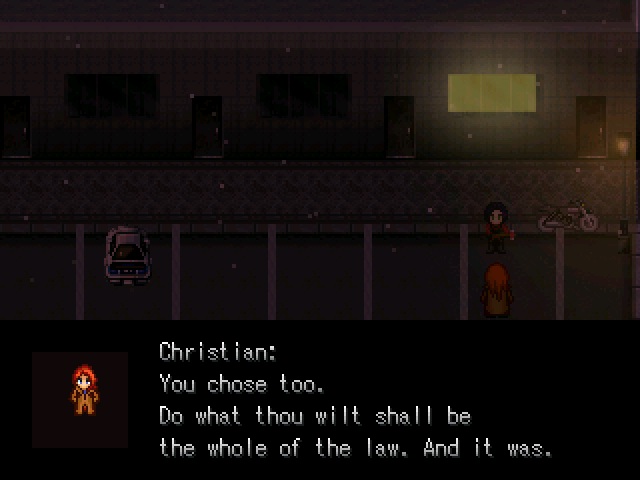
@MaxMcgee: http://rpgmaker.net/media/content/games/872/screenshots/Confrontation.jpg
Way too dark. And I mean waaay too dark. I can barely see anything in there (besides the text, which you should format properly btw) and the player should always have a good visibility of the screen, no matter what.
Everyone's monitors are different, and on my laptop's LCD screen it's not too dark at all. Of course, one might say, everyone's monitors are different so err on the side of light. : /
And I have no idea, and I mean noooo idea, what you mean about the text being 'formatted' properly.

author=Max McGee
And I have no idea, and I mean noooo idea, what you mean about the text being 'formatted' properly.
possibly something to do with the ridiculous wrapping. you're allowed more than one sentence on a line, you know!
author=geodudeauthor=Max McGeepossibly something to do with the ridiculous wrapping. you're allowed more than one sentence on a line, you know!
And I have no idea, and I mean noooo idea, what you mean about the text being 'formatted' properly.
yeah make the text go as far as it can without cutting off a word.
iirc the max # of characters that fit is 50.
Tip: Use Notepad++ to write your dialogue and set the # of columns to 50 for delicious Rm2k-ready text.

(just because i scanned that before i opened it doesnt mean i dont trust you darken)
wow cool utility. I was probably mistaken about the character limit anyway.
wow cool utility. I was probably mistaken about the character limit anyway.
I just type everything up in Wordpad in a monospaced font. The only annoying things you have to add all your special tags like font color after-the-fact. When I have my PC again I'll have to try that software.
Thanks for the suggestion, gang.
(Although going back and fixing all the text in the whole game that way would be unimaginably tedious, I might try to use either RMText or notepad going forward.)
(Although going back and fixing all the text in the whole game that way would be unimaginably tedious, I might try to use either RMText or notepad going forward.)
I'm really not a fan of that title, and I mean the title, not the screen, It's way too long. I would just use "Keepers" in big letters and "of souls" (without restless) in a smaller font.
I'm practicing with some biggher sprites and tilesets for my next project (now that lost king is close to being finished) The sprite is a WiP but still I?m liking how it is going.
Do you like how a game looks with bigger sprites? I'm kinda getting tired of small ones...

maybe his head is too big though...
I'm practicing with some biggher sprites and tilesets for my next project (now that lost king is close to being finished) The sprite is a WiP but still I?m liking how it is going.
Do you like how a game looks with bigger sprites? I'm kinda getting tired of small ones...
maybe his head is too big though...

