


THE SCREENSHOT TOPIC RETURNS
Posts

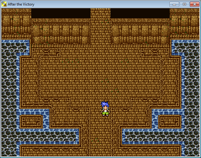
The brick tile has a seam that I can see pretty noticeably (Right above the hero's head you can trace it all the way up, and every 16pix in either direction)
I'm not sure what the dark colored thing is supposed to be... At first I thought it was arches, and that the brick was a platform, but obviously thats not what it is. Water? It should probably be blue but there may be context for it to be black and white.
Also I like the decorative border tiles.
I'm not sure what the dark colored thing is supposed to be... At first I thought it was arches, and that the brick was a platform, but obviously thats not what it is. Water? It should probably be blue but there may be context for it to be black and white.
Also I like the decorative border tiles.
Does adding more layers on the trees make it look better? My brother said he didn't notice a the difference while I thought it was a big improvement.
I added the actual trees so maybe that will make it for people to understand what that is. Yeah I know that the tree needs some work.
@Radnen: I'm not sure what you mean by the leaves being brighter. To me they actually look darker because all of that grass around is bright. Also I tried changing the black to a green but then pretty much the entire map is green and it really doesn't look right to me.
@Darken: Agreed. I can't get it looking right at this point but I will get to it eventually.
@SorceressKyrsty: Making the whole top leafy would definitely be the best choice but I don't even know how I would make a tile like that. Also I like the black because it adds a better mixture of colors.
EDIT: I tried using the green and I'm kinda liking it now. Which is better?
I added the actual trees so maybe that will make it for people to understand what that is. Yeah I know that the tree needs some work.


@Radnen: I'm not sure what you mean by the leaves being brighter. To me they actually look darker because all of that grass around is bright. Also I tried changing the black to a green but then pretty much the entire map is green and it really doesn't look right to me.
@Darken: Agreed. I can't get it looking right at this point but I will get to it eventually.
@SorceressKyrsty: Making the whole top leafy would definitely be the best choice but I don't even know how I would make a tile like that. Also I like the black because it adds a better mixture of colors.
EDIT: I tried using the green and I'm kinda liking it now. Which is better?


LockeZ

I'd really like to get rid of LockeZ. His play style is way too unpredictable. He's always like this too. If he ran a country, he'd just kill and imprison people at random until crime stopped.
5958
Veris's office at the Truelight Detective Agency.
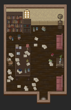
I kind of want to add a ceiling fan but have no idea how to do that from an overhead perspective without it looking retarded.
I kind of want to add a ceiling fan but have no idea how to do that from an overhead perspective without it looking retarded.

The office looks awesome!
@Arcan: Definitely looks better with dark green, still, wouldn't use that particular shade myself.
I've reworked the floor tile a little to try and eliminate the seam, edited the water to be a little more blue, and also made a wall tile
@Arcan: Definitely looks better with dark green, still, wouldn't use that particular shade myself.
I've reworked the floor tile a little to try and eliminate the seam, edited the water to be a little more blue, and also made a wall tile
@treeghost: The top bush tiling is really noticeable and the character has like no shading so it doesn't really fit into the tileset.
@Lockez: The wall looks super grainy, my suggestion is to make the darkest color on the wall much lighter.

@Sam: If you think you have a better color I'd like to see it. The tiles you made have a nice amount of detail but that also makes it look messy. For that I recommend you make the brightest color of the floor/walls a bit darker.
@Lockez: The wall looks super grainy, my suggestion is to make the darkest color on the wall much lighter.
@Sam: If you think you have a better color I'd like to see it. The tiles you made have a nice amount of detail but that also makes it look messy. For that I recommend you make the brightest color of the floor/walls a bit darker.

Sam, you should consider using different colors for the walls. You want there to be a clear, visual difference in what is passable and impassable. It depends on the area, but I generally like my floors to be darker and I often use a contrasting color.

author=LockeZ
Veris's office at the Truelight Detective Agency.
I kind of want to add a ceiling fan but have no idea how to do that from an overhead perspective without it looking retarded.
how bout just the shadow of one whirring on the floor?
edit: well maybe you'd then also want some of the papers to be slightly animated/russling

@Sam - Well, I like it. But the floor tile should probably be changed to a different color so it doesn't blend with the wall that much, because it looks...well...kinda bad. The water also, too, looks really strange with this chip... But, it's alright, I guess.
@LockeZ - I love it. I don't even think it needs a ceiling fan; it looks perfect. Maybe some lighting with the window cell? Either way, looks great, LockeZ. :D
@LockeZ - I love it. I don't even think it needs a ceiling fan; it looks perfect. Maybe some lighting with the window cell? Either way, looks great, LockeZ. :D

@treeghost, feld, lockez:
Really liking the most recent screenshot you guys each posted. Well in treeghost's case, the last two screenshots. Anyway, very nice looking! What game is that for, treeghost?
Really liking the most recent screenshot you guys each posted. Well in treeghost's case, the last two screenshots. Anyway, very nice looking! What game is that for, treeghost?
author=Max McGeeIt's for a horror rpg I'm recently working on. It's based on a short story I wrote in the last fall.
@treeghost, feld, lockez:
Really liking the most recent screenshot you guys each posted. Well in treeghost's case, the last two screenshots. Anyway, very nice looking! What game is that for, treeghost?
I named it "Immer Jung" which means "Ever Young". I know it isn't very special but a name doesn't make a whole game.
LockeZ
I'd really like to get rid of LockeZ. His play style is way too unpredictable. He's always like this too. If he ran a country, he'd just kill and imprison people at random until crime stopped.
5958
The contrast between the wall and floor looks much better now. What is the blue border on the edge of the water supposed to represent?


It looks fine, the position of the heroes is a test too no????

A Cameo of a friend game, Project:Base.
A Cameo of a friend game, Project:Base.

The word you're looking for is "headquarters", not "Head Quarter". The canopy almost looks black, (I'd lighten it just a bit so it more apparently faded) but otherwise I really like it, despite being a little cameo area.

