


THE SCREENSHOT TOPIC RETURNS
Posts

author=thelatteauthor=dethmetal^^^
I'm gonna be using the RTP monsters for this project because I think they're gorgeous and actually a little underused
Agreed.
Testing alternative ways to show building interiors... waddya think? Oh, the interior textures are only temp.
Are you using teleports into edited maps + pictures or w/e? Seems like a nice effect, but also probably has an effort related drawback.

Wow that's interesting : you can make whole indoor parts that are hidden and that you discover only once you step in the area, behind some big furniture eventually! (or can you?),

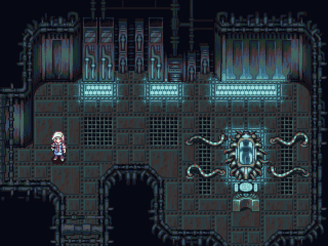
@Perihelion: http://img.photobucket.com/albums/v325/ViridianMoon/screens/mock1big.gif
That screen looks amazing! But rather than just praising it, I’m going to point out some things that look odd to me, in hopes that is of any help to you.
-Those green pixels all over the character don’t blend too well with her skin and clothes. Rather than highlights it looks like she’s covered in slime or something.
-The 'monochromeness' of the scene helps the mood. But you may still want to break it a little; it will look richer that way. Try some tiny warm lights someplace.
-The light coming from the capsule looks too square-y, but it should take more of an elliptical form around it.
-The console/computer doesn’t seem to have the same perspective as everything else. It looks frontal to me.
@Cray: http://i52.tinypic.com/zl6mnq.jpg
I understand this is a work in progress so the lack of tile variety is expected, I just hope you keep that in mind. You should also be very aware of is what colors you use, you don’t want your forest to look like a big green mess, try to differentiate more the color of the leaves from that of the grass and other plants. …Now, something that really bothers me is that mist. I don’t know why it has to be so bright. (alpha channel?) Is that some kind of supernatural mist or something?
@arcan: http http://rpgmaker.net/media/content/users/2604/locker/62620112.png
Very nice! I like what you did with the trees. But there are still some parts of the auto-tiles that look rather square-y. You should get rid of that all together.
@treeghost: http://img811.imageshack.us/img811/8570/mp4b.png
Not bad. The map looks very nice actually, but the charas need a bit of work. Their ‘borders’ need to go, or at least you need to make them subtler somehow. ...And it seems you’re using white over black for the light-map, but it looks rather 'meh' that way, imo. Try to use a pale blue over a dark blue instead.
@Sam: http://i648.photobucket.com/albums/uu205/Afr0Blu3/Arena01WIP03InGame-1.png
Better indeed. But now I don’t have much else to critique; except maybe that you should try to smoothen the textures a bit... I like the designs on the floor, btw.
@Deacon Bastista: http://img7.imagebanana.com/img/50k5wo4n/01.png
Heh; I like that. It’s a nice way to simulate a mode-7 effect, however, there needs to be a haze of light on the horizon. Kinda the opposite of what Arcan did.
@Felipe_9595: http://www.youtube.com/watch?v=BWIqNmBGXw4
That needs to be polished so much that I don’t know where to begin... For instance, whenever the screen fades in or out you must make sure everything on it appears or disappears at the same time. Also, you should never let the message window obstruct the player’s visibility of the protagonist, (There’s even an option for it!) even if the window is transparent. …I know you just started this project, but you may want to work a little more on it before looking for critique.
@Spellbinder: http://www.zockergilde.net/boards/sewer.png
Man, those tiles are awesome! And the tiny sprites are very cute, specially those of the monsters. Are they custom? ...Anyway, into the odd stuff.
-Some of the pipes seem to have a very complicated arrangement, and don’t look too believable. Then again, what do I know?
-I agree with Darken about the little pyramidal thingies, they don’t quite match with everything else being transparent and all.
-The window that displays the location doesn’t seem to be properly centered on the screen, but that’s probably already fixed.
@Miracle: http://rpgmaker.net/media/content/users/10065/locker/World_Map.png
That’s a nice little map. My only advice would be that you should lighten up a bit the 'burned' areas so it doesn’t get too difficult to see what’s beneath them.
@tellate: http http://www.youtube.com/watch?v=q045QXflsNQ
Your graphics seem blurry or smudged to me, which is rather ugly, honestly. Follow Nessiah's advice and upload your screens in png format so we can have a better look at them without all those pesky jpg artifacts. As for shapes and colors go, I have no qualms with them... And damn! That trick is neat!
@rabitZ: I don’t know. Percentage of success of an attack maybe?
@benos: Nice title! “Chronicles of rrus enderson.” *eye twitch*
Ps: I probably should post in here more often so I don't end up making big ass posts like this every time. =P

@ Alterego - Yeah, you should come around more often...god damn! That is a lot of text.
That's so cool! It reminds me of the same effect that was in all those 'Ultima' games on the SNES! I'm thinking you used a picture for the effect, right? Either way, I like it! The only downside to doing this is probably the amount of time you have to take to do each building / area like this, ouch. :D
author=thelatte
Testing alternative ways to show building interiors... waddya think? Oh, the interior textures are only temp.
That's so cool! It reminds me of the same effect that was in all those 'Ultima' games on the SNES! I'm thinking you used a picture for the effect, right? Either way, I like it! The only downside to doing this is probably the amount of time you have to take to do each building / area like this, ouch. :D


I would agree but, maybe it's like a harvest moon style game? That would be amazing with that feature.
Sorry for the size, I can't do a full screen capture with this monitor.
These are the latest from Beyond Eden.

Children are staring!

The notorious "other heroes"
These are the latest from Beyond Eden.
Children are staring!
The notorious "other heroes"

Ooooooo...PURDY! :D
Does that Blue Sniffit shoot out stuff when he sees you? It's been awhile since I've played Mario 2.
Looks great, Deckiller!
Does that Blue Sniffit shoot out stuff when he sees you? It's been awhile since I've played Mario 2.
Looks great, Deckiller!

author=alterego
@Perihelion:http://img.photobucket.com/albums/v325/ViridianMoon/screens/mock1big.gif
That screen looks amazing! But rather than just praising it, I’m going to point out some things that look odd to me, in hopes that is of any help to you.
-Those green pixels all over the character don’t blend too well with her skin and clothes. Rather than highlights it looks like she’s covered in slime or something.
-The 'monochromeness' of the scene helps the mood. But you may still want to break it a little; it will look richer that way. Try some tiny warm lights someplace.
-The light coming from the capsule looks too square-y, but it should take more of an elliptical form around it.
-The console/computer doesn’t seem to have the same perspective as everything else. It looks frontal to me.
@Cray: http://i52.tinypic.com/zl6mnq.jpg
I understand this is a work in progress so the lack of tile variety is expected, I just hope you keep that in mind. You should also be very aware of is what colors you use, you don’t want your forest to look like a big green mess, try to differentiate more the color of the leaves from that of the grass and other plants. …Now, something that really bothers me is that mist. I don’t know why it has to be so bright. (alpha channel?) Is that some kind of supernatural mist or something?
@arcan: http http://rpgmaker.net/media/content/users/2604/locker/62620112.png
Very nice! I like what you did with the trees. But there are still some parts of the auto-tiles that look rather square-y. You should get rid of that all together.
@treeghost: http://img811.imageshack.us/img811/8570/mp4b.png
Not bad. The map looks very nice actually, but the charas need a bit of work. Their ‘borders’ need to go, or at least you need to make them subtler somehow. ...And it seems you’re using white over black for the light-map, but it looks rather 'meh' that way, imo. Try to use a pale blue over a dark blue instead.
@Sam: http://i648.photobucket.com/albums/uu205/Afr0Blu3/Arena01WIP03InGame-1.png
Better indeed. But now I don’t have much else to critique; except maybe that you should try to smoothen the textures a bit... I like the designs on the floor, btw.
@Deacon Bastista: http://img7.imagebanana.com/img/50k5wo4n/01.png
Heh; I like that. It’s a nice way to simulate a mode-7 effect, however, there needs to be a haze of light on the horizon. Kinda the opposite of what Arcan did.
@Felipe_9595: http://www.youtube.com/watch?v=BWIqNmBGXw4
That needs to be polished so much that I don’t know where to begin... For instance, whenever the screen fades in or out you must make sure everything on it appears or disappears at the same time. Also, you should never let the message window obstruct the player’s visibility of the protagonist, (There’s even an option for it!) even if the window is transparent. …I know you just started this project, but you may want to work a little more on it before looking for critique.
@Spellbinder: http://www.zockergilde.net/boards/sewer.png
Man, those tiles are awesome! And the tiny sprites are very cute, specially those of the monsters. Are they custom? ...Anyway, into the odd stuff.
-Some of the pipes seem to have a very complicated arrangement, and don’t look too believable. Then again, what do I know?
-I agree with Darken about the little pyramidal thingies, they don’t quite match with everything else being transparent and all.
-The window that displays the location doesn’t seem to be properly centered on the screen, but that’s probably already fixed.
@Miracle: http://rpgmaker.net/media/content/users/10065/locker/World_Map.png
That’s a nice little map. My only advice would be that you should lighten up a bit the 'burned' areas so it doesn’t get too difficult to see what’s beneath them.
@tellate: http http://www.youtube.com/watch?v=q045QXflsNQ
Your graphics seem blurry or smudged to me, which is rather ugly, honestly. Follow Nessiah's advice and upload your screens in png format so we can have a better look at them without all those pesky jpg artifacts. As for shapes and colors go, I have no qualms with them... And damn! That trick is neat!
@rabitZ: I don’t know. Percentage of success of an attack maybe?
@benos: Nice title! “Chronicles of rrus enderson.” *eye twitch*
Ps: I probably should post in here more often so I don't end up making big ass posts like this every time. =P
???
I cant fade the particles, they are generated by scripts. Ehm and i cany place the window in another spot, in the top si gonna hide the maps location, in the middle
is going to hide the char and the map's name. The only choice i had was put it on the bottom. (Maybe i can make it a Comic bubble("Should i enter this place ??"))
@ Demi - I just read your blogpost about your game being cancelled...it really is a shame. I remember hearing about his game for YEARS and it reminded me about one of my older projects, back then, so I was intrigued for this game. But, I guess you have your reasons... Oh well. Hopefully, you'll get back to game making and make another project! :D
Still, playing your demo in the next few days will be great. :D
Still, playing your demo in the next few days will be great. :D


