


THE SCREENSHOT TOPIC RETURNS
Posts

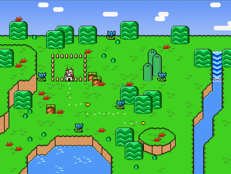
author=kentona@Kentona: http://rpgmaker.net/media/content/users/105/locker/dokidoki_worldmap.pngMostly because in the game we are using the graphics from the SNES version of SMB2 and SMW.
The visual discrepancy between the graphics of SMW and the Snes version of SMB2 is quite noticeable, so why don’t you use the graphics from the original Nes version of SMB2 instead? They may still need to edited a bit, but I think they’ll make a much better match for the SMW graphics, at least in the world map.
Well, yeah. But what I was trying to say is that you should use the graphics from the Nes version in the worldmap as they are less detailed and more 'illustrative', and the graphics from the Snes version inside the levels. I know nothing of SMBX though, so I don't know if that's even possible.
Oh yeah, I used Paint.NET, @MaxMcGee, though, I might darken it a little, so no one goes blind. You should test out the title in rpg maker, and see any difference, will post it up a new dark bright version soon after I edit this post again, and see any results. The original Elendor title have bits of pieces of dots around it, and looked bad. With the bright lighted character, just wanted to make it look snazzy though. Or turn down the brightness of your PC. :p

Good? Bad? Ugly?
Using F5 works some wonders to lower the window screen on test play maybe that'll help.
Good? Bad? Ugly?
Using F5 works some wonders to lower the window screen on test play maybe that'll help.

The silhouette is very blurry. (Looks like you went overboard with the glow effect on photo shop) Also, the title is too close to the left border of the screen. More importantly, how do the subjects depicted in this title screen relate to your game as a whole?
Elendor: "The one and only".
Could be anyone, the main character?. It's mysterious, and speculated.
Though, I did darken the title screen, as it would be too bright. And the lines there are just randomly there. I didn't make the title, found it at some japanese site, The site name is lost in time where I found it, I just edited it around.
I'll see that I can lessen the text size for you. Don't see how the end letter really effects the character's head. It's good enough. Don't want to go overboard with people's opinions and I should change, I keep it, and keep people from changing my mind alot. lol. I know it's contrustive criticism, don't mind it.

author=King of Games
The silhouette is very blurry. (Looks like you went overboard with the glow effect on photo shop) Also, the title is too close to the left border of the screen. More importantly, how do the subjects depicted in this title screen relate to your game as a whole?

The original title screen without the Elendor title, guess you could do better title, really. I see nothing wrong with my title as much, I made it, and see it as little improvement, and can't help if the title hasn't got class for you, trololol. :p

I preferred and really liked the first one, though this one's good too(the golden one), the only thing, though it doesn't bother me, is maybe make the letters more regular! (I presuppose all this "blurriness" or "inexactitude" is in the mood of the game?)Elendor's fine to me!

Yeah, Benos, I actually don't mind the original title screen with the gold lettering, but is there anyway you can make it...smaller? I just think with it being too large it's really distracting when you try and look at it.
Otherwise, I think it looks alright.
Otherwise, I think it looks alright.

Benos, I really wish you would worry less about your title screen and focus that energy into the actual game. Most of your screenshots are title screens, it seems, and it’s not something you should worry about until you're ready to release something.
LockeZ

I'd really like to get rid of LockeZ. His play style is way too unpredictable. He's always like this too. If he ran a country, he'd just kill and imprison people at random until crime stopped.
5958
Benos, the glow effect on the lettering doesn't necessarily look bad, but it looks like an anime from the 1980s.
Demicrusaius, the green water should totally be bubbling. Also, maybe put spikes on the building's roof.
Demicrusaius, the green water should totally be bubbling. Also, maybe put spikes on the building's roof.

author=benos
Oh yeah, I used Paint.NET, @MaxMcGee, though, I might darken it a little, so no one goes blind. You should test out the title in rpg maker, and see any difference, will post it up a new dark bright version soon after I edit this post again, and see any results. The original Elendor title have bits of pieces of dots around it, and looked bad. With the bright lighted character, just wanted to make it look snazzy though. Or turn down the brightness of your PC. :p
Good? Bad? Ugly?
Using F5 works some wonders to lower the window screen on test play maybe that'll help.
I really like this title screen, don't change a thing.
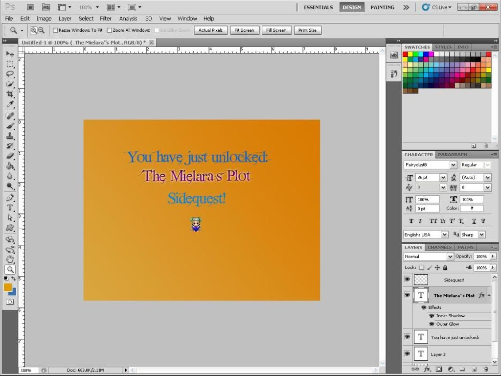
I have sidequests in my game, so I decided to make an image popup when they have unlocked a sidequest. like this one. I still have to touch up Mielara down there.
Adon237
I still have to touch up Mielara down there.

HA HA! MULTIPLE ENTENDRE!
Also that looks terrible, not even kidding.
Yeah, I kinda screwed up.
Maybe I should get rid of the orange tint. Thanks for your input though :3.
Maybe I should get rid of the orange tint. Thanks for your input though :3.


author=OtokonokoAdon237
I still have to touch up Mielara down there.
HA HA! MULTIPLE ENTENDRE!
Also that looks terrible, not even kidding.
I love that character so much.

Sorry Otokonoko, it doesn't look any better like this either. :(
Maybe I should stop this. How am I going to make a logo if I can't even do this right? :\

