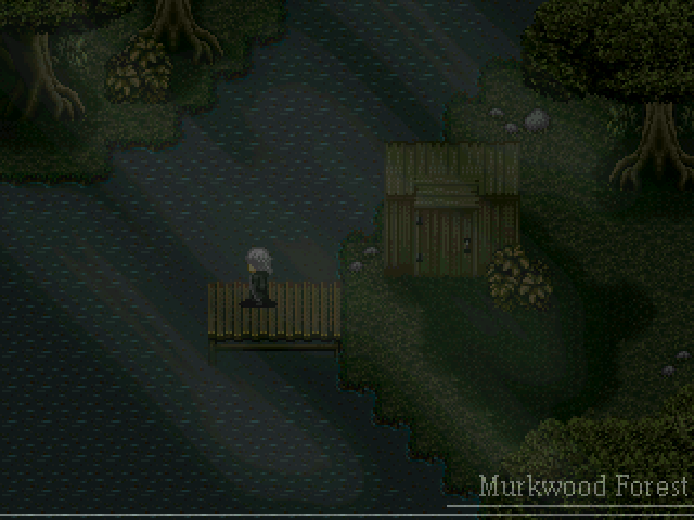
THE SCREENSHOT TOPIC RETURNS
Posts


author=chana
A very small village. Feedback is welcomed!
The layout is decent. A few things I notice:
The places where grass and street meet is a bit odd. I think because you have road tiles underneath some of the fence tiles(how did they drive the wood into the rock? :) Try having all fence tiles sitting on grass.
In the second screenshot, in the area near the old man in green the tree is inside the fence but the fence is missing the piece. Close off that fence. I'm guess that both fence and tree are on the upper layer, so either move the tree or put the tree in a charset to show it above the upper layer fence tile.
author=chana
for the tree, couldn't it be hiding the fence?
Yep, however when you look at the tiles on either side of the tree you can clearly tell that there's something missing. The planks of the fence are cut in half. If there was a fence tile behind the tree it would complete the visible portion of the fence and the tree would be hiding the rest.
author=chana
Nice but a bit mixed up : what's the bush doing on the roof, etc.
Giving it a more nature feel to the town, but yeah I removed that. There's enough trees and flowers in town anyway.

You can't see the back part of the roofs so the tip of the purple stuff is the very top of the roof and what's above it is another house with a flat roof. I would say.
It is a bit confusing overall.
It is a bit confusing overall.
author=UPRC
Edited RTP! First map in game directory!
Going to throw in a few silly things like being able to squish flowers when you walk on them, access rooftops, etc. Not sure what else, but I'll think of something.
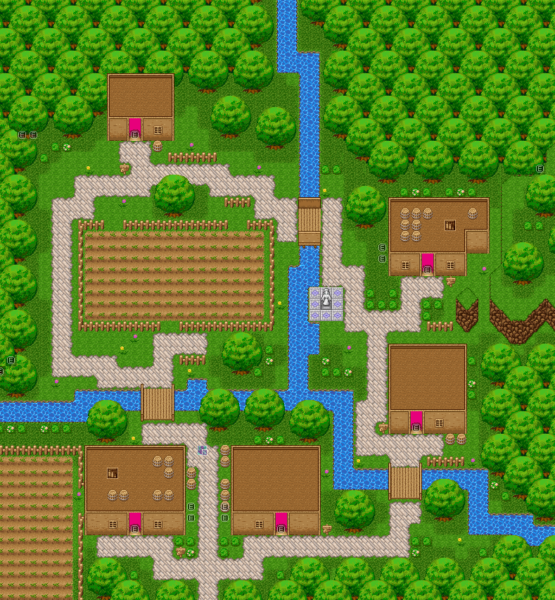
I dig the edits, but one of the biggest flaws of the RTP chipset, in my opinion, is it's tacky and over saturated color scheme. Try to throw something besides lime-green and butt-brown in there, eh? Maybe add some different colored trees to the mix, try desaturating some of the greens and browns, maybe add some grey to the houses... you know, spice things up, give them more of an appeal.
Basically, as it stands, it still looks 'RTP' to me.
Although I really like the trees and the walkways!
author=OceanShort project I did in a few days, then back to commissions/Adalyn/Stuff.
Looks really good, I especially like the shingles on the rooftops. They have a nice color to them. The chimneys are pretty dope, and that little cog-machine thing in the upper-left portion of the screen is rad!!
Removing the bushes from the rooftops was a good call, but it still might be cool to have some plants hanging from the windows or something.
Also, some of this screen might look a bit jumbled up, but I think that is largely due to the way it's cropped. Hard to make sense of tiles when they aren't entirely in context sometimes.
You are ABSOLUTELY sure you're not being even a tiny bit partial there (imagine it was done by some one else)? I want a completely sincere answer, thank you.

I think the problem is that the autotiles aren't working as they should. I'm pretty sure they're Celianna and Lunarea's steampunk tiles mixed with some mack and other tiles and both Lunarea and Celianna say that they aren't formatted for tilesets. They were made for parallax mapping and need adjusting to work as autotiles.
I think it still needs a little work, but it's a good start.
I think it still needs a little work, but it's a good start.

I am! ^.~
UPRC: Nice RTP. I really like those bridges and the paths. Like, really, really. Great job on those!
UPRC: Nice RTP. I really like those bridges and the paths. Like, really, really. Great job on those!
LockeZ

I'd really like to get rid of LockeZ. His play style is way too unpredictable. He's always like this too. If he ran a country, he'd just kill and imprison people at random until crime stopped.
5958
Ocean's map is okay for a project that she only did in a few days. If I only spent a few days on a project, the entire game world would consist of that screenshot, and the entire game's plot would consist of a single auto-start event with a few DBS battles in it. The buildings make perfect sense to me, and I don't think the tilesets clash at all, but I agree the plants on the roofs are really weird.
UPRC, I agree with Narcodis's stance on the RTP colors, and would also like to add that the town needs more doodad variety. Also, that big field in the middle better have a purpose, because it adds a lot of empty area.
UPRC, I agree with Narcodis's stance on the RTP colors, and would also like to add that the town needs more doodad variety. Also, that big field in the middle better have a purpose, because it adds a lot of empty area.

Ocean's map is ok for a 3 day game. I don't really so much issue with his map since it looks ok in game? O_o