


THE SCREENSHOT TOPIC RETURNS
Posts

I like the lettering and the fog, the forest is a bit of an undefined color, or too dark (a bit messy)?
The game over's fine, a bit empty at the top, the sentence above is not too, too clear (but maybe that's just me?). I like how the fog in one refers to the fog in the latter.
The game over's fine, a bit empty at the top, the sentence above is not too, too clear (but maybe that's just me?). I like how the fog in one refers to the fog in the latter.

The wording, it's understandable, but could maybe be said otherwise, better?
Oh, I forgot, the character's somewhat blurred.
Oh, I forgot, the character's somewhat blurred.
"The path of Sarkness"
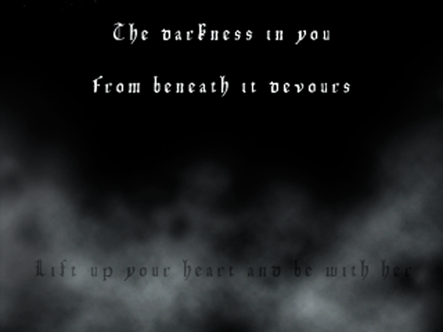
The dark spots of the font blend in with the background and makes it harder to read than it should be. I personally have a very strong dislike for that font. Those kinds of gothic fonts are usually hard to read but this one is pretty bad.
"The oarfness in you
From beneath is oevours
Lift up your heart and be with ???"
Hard to read font with black letters on a mostly black bg isn't a good idea.
An outline around all text might make it more visible against the bg, but it won't do anything about my hatred for that font hah
Everything else is "ok". The image in the title screen is fine, that fog effect might be layed on a little thick. The gameover is a little empty, but the way you have words about darkness in the black is cool(if intentional). Maybe have something like...a hand reaching up from the bottom of the screen to go with the words along the bottom.


Yes, I took the sentence from Buffy. I loved that season xD.
But I changed it now:

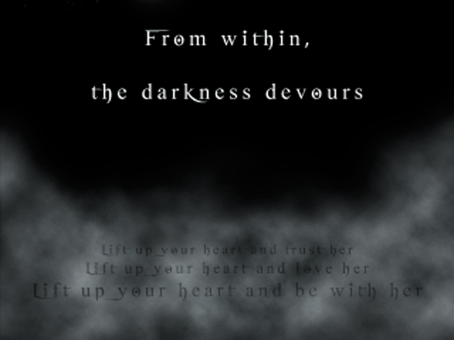
The three sentences in the bottom are part of in-game lore.
But I changed it now:
The three sentences in the bottom are part of in-game lore.
Much easier to read that font. Those long trails are kinda iffy, but it gives a unique look at least.
The title words might look good with a tiny outline, to keep the form of the letters apparent. I get your following a theme of fog but the text shouldn't be shrouded, imo. It's not impossible to read right now. So whatever.
The bottom words are still hard to read, unless that fog scrolls by? It's in a different position than the last screen. If it scrolls then I can imagine it would be fine. I suppose taking into consideration you will be seeing that screen a lot(maybe? haha) having them instantly readable may not be a top priority.
*Oh you changed the words, too. It's much clearer now.

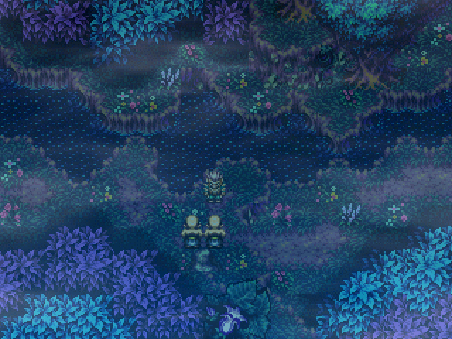
I tried VX Mapping, dunno how successful it is but I needed a map <v<;
They're in a real facility, it's hard for me to explain :C

They're in a real facility, it's hard for me to explain :C

author=Avee
Well, it is already decided that I will keep the second version of the menu. I do consider everyone's feedback in making this version easier to look at though.
Here's a quick little change for now: The background image could be all black, all white (appears grey because of the black semi transparent pic I put on top of it, but we could remove it), or show the battle background of the current dungeon like I first planned.
What bg do you guys prefer, considering how it affects the info on the menu?
]
In order for how I like them: 3rd, 1st, 2nd.
author=Crazeauthor=Natookit is impossible to add an objective to the first menu, the world would implode and Mayans would attack
Second is better. Much more consistent and shows an objective. I like having easy access to what I should be doing. First is kinda cluttered.
look at me, i'm craze and i can't let anyone else think differently without being an ass about it, i<3vx
LockeZ

I'd really like to get rid of LockeZ. His play style is way too unpredictable. He's always like this too. If he ran a country, he'd just kill and imprison people at random until crime stopped.
5958
author=Natookauthor=Crazelook at me, i'm craze and i can't let anyone else think differently without being an ass about it, i<3vxauthor=Natookit is impossible to add an objective to the first menu, the world would implode and Mayans would attack
Second is better. Much more consistent and shows an objective. I like having easy access to what I should be doing. First is kinda cluttered.
Look at me, I'm Natook and I can't tell the difference between couching advice with humor to make it seem less harsh and being an ass.
author=LockeZauthor=NatookLook at me, I'm Natook and I can't tell the difference between couching advice with humor to make it seem less harsh and being an ass.author=Crazelook at me, i'm craze and i can't let anyone else think differently without being an ass about it, i<3vxauthor=Natookit is impossible to add an objective to the first menu, the world would implode and Mayans would attack
Second is better. Much more consistent and shows an objective. I like having easy access to what I should be doing. First is kinda cluttered.
lockez: i'll take "what is sarcasm" for 500 alex

author=Archeia_Nessiah
I tried VX Mapping, dunno how successful it is but I needed a map <v<;
They're in a real facility, it's hard for me to explain :C
Ness, not bad at all. I don't know what's going on with the tiles just above the steps, though. What are they meant to be?
@Ness: I like this too but the eastern wall being 2 tiles wide and 2 tiles deep would mean there's empty space at the right of the stairs, if you know what I mean.
The left wall is fine though.
The left wall is fine though.

New edit i'm working on. Tried to make that big knight guy from secret of mana 3 into a Rudra sprite.

Looks great to me! I'm not a huge fan of the Rudra style, but that's personal preference- and it still looks really good.
author=Max McGee
Ness, not bad at all. I don't know what's going on with the tiles just above the steps, though. What are they meant to be?
They're...curtain door things that you slide off to the side ;v;
@Avee whoa I knew it! I did have it 2 tiles ..walll thing but I realized I didn't have much space to walk in so I made it one tile off, oops. Thanks!
(Learning something new everyday~)

