THE SCREENSHOT TOPIC RETURNS
Posts
author=Kevinds
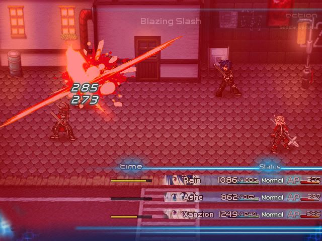
Little sneak peak off my battle system, It's not done yet but it will look something like this =)
ps: I know "Getsuga Tenshou" is a skill used in the anime/manga "Bleach" but I think its uber awesome and is a must in my game =)
This reminds me of Lucifer Nazi's game. Crisis M.E.T.E.O.R.
IT IS THE SAME.

Original Thread: http://community.thaiware.com/index.php/topic/335652-previewcrisis-meteor-war-of-meteor-crystals/page__hl__CRISIS%20METEOR
Lusi's site: http://lusinazi.exteen.com/20100208/cm-preview-crisis-m-e-t-e-o-r-war-of-meteor-crystals-1
This is the title screen from my project in RMXP. I've changed the name of my game from CRISIS M.E.T.E.O.R to "Revenant Gods - ragnarok war chronicle -" because it fits more with the story and the old logo looked too much like Final Fantasy.
For more info about this game, follow this link.
http://irpg.in.th/forum/Showroom/433-CRISIS-METEOR---War-of-Meteor-Crystal
However, the information in this thread is not up-to-date yet. Sorry.
Facebook page: http://th-th.facebook.com/pages/Revenant-Gods-ragnarok-war-chronicle-/214571135273739
And even if you are the same person, didn't you finish this battle system ages ago? I remember playing it on my pc with a demo (looks for it) :|
DAMNIT NEW PAGE AND I HAVE NOTHING TO SHOW
but uh here? It works!
Nice, but I think the white of her eyes should be really white.(where'd she go??) ( Who the f**** chose "Lucifer Nazi" as a nickname!?)
Wow, looks really great, professional, I want to play this!
Wow, looks really great, professional, I want to play this!
author=KevindsLittle sneak peak off my battle system, It's not done yet but it will look something like this =)
ps: I know "Getsuga Tenshou" is a skill used in the anime/manga "Bleach" but I think its uber awesome and is a must in my game =)
Are you Lusifernazi?
If not, then I highly implore you to drop his battle HUD and character graphics/effects. It's a shame to see Revenant Gods get aped like that.
The battle system looks really interesting! I like the slightly slanted perspective and the interface.
@chana Thanks! The demanteling can be seen in the upcoming trailer :3
@chana Thanks! The demanteling can be seen in the upcoming trailer :3
Wow guys...those screenshots are just beautiful. I honestly don't think I can say anything to improve Far_Oz's or stardust's work; it's simply stunning.
@Feldschlacht IV
That looks gorgeous too, though I agree with deleting the bottom row of tiles to make the area a little less barren. I've been studying real-world architecture a lot recently, and I've learned that smaller rooms look more natural.
@Scourge
That is very impressive map work. The only thing that looks a little weird to me are the positions of the towers. Typically, castle towers were built around the perimeter of a castle as a defense strategy to avoid the problem of 'blind spots' that traditional castles had, so having all the towers together like that doesn't seem to fit.
@Kevinds
That system looks very cool and action packed. The only issue I have with the graphics is that some of the shadows don't match (that tree's shadow looks much more nature than the square one of the tree next to the stairs), and the character sprites are not quite in the same style as the RTP stuff. These are really nitpicks though.
@UPRC
Cool, a fan game of one of the best RPGs ever! The dialogue and mapping so far do seem reminiscent of FFVI. I look forward to seeing more of it.
@Arandomgamemaker
...I am incredibly curious, actually.
It has been a while since I posted something, as I've been busy with work and making other non-graphical aspects of my game. I do have a few work in progress shots however.
The first is the current edition of my wilderness tileset. I again took LockeZ's advice and made the tall grass the same colour as the normal grass, and I think the effect is superior. I also increased the size of the trees and re-edited the deciduous leaves. The wilderness tileset is probably something I'll be working on all the way through development (who knew nature was so complicated?!?), but since the basics will stay the same there was nothing preventing me from completing several maps:


Next is the 'Dark Fortress' area from the game's prologue:

The castle is another tileset in progress, but you can get a sense of the tones and overall composition from this screenshot.
Here is my attempt to solve the white text problem in the DBS system. This is from the game's first boss fight.

You can see that I added a shadow over the text. I think this makes the text and numbers pretty easy to read, but as always I'd appreciate other opinions.
@Feldschlacht IV
That looks gorgeous too, though I agree with deleting the bottom row of tiles to make the area a little less barren. I've been studying real-world architecture a lot recently, and I've learned that smaller rooms look more natural.
@Scourge
That is very impressive map work. The only thing that looks a little weird to me are the positions of the towers. Typically, castle towers were built around the perimeter of a castle as a defense strategy to avoid the problem of 'blind spots' that traditional castles had, so having all the towers together like that doesn't seem to fit.
@Kevinds
That system looks very cool and action packed. The only issue I have with the graphics is that some of the shadows don't match (that tree's shadow looks much more nature than the square one of the tree next to the stairs), and the character sprites are not quite in the same style as the RTP stuff. These are really nitpicks though.
@UPRC
Cool, a fan game of one of the best RPGs ever! The dialogue and mapping so far do seem reminiscent of FFVI. I look forward to seeing more of it.
@Arandomgamemaker
...I am incredibly curious, actually.
It has been a while since I posted something, as I've been busy with work and making other non-graphical aspects of my game. I do have a few work in progress shots however.
The first is the current edition of my wilderness tileset. I again took LockeZ's advice and made the tall grass the same colour as the normal grass, and I think the effect is superior. I also increased the size of the trees and re-edited the deciduous leaves. The wilderness tileset is probably something I'll be working on all the way through development (who knew nature was so complicated?!?), but since the basics will stay the same there was nothing preventing me from completing several maps:


Next is the 'Dark Fortress' area from the game's prologue:

The castle is another tileset in progress, but you can get a sense of the tones and overall composition from this screenshot.
Here is my attempt to solve the white text problem in the DBS system. This is from the game's first boss fight.

You can see that I added a shadow over the text. I think this makes the text and numbers pretty easy to read, but as always I'd appreciate other opinions.
author=Lucidstillness
@UPRC
Cool, a fan game of one of the best RPGs ever! The dialogue and mapping so far do seem reminiscent of FFVI. I look forward to seeing more of it.
Glad to hear! All I'm doing is an intro for now which I'll then stick up on YouTube or something. There won't be much to it until I get Blackmoon Prophecy out of the way (I'm gearing up to do a big final push to finish the damn thing once and for all).
Hi, Lucid, I've once again looked your screens over and wrote a detailed list of what I think could be improved. Take it or leave it.

+: the (yellow) dirt looks good.
-/+: Did you add noise to your grass texture? You did the right thing in lowering the saturation of that grass but I'm not a fan of the grainy texture, it looks odd.
-: You still a really serious problem with heterogeneity. To be honest I don't understand how you create your stuff. The flowers are obviously pixel art, the cliffs seem to have been ripped from another game. You can the see the huge difference in quality if you campare the flowers (very basic) and the cliff (pro looking).
Out of curiosity, are those rips? custom made? modified version of rips? I'm honestly at a loss. This is really the most serious issue at the moment. Either go for pixel art, or hand paint everything or use rips but right now the mix doesn't give a good result I think.
Just to give you an idea, look at this screen by Wanoklox:
Notice how everything blends in nicely and looks great? Everything is drawn in the same unique style and the screen itself is really neat because of that.
-: The trunk of the trees seem like they were done by hand but the leaves don't. It looks like the leaves were ripped from an actual picture and pasted on top of a hand drawn trunk and it doesn't fit nicely in my opinion.
-: the statues on the side of the stairs are flat, no shadow and they stick out. They just don't integrate well with the rest of the screen.
-: the texture for the cliff seem to have been stretched with photoshop and it doesn't look very good, especially at the very bottom of the cliff. Try to find a way to make it look less seemless.
-: You still have issues with your character sprite. You've been told about this before and I really think you should take some time to fix it considering it's pretty important. I'd stop mapping for a bit and polish up what you've already done. Get a reference for his anatomy, the shoulders are off.
-: the slime has a row of pixel at the bottom and it's very distracting. Maybe you could replace it with a darker color? The eyes of the slime could certainly use more contrast, it's difficult to actually see the details you've put in the eyes.

-: Same problem here. It seems like different people of very different artistic ability worked on this. For instance, the red eyes of the statue is a bit awkward in my opinion. The glow would probably be better if you played with transparency around the rim of the glow (if that makes any sense). I mean, the glow of the candle is not bad, why is it that the glow for eyes of the statues is so different? Maybe you were going for a different kind of light effect, I'm not sure really.
-: the arrows are oddly placed. Why are they so far away from the exits they indicate? I would put them closer, I think it'd look better. Also the arrow on top overlaps with the wall and it doesn't look great that way I think.

That's the best screen out of the three. The text is a bit dark, I think a lighter shade would make it easier to read. Did you draw the dragon? The faceset? I'm honestly trying to figure out where everything comes from in this game as the parts of its whole are just so different.

+: the (yellow) dirt looks good.
-/+: Did you add noise to your grass texture? You did the right thing in lowering the saturation of that grass but I'm not a fan of the grainy texture, it looks odd.
-: You still a really serious problem with heterogeneity. To be honest I don't understand how you create your stuff. The flowers are obviously pixel art, the cliffs seem to have been ripped from another game. You can the see the huge difference in quality if you campare the flowers (very basic) and the cliff (pro looking).
Out of curiosity, are those rips? custom made? modified version of rips? I'm honestly at a loss. This is really the most serious issue at the moment. Either go for pixel art, or hand paint everything or use rips but right now the mix doesn't give a good result I think.
Just to give you an idea, look at this screen by Wanoklox:
Notice how everything blends in nicely and looks great? Everything is drawn in the same unique style and the screen itself is really neat because of that.
-: The trunk of the trees seem like they were done by hand but the leaves don't. It looks like the leaves were ripped from an actual picture and pasted on top of a hand drawn trunk and it doesn't fit nicely in my opinion.
-: the statues on the side of the stairs are flat, no shadow and they stick out. They just don't integrate well with the rest of the screen.
-: the texture for the cliff seem to have been stretched with photoshop and it doesn't look very good, especially at the very bottom of the cliff. Try to find a way to make it look less seemless.
-: You still have issues with your character sprite. You've been told about this before and I really think you should take some time to fix it considering it's pretty important. I'd stop mapping for a bit and polish up what you've already done. Get a reference for his anatomy, the shoulders are off.
-: the slime has a row of pixel at the bottom and it's very distracting. Maybe you could replace it with a darker color? The eyes of the slime could certainly use more contrast, it's difficult to actually see the details you've put in the eyes.

-: Same problem here. It seems like different people of very different artistic ability worked on this. For instance, the red eyes of the statue is a bit awkward in my opinion. The glow would probably be better if you played with transparency around the rim of the glow (if that makes any sense). I mean, the glow of the candle is not bad, why is it that the glow for eyes of the statues is so different? Maybe you were going for a different kind of light effect, I'm not sure really.
-: the arrows are oddly placed. Why are they so far away from the exits they indicate? I would put them closer, I think it'd look better. Also the arrow on top overlaps with the wall and it doesn't look great that way I think.

That's the best screen out of the three. The text is a bit dark, I think a lighter shade would make it easier to read. Did you draw the dragon? The faceset? I'm honestly trying to figure out where everything comes from in this game as the parts of its whole are just so different.
Thanks Creation, you've given me a lot to think about. Yes, everything in the game was hand drawn by me from scratch, so I think the clash you keep mentioning is caused by my resizing and shifting pixels around. Some of the graphics are also pixel art or upgraded pixel art, like the flowers, so that might also contribute to the clashing.
The grass is something that I've been playing around with for some time; I'm thinking about lowering the contrast a bit to make the pixel details less noticable. You're also right about my modifying the cliff textures with Photoshop; I'm planning to draw over them with new details to remove the slight distortion effect. Not sure what to do to blend the statue better...maybe add more grass at the base? The glowing eyes on the monster statues are also going to be redone, since I modified the sprites last night to match the current colour palette.
My design process is essentially to make a bunch of sprites, assemble them, then upgrade them bit by bit as my skills improve. Textures are easy, but more complicated things like trees take more time. This approach allows me to work on the game at my leisure, but it does create the problem of some elements looking better than others during the design phase (for example, I haven't worked on the character sprites at all in months). If you have any suggestions about how to minimize this problem I would be grateful.
Thanks again for taking the time to give me such detailed advice!
lucidstillness
If you have any suggestions about how to minimize this problem I would be grateful.
Creation
I'd stop mapping for a bit and polish up what you've already done.
Some of the stuff in your game has been improved far too much compared to what you used to do before to the point where the graphics just don't sit well together. I mean if you keep creating stuff you'll become better at it as you go along. It happens to just about anyone who works on graphics for long enough. People constantly replace their old resources so that they match their new ones, there's no avoiding it really.
I mean, just look at the dragon and the anime faceset. The dragon looks like it was drawn by someone who is lightyears ahead of the person who did that faceset which looks like it was done by someone who has just started. I'm sure you see the HUGE difference as well, now you have to replace your outdated graphics with something more uniform.
I mean, even in your older screens, your battlers were still much better than your facesets:

To be honest with you, those battlers always screamed rotoscoping to me which is why I'll be honest that I was a bit suspicious about the whole ''drawing from scratch'' thing but I'll take your word for it. The reason I'm under this impression is that while the anime facesets could be criticized, the battlers itself is quite simply flawless. It looks like something you'd see in an AD&D rulebook or something, it's that perfect. I was doubtful that you went from average facesets to stellar battlers. I wouldn't be surprised if other people familiar with digital art were left with the same impression however. Just putting it out there. Your screens were actually featured in an international news available here and the writer was exactly under the same impression.
By drawing from scratch you do mean that you use references however, do you not? If you don't use references, then please replace that faceset with something of the quality of the dragon asap :-).
Ah, I suspected everybody did have that problem. Live and learn I guess.
I use photographic references and I look to see how other games have done certain things, while being careful not to copy any one game's style. I think that also contributes to some of the clashing art styles, as I am trying to find my own way of doing things.
Do you mean the face set looks bad for anime, or bad because it is anime next to more realistic graphics? The decision to use anime graphics with realistic backdrops and enemies was a design choice I made early on, so the game would be reminiscent of a lot of JRPGs. This would have allowed for a lot of easy to draw cutscenes.
However, the contrast ended up being a bit too much, and I started airbrushing my lineart that was initially cell shaded. The entire design process of the character graphics was different from everything else; the characters were clean line art done in Sai, whereas the other graphics were mostly done in Photoshop. Looking back on it now, that was probably a mistake, as it made the characters look too clean and simple compared to everything else.
Ironically, it would probably be a lot easier to just draw the character art in the same detailed style as everything else. The art design seems to be moving in that direction by itself, so that's what I might end up doing.
Also, wow, thanks for telling me about that international thread! It's great to know people are interested in this project. :)
Here are some screens to show what I mean about the different design processes
Whaaaaaaaaaa, someone is actually INTERESTED? huh.
Well, anyway, i think you are doing great so far, lucidstillness. Much better then me, however....
Welp, i'm offically creating this game. Yup, that's right. A RTP game. The 5000th one. With the main character being a dog. In Rpg Maker 2000.
Yes, well, anyway, (I say anyway too much.) here are some screenshots i decided to take:

Yup, you can dig in dirt. It doesn't work on the world map, however. Since a dog buying stuff from humans would be a little weird, i made chickens shop owners now.

Yes, well, i think my writing could be improved on. That smooshed text is really starting to kill me....

"Cute" obviously stands for "Normal". I mainly just renamed the commands, simply because this is supposed to be a cutesy game. At least i broke the mold and named "L" "F". for Finesse.
Tell me what you guys think. I love improving things.
Well, anyway, i think you are doing great so far, lucidstillness. Much better then me, however....
Welp, i'm offically creating this game. Yup, that's right. A RTP game. The 5000th one. With the main character being a dog. In Rpg Maker 2000.
Yes, well, anyway, (I say anyway too much.) here are some screenshots i decided to take:

Yup, you can dig in dirt. It doesn't work on the world map, however. Since a dog buying stuff from humans would be a little weird, i made chickens shop owners now.

Yes, well, i think my writing could be improved on. That smooshed text is really starting to kill me....

"Cute" obviously stands for "Normal". I mainly just renamed the commands, simply because this is supposed to be a cutesy game. At least i broke the mold and named "L" "F". for Finesse.
Tell me what you guys think. I love improving things.
author=Darken
Will there be a CBS(custom bark system)? please keep up the good work
A custom bark system? Maybe. I never really thought about it. You can get eggs and milk when you get a cow and chicken, and cook when you have recipes. Oh, yes, and there's begging, based on your cuteness rating.
Wow, just saw your edit, lucid. You do draw everything, my bad. Well done, I can't wait to see the final product when everything is up par with the same quality.
@Adon: This is by far the most interesting project you've worked on IMHO. I like the idea of being in control of a dog.
I laughed.
@Adon: This is by far the most interesting project you've worked on IMHO. I like the idea of being in control of a dog.
Will there be a CBS(custom bark system)?
I laughed.


