THE SCREENSHOT TOPIC RETURNS
Posts
Okay, I've added Judes changes which is nice. Now, here's a nighttime scene:
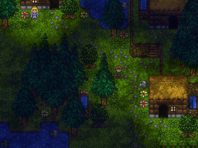
I saw Jude also changed the grass. I still kinda like it this way because it makes it look grassier, with blades and all. But that's just preference.

I saw Jude also changed the grass. I still kinda like it this way because it makes it look grassier, with blades and all. But that's just preference.
author=RadnenOh, I didn't change the grass. Maybe I jacked something up when I copy/pasted your image into my paint software. I only intentionally changed the tree foliage.
Okay, I've added Judes changes which is nice. Now, here's a nighttime scene:
I saw Jude also changed the grass. I still kinda like it this way because it makes it look grassier, with blades and all. But that's just preference.
Ashley_Lacure
Saw that Craze was hogging the screenshot topic
.
The entire community is a hivemind determined to harass and upset me. :< (Also, wtf srsly?)
LockeZ

I'd really like to get rid of LockeZ. His play style is way too unpredictable. He's always like this too. If he ran a country, he'd just kill and imprison people at random until crime stopped.
5958
Lyric, that's pretty slick looking. Loving the artwork. What RPG Maker are you using?
Based on the fact that there's no max HP or MP shown, only current HP and MP, I assume that the characters' HP and MP are restored after every fight? If they're not always at full HP, you should probably show Health: 30/30 instead of just Health: 30. If I'm checking the menu, 9 times out of 10 it's to heal myself, so it's good to be able to immediately see whether I need to do so.
Based on the fact that there's no max HP or MP shown, only current HP and MP, I assume that the characters' HP and MP are restored after every fight? If they're not always at full HP, you should probably show Health: 30/30 instead of just Health: 30. If I'm checking the menu, 9 times out of 10 it's to heal myself, so it's good to be able to immediately see whether I need to do so.
@chana: Thank you, like Ive said in my Game Page that is part of the games intro. Its missing lighting effects which I have yet to even mess with but know it will look nicer in a month or two.
@Max: Im releasing the video of the intro this weekend, tell me how you like it then.
@Lyric: I really like the look of this, Id recommend change the color of the class for Ruffian and Student it blends in with their hair too much. P.S.: I never thought I'd see Lelouch alive and well ^_^.
@Craze: <3
Lastly is no one bothered by the battle set up and level up bar popping up outta the shadows? If not I guess I did my job well.
author=LockeZCurrently VX, but I am planning on switching over to Ace if it comes out before I'm happy with the project (which is looking very likely - I keep waking up the next day and being unhappy with things I loved the day before).
Lyric, that's pretty slick looking. Loving the artwork. What RPG Maker are you using?
Based on the fact that there's no max HP or MP shown, only current HP and MP, I assume that the characters' HP and MP are restored after every fight? If they're not always at full HP, you should probably show Health: 30/30 instead of just Health: 30. If I'm checking the menu, 9 times out of 10 it's to heal myself, so it's good to be able to immediately see whether I need to do so.
Ha I honestly hadn't thought of that! I knew there was something missing, just goes to show my critical eye isn't the only one I need to get things right. I'm not sure whether to go with a bar or just x/x right now, or even if healing after battle might be a valid option... More thoughts for the drawing board, thank you!
author=Ashley_LacureAww, thank you! Yeah, they do need changing, or at least moving around a little so they're not... blending so well. I am working on it, so I'll make sure I post the finished thing here for you!
@Lyric: I really like the look of this, Id recommend change the color of the class for Ruffian and Student it blends in with their hair too much. P.S.: I never thought I'd see Lelouch alive and well ^_^.
(I thought somebody might notice, haha! By the way I love love LOVE the set up.)
@Craze: http://i41.tinypic.com/ra147a.jpg
I'm not sure what are you trying to do here, but I don't quite like the result. It looks like a desaturated rainbow or smething. :S Expanding on Newblack's suggestion, I recommend you to make a heavy use of gray. Remember that old saying: "Gray goes with everything". For example, a gray-scaled background would make the enemies pop-out more. And if everyone is related to a primary and secondary color, make a top-to-bottom gradient of those colors instead of just coloring random parts parts of each character.
@Radnen: http://rpgmaker.net/media/content/users/6429/locker/RPGscreen8.png
Is this some kind of maple-leaf? Cloudy? Overlay? It looks awful. Kill it! Kill it with fire! ...There's lots of merit in your pixel work, but it already looks kinda messy on its own. The overlay is just overkill. - As for the night, why don't you just use a tint screen effect instead?
Ashley_Lacure: http://rpgmaker.net/media/content/games/3678/screenshots/RV03.png
Very nice screens! Nothing really worth criticizing in them, except for a very small detail in this one. That "F" is very hard to read and it almost looks like you can see the dirt tiles trough it. You could draw a profile around it, but I suggest you to stick to white & yellow only.
@Lyric: http://rpgmaker.net/media/content/users/18015/locker/menuscreen.jpg
Not bad. I like the design, it's simple but effective. The menu section looks a bit empty though, Why don't you try and push the options a bit to the right? So the cursor is around the place where the icons are now. - I like the background personally. It's very appropriate if you game is set in a modern city, but it would be best if it where a drawing instead of a photo. ...As for the character portraits, the kinda look from different drawing styles, specially the last one. I suggest you change them, but I can force you to do so. =P
Edit:
What a sound argument! - It counts for consistency. Except if you're consciously trying to make your game look like a collage, that is...
I'm not sure what are you trying to do here, but I don't quite like the result. It looks like a desaturated rainbow or smething. :S Expanding on Newblack's suggestion, I recommend you to make a heavy use of gray. Remember that old saying: "Gray goes with everything". For example, a gray-scaled background would make the enemies pop-out more. And if everyone is related to a primary and secondary color, make a top-to-bottom gradient of those colors instead of just coloring random parts parts of each character.
@Radnen: http://rpgmaker.net/media/content/users/6429/locker/RPGscreen8.png
Is this some kind of maple-leaf? Cloudy? Overlay? It looks awful. Kill it! Kill it with fire! ...There's lots of merit in your pixel work, but it already looks kinda messy on its own. The overlay is just overkill. - As for the night, why don't you just use a tint screen effect instead?
Ashley_Lacure: http://rpgmaker.net/media/content/games/3678/screenshots/RV03.png
Very nice screens! Nothing really worth criticizing in them, except for a very small detail in this one. That "F" is very hard to read and it almost looks like you can see the dirt tiles trough it. You could draw a profile around it, but I suggest you to stick to white & yellow only.
@Lyric: http://rpgmaker.net/media/content/users/18015/locker/menuscreen.jpg
Not bad. I like the design, it's simple but effective. The menu section looks a bit empty though, Why don't you try and push the options a bit to the right? So the cursor is around the place where the icons are now. - I like the background personally. It's very appropriate if you game is set in a modern city, but it would be best if it where a drawing instead of a photo. ...As for the character portraits, the kinda look from different drawing styles, specially the last one. I suggest you change them, but I can force you to do so. =P
Edit:
nah
What a sound argument! - It counts for consistency. Except if you're consciously trying to make your game look like a collage, that is...
author=Max McGeeI really really really really really really really like this.
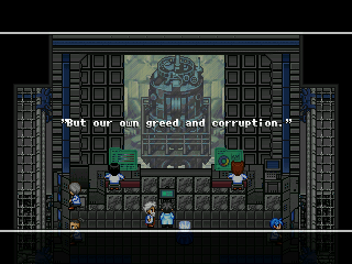
second, it's probably off perspective or w/e (well all top down is usually) but it's really cool to see actual "depth" in a screenshot with not just MOUNTAIN CLIFF USAGE but with a convincing foreground effect. makes me go HMMM WHAT IS THIS MYSTERIOUS MACHINERY.
author=alterego
I like the background personally. It's very appropriate if you game is set in a modern city, but it would be best if it where a drawing instead of a photo.
nah
author=alteregoIt is all still going to be shuffled around, and I'll be sure to take your comments into account, so thank you for them! The image itself is more of a filler for now, until I can find a more appropriate one. Worry not, the character images themselves will be changed as well - at the moment they're just renders of characters from different animes! Purely to get an idea of how I wanted them to look in the menu.
@Lyric:http://rpgmaker.net/media/content/users/18015/locker/menuscreen.jpg
Not bad. I like the design, it's simple but effective. The menu section looks a bit empty though, Why don't you try and push the options a bit to the right? So the cursor is around the place where the icons are now. - I like the background personally. It's very appropriate if you game is set in a modern city, but it would be best if it where a drawing instead of a photo. ...As for the character portraits, the kinda look from different drawing styles, specially the last one. I suggest you change them, but I can force you to do so. =P
second, it's probably off perspective or w/e (well all top down is usually) but it's really cool to see actual "depth" in a screenshot with not just MOUNTAIN CLIFF USAGE but with a convincing foreground effect. makes me go HMMM WHAT IS THIS MYSTERIOUS MACHINERY.
My favorite part is definitely how the guys are sitting and how much like sitting their sitting looks.
Curses, my prospective is off how could I be so foolish. But really I didnt notice it until I looked at it again. Thanks for the comments guys I have to start cranking out maps like the octamom if I want to meet my deadline.
@Max: If you like their sitting you will love their typing.
@Max: If you like their sitting you will love their typing.
author=alterego
@Radnen:http://rpgmaker.net/media/content/users/6429/locker/RPGscreen8.png
Is this some kind of maple-leaf? Cloudy? Overlay? It looks awful. Kill it! Kill it with fire! ...There's lots of merit in your pixel work, but it already looks kinda messy on its own. The overlay is just overkill. - As for the night, why don't you just use a tint screen effect instead?
I knew someone will eventually say that. You are absolutely right! At the time it looked okayish, but now I added dirt to the map. This alone removes the need for an overlay by reducing the need to have randomization.
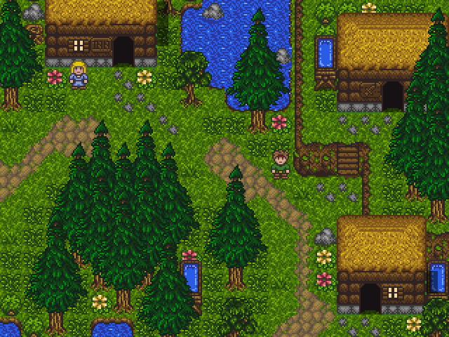
The main character is hard to find because his colors are the same colors as his surroundings. (brown: hair, cliffs. Green: shirt, grass. He should have some color/feature that makes him stand out/easily recognizable against the bg. You shouldn't have to where's waldo your main character.
author=King of Games
The main character is hard to find because his colors are the same colors as his surroundings. (brown: hair, cliffs. Green: shirt, grass. He should have some color/feature that makes him stand out/easily recognizable against the bg. You shouldn't have to where's waldo your main character.
True, but he does move around. I've found it hard to find the main character on other peoples screenshots. Especially on games in which I have no idea who the main character looks like! Let's just call this... Coincidental. If I had him in a different area, you'd probably not say that. I could have been that female on the upper-left, and you'd again have no idea. I'm surprised she wasn't your conclusion. Which means I'm partially successful already.
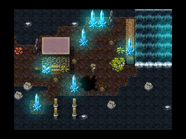
adon, only thing that looks odd to me is the waterfall; elevation's not quite looking right
why are you working on the title screen for part 3 if you haven't finished part 1? that's crazy
why are you working on the title screen for part 3 if you haven't finished part 1? that's crazy
author=Max McGee
adon, only thing that looks odd to me is the waterfall; elevation's not quite looking right
why are you working on the title screen for part 3 if you haven't finished part 1? that's crazy
Still trying to figure out how to fix it.
Well, I have a planned story for a Stonesearch 2 and a Stonesearch 3.
Always nice to have that stuff out the way.


