THE SCREENSHOT TOPIC RETURNS
Posts
@Everyone - So the perspective is all good now? And it seems the original title screen still lands on top. The logo does look better but I can't seem to get the title screen to look as good as this..

In Rpg Maker. Also, in terms of context with the game.. This new title is just supposed to look good. It's kinda like how a pretty girl will hang out with uglier girls to make her seem more pretty to others.

In Rpg Maker. Also, in terms of context with the game.. This new title is just supposed to look good. It's kinda like how a pretty girl will hang out with uglier girls to make her seem more pretty to others.
Perspective looks good to me.
Because RPG Maker 2003 doesn't support full colours or alpha channels. That result would appear in RPG Maker XP and all above, but 2k / 2003 don't support alpha channels or full colours, this it substitutes some and replaces them with its own. Giving it a pixelated look.
Because RPG Maker 2003 doesn't support full colours or alpha channels. That result would appear in RPG Maker XP and all above, but 2k / 2003 don't support alpha channels or full colours, this it substitutes some and replaces them with its own. Giving it a pixelated look.

author=Killer Wolf
Snow OwlThe perspective is really weird. The knotwork crosses look like they're almost laying flat and the angle the table is on to the camera does not match with the walls at the back.
I can see why the statues would look that way to you but i see nothing wrong with the table? Can you explain what you mean?
I agree with Killer Wolf. Compared to the walls, the angle on the table looks wrong. I'm not really sure how else to explain it.
I agree with him about the crosses, as well. To fix that problem, make them a bit shorter. They look like they're a design on the carpet at the moment.
I agree with him about the crosses, as well. To fix that problem, make them a bit shorter. They look like they're a design on the carpet at the moment.
It is because the left and right edges of the table taper as if it were in the perspective of a lower view, the objects on the table don't help this either.
author=Khos
It is because the left and right edges of the table taper as if it were in the perspective of a lower view, the objects on the table don't help this either.
Ah, now i understand. I'll fix that.

Working on an XP side project, going to mostly use RTP and Naramura and related resources.
This screen is from the beginning of the game, I haven't decided on random battles or on screen touch encounters, so I don't have any enemies visible yet.
LockeZ

I'd really like to get rid of LockeZ. His play style is way too unpredictable. He's always like this too. If he ran a country, he'd just kill and imprison people at random until crime stopped.
5958
author=InfectionFilesWorking on an XP side project, going to mostly use RTP and Naramura and related resources.
This screen is from the beginning of the game, I haven't decided on random battles or on screen touch encounters, so I don't have any enemies visible yet.

I think you meant to post this screenshot, based on the URL in your img tag.
It's simple, but also pretty. The fog and background blend together nicely.
Haha, I didn't realize it didn't show up, thanks LockeZ. :)
Edited the OP, and cool, I'm glad you think it blends, I thought so too.
Sorry guys! Now it's visible. :P
Edited the OP, and cool, I'm glad you think it blends, I thought so too.
Sorry guys! Now it's visible. :P
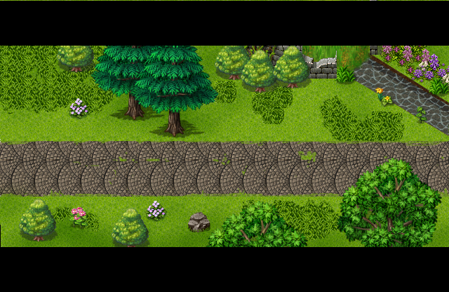
Missing a few map items, but pretty much finished ^^
@InfectionFiles - I dig the sky and atmosphere, I'd usually say it needs more doodads but the emptiness is kinda nice o_o
@SorceressKyrsty - Is naaaice.
@SorceressKyrsty - Is naaaice.
It's man made, so yes. It's actually in the middle of a city~ one of those engineered path ways.
author=NewBlack
@InfectionFiles- I dig the sky and atmosphere, I'd usually say it needs more doodads but the emptiness is kinda nice o_o
Yeah I didn't want to overdo it with little things. It was even more empty before I added some of the water pools and mushrooms. Figured it needed something, although I really do like that tileset even without the doodads, the emptiness made it really slick looking.
@SorceressKyrsty- Very nice looking, I can't help but wonder how the water and the road looks as it intersects.
The perspective on that road/path tile is.. well, it's just awful. Sorry, but it has a clearly top-down perspective. It might pass if it was running north-south, but when its running east-west and the shadows would indicate that the sun was to the right of the screen since it was clearly rotated to the side without the shadows in mind.
I'd replace it, it just doesn't look right and no amount of justification will make it look right. You'd have to essentially redraw the entire tile just to make it look proper.
I'd replace it, it just doesn't look right and no amount of justification will make it look right. You'd have to essentially redraw the entire tile just to make it look proper.
LockeZ

I'd really like to get rid of LockeZ. His play style is way too unpredictable. He's always like this too. If he ran a country, he'd just kill and imprison people at random until crime stopped.
5958
...it's flat on the ground, what perspective and shadows are you even talking about

These. They are shadows. In particular, the one on the right is a shadow. The one on the left is a "lip" which would indicate the edge of the stones as it's increasing in height. Either way they are designed to run up the map, not sideways across it.
edit because I don't know my lefts and rights
LockeZ

I'd really like to get rid of LockeZ. His play style is way too unpredictable. He's always like this too. If he ran a country, he'd just kill and imprison people at random until crime stopped.
5958
I'm pretty sure those are flat, and just darker stones in some places and thicker lines in some places. I mean this type of cobblestone sidewalk is super common in real life and is definitely always flat.


I guess there might be sidewalks somewhere in the fantasy multiverse that are actually steps laid out so they slant diagonally across flat ground like you're saying, but I feel safe saying that it's at least believable to the player that this tile was designed to look like the ones I see when I google "cobblestone sidewalk"
I guess there might be sidewalks somewhere in the fantasy multiverse that are actually steps laid out so they slant diagonally across flat ground like you're saying, but I feel safe saying that it's at least believable to the player that this tile was designed to look like the ones I see when I google "cobblestone sidewalk"


