


THE SCREENSHOT TOPIC RETURNS
Posts

I'm not saying that a flat cobblestone road doesn't exist, that would be non-sense.
What I am saying is that the tile that Kyrsty is using is designed to run up and down the map, not side to side. That is evident by the shadows and steps.
But regardless of what it is meant to be used for, it doesn't look right. In fact, it looks bad. Mapping is all about how it looks and functions. I'm sure it functions fine, but it looks bad, and looks wrong.
additional point
Not to mention that if you visually trace those arcs on the tile, you can see that what I am calling the lower step, the stones along the arc aren't as large. This visually implies that they are under what I would call the upper step.

Prexus is right, the tile is actually rotated because the path in question runs in that direction but has that cobblestone pattern, and if I used the top-down version for a path that runs horizontally it'd look weird. But apparently it looks weird this way! So I'll look for a replacement tile.
sadaface
sadaface


Layout I've been working on, will eventually be part of a full system. There's a couple of bits still to do, such as make selection cover the whole party member, but other than that it's pretty much done.

I love it CociCookie! Nice and clean layout.

@Craze: Loving the muted palette on your world map. RMVX's standard world tileset is pretty good as-is, but I find the colours are a bit loud.
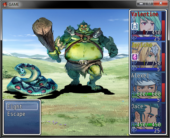
@Coci: I like this idea (and the moving of what I'm assuming is the TP bar to the right-hand side of the portraits). It probably goes without saying, but adjusting the font size for the battle text would go a long way towards de-cluttering it
Nothing fancy. These are some screens from my first RMVX Ace project, "Glass".
Tau, thanks. =3
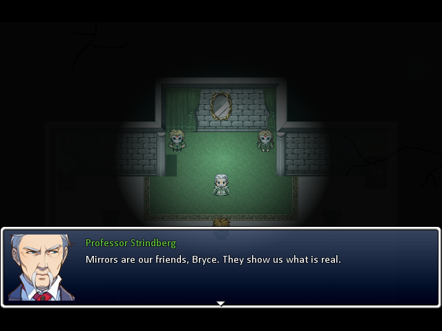
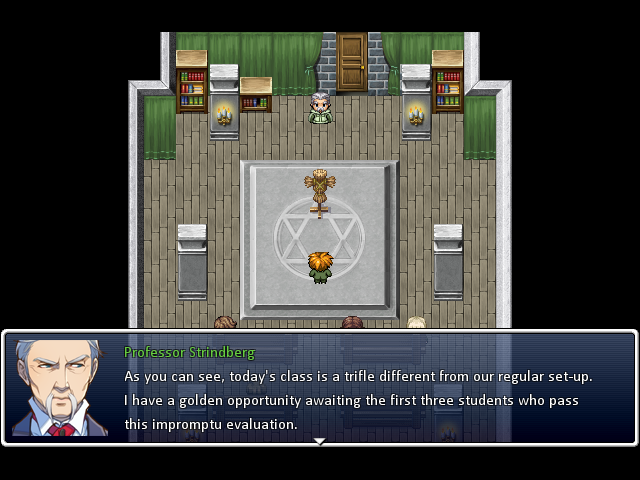
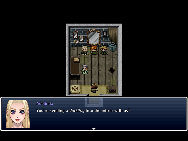
Lensky, that is something that I want to play. Strindberg's a little heavy on adjectives, but I'm going to assume that's purposeful? Your writing seems good enough to make it seem so.
Make a game profile so that I can subscribe to it, plzkthnx.
Cocicookie: Okay, you moved it do the side. What're you going to do with the vertical space now? That seems more clunky and in-the-way than anything.
EDIT: Lensky, yeah, a tint goes a looooong way. (Also, the mood of the game is subtly oppressive, and there is a GIANT MOTH IN THE SKY dimming the light from the sun, so... yeah. It's both because the RTP is too loud, and because the game world is mid-apocalypse.)

Something in me wants to believe Tau was joking about your maps, Craze. I know you like to think that graphics don't matter and would love to assert that by making crappy maps on purpose, but c'mon! ...At least pretend you tried. xD
The first screen is specially jarring, with its ample variety of ground tiles, mountains, and such. None of which blends together very well to be honest. And it's all arranged in a way that seems utmost careless... Get off your lazy ass and make some edits if necessary, but at least try to make something that resembles nature in some way. xP
The first screen is specially jarring, with its ample variety of ground tiles, mountains, and such. None of which blends together very well to be honest. And it's all arranged in a way that seems utmost careless... Get off your lazy ass and make some edits if necessary, but at least try to make something that resembles nature in some way. xP
LockeZ

I'd really like to get rid of LockeZ. His play style is way too unpredictable. He's always like this too. If he ran a country, he'd just kill and imprison people at random until crime stopped.
5958
The random-ass sand borders between terrain types need to disappear, yeah. As do the LAVA TILES on the world map, holy shit that is not how lava works, you do not just have seas of lava, at least not unless your apocalypse has progressed way past the point where there would still be cities and non-ruined regions.
Also I really just universally hate all types of world map mountain tiles. That's not your fault though so I won't complain about how badly they tile and how bizarre they look with all those tiny peaks lined up next to each-other without any increase in base altitude. Or, apparently, it seems I will still complain, but at least I won't expect you to do anything about it.
I do hope you'll stop mixing different colors of mountain tiles together in the same region, though. If you want to have more variety in tiles, you can make different shapes of mountains, but don't mix gray and brown ones on the same landscape. Mountains should generally be the same color as the ground under them, since they're the same type of ground as the ground under them, just at a higher altitude. If they get really high, they stop having grass, but I'm pretty sure they don't change from clay to granite. (If my understanding of geography is wrong, please correct me)
alterego
The first screen is specially jarring, with its ample variety of ground tiles, mountains, and such. None of which blends together very well to be honest. And it's all arranged in a way that seems utmost careless... Get off your lazy ass and make some edits if necessary, but at least try to make something that resembles nature in some way. xP
LockeZ
As do the LAVA TILES on the world map, holy shit that is not how lava works, you do not just have seas of lava, at least not unless your apocalypse has progressed way past the point where there would still be cities and non-ruined regions.

1) the demon king has been destroying the fuck out of various regions as he has the power to do so, so yes, the apocalypse has progressed; as you can see, some land masses have been broken off of others, huge scars have been left in the world, etc.
2) it's a videogame, nobody except you cares about NATURAL GEOGRAPHY i'm pretty sure. you have fucking lava sharks in your game LockeZ, don't go "GOLD ARMOR WOULDN'T PROTECT WELL" on me (AE I'm assuming you hate me for pissing on 2k3 or something, so deal with yourself?)
3) how do you two live life and have friends if you're this anal :<
MAPS ARE ART NOT GEOGRAPHY, seriously
Craze I love you
I wish the VX/VXA RTP's tile blending wasn't so fucking stupid though. :C
LET'S PUT SAND AROUND EVERYTHING :C
@Lensky the first map seems a bit too open, especially compared to the third. The style overall though is nice and the green suits are awesome.
I wish the VX/VXA RTP's tile blending wasn't so fucking stupid though. :C
LET'S PUT SAND AROUND EVERYTHING :C
@Lensky the first map seems a bit too open, especially compared to the third. The style overall though is nice and the green suits are awesome.

I have a criticism on behalf of Dragon Quest (or Dragon Warrior in the United States of America). With certainty I believe the spell "Hurt" or "Firebal" (in the GBC version) is not realistic because the main character is without the necessary resources to throw that of a ball of fire. One he would have to have some pyrotechnic ability to cover a flammable but durable ball and secondly he would have to have a multitude of those in which to throw them. Magic has been proven not to exist so therefore the game Dragon Warrior is slightly unrealistic. Having said that I do not think a fireball could hurt more than a swing of a sword. With lab analysts we spent half a year testing jellyfish inside fish bowls (to represent slimes) and initializing experiments by smashing them with swords and throwing balls of fire at it. We concluded that a fireball would not indeed hurt or hurt more than a sword. I heard there could be hints of unrealistic turn based combat, monsters that don't exist, not having to go to the bathroom, not having to eat unless to regain your health which is contained in a static variable (unrealistic) and of course a rainbow staff. Thus DW is a shitty game and I will now go play Farming Simulator 2012 GOTY Edition to stare at beef sales graphs all day long.


Mmhhh- So that's why I don't have any friends... But you know, for someone who believes in "unmitigated feedback" you can get a bit touchy yourself when receiving criticism. Seriously though, I just pointed out something that almost anybody would have picked up. If you think that's just me 'hatin' on you, then fine. I'll remember to sugarcoat things for you next time. =P
_
lol, Darken. U so silly.
_
lol, Darken. U so silly.
author=Archeia_Nessiah
Speaking of World Maps...
This is the result of a discussion between Rhyme, Nessy and Decky
Nessy your world map looks.. very parallel to the Super Mario World world map. It may not be THAT close, but it was close enough to make me think of it within seconds of seeing it, and I haven't played Super Mario World in years.

Shalza is World 1
Astoria is World 2
world 3 is indoors so..
Ursulesta is World 4 (albeit snowy)
Lazerine is World 5
Devil's Eye is World 6
and Mainlands is world 7
The Void even looks like the Star Road just above Bowser's Realm.
Again it may just be a coincidence that I saw in my head that isn't actually there.. but like I said. I hadn't even seen this map in years. I only just looked it up after I started writing this post.
The SMW map is just so goddamn good that people subconsciously make things similar to it. At least, I assume. I know I have.
Nessy, it's really cool to see this big-ified after the early PP releases. Looks good! The roads are a little awkward when they just suddenly CUT OFF in the middle of nowhere... it makes sense for, say, a forest to intercept it, but otherwise... oh well, I like it overall. =3
Nessy, it's really cool to see this big-ified after the early PP releases. Looks good! The roads are a little awkward when they just suddenly CUT OFF in the middle of nowhere... it makes sense for, say, a forest to intercept it, but otherwise... oh well, I like it overall. =3
author=Craze
The SMW map is just so goddamn good that people subconsciously make things similar to it. At least, I assume. I know I have.
Nessy, it's really cool to see this big-ified after the early PP releases. Looks good! The roads are a little awkward when they just suddenly CUT OFF in the middle of nowhere... it makes sense for, say, a forest to intercept it, but otherwise... oh well, I like it overall. =3
It's a habit from playing too much Ogre Battle, I think!
LockeZ
I'd really like to get rid of LockeZ. His play style is way too unpredictable. He's always like this too. If he ran a country, he'd just kill and imprison people at random until crime stopped.
5958
author=Craze
2) it's a videogame, nobody except you cares about NATURAL GEOGRAPHY i'm pretty sure. you have fucking lava sharks in your game LockeZ, don't go "GOLD ARMOR WOULDN'T PROTECT WELL" on me (AE I'm assuming you hate me for pissing on 2k3 or something, so deal with yourself?)
You know damn well I don't dislike you at all and I almost always enjoy your posts, so stop being pissy. I just think the map is ugly and I feel bad about saying so without giving any justification as to why. If you would rather I not try to psychoanalyze my thought processes to figure out why it strikes me as odd looking, then okay. It's ugly and the tiles clash. Is that better?

