


THE SCREENSHOT TOPIC RETURNS
Posts
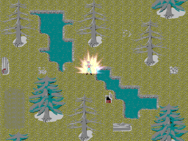
LockeZ

I'd really like to get rid of LockeZ. His play style is way too unpredictable. He's always like this too. If he ran a country, he'd just kill and imprison people at random until crime stopped.
5958
That's a joke screenshot, I assume
Working on another thousandth game with fallout type elements in the fantasy world ala wild arms type deal without the guns.
Edit: lol sorry, the ending part where you don't see people talking, was supposed to be shown, but already fixed that. The music is just used in the youtube editor, I couldn't record the game sound.

author=SnowOwlauthor=DyhaltoI'm sorry, but i just can't agree with your post. I'm sure there is a (very) small audience for stuff that looks like you hit random on google image search and then took the first ten images and put them together. But if you are going to encourage that, you might as well encourage not caring at all that your work meets a certain standard. There are better ways to do surreal stuff than throwing together the first image you can find of something. I would rather help him by stating my honest opinion than false encouraging like you. You even state yourself that you are not very fond of it.
pfft. A bunch of shallow "I don't like your style" posts trying to redesign themselves as constructive criticism. Mainstreamers casting stones at the fringes.
Noacceptance, just keep doing what you do. Your stuff is off-the-wall bizarre and I'm not a fan personally, but you may find a niche audience if you keep to your ideas. Crazy shit usually does.
I am going to drop this discussion now since i can feel that it won't be helping anyone, since he/she doesn't seem to care about criticism.
They're not from google images.They're from a Japanese game named "The Silver Case 25ward".
author=Lotus_Games
As far as this recent uproar is concerned regarding Noacceptance's screenshot all I can say is while I agree with some of the criticism being brought up, I strongly believe art and beauty for that matter is objective so all I can say is that I fully support your approach and I'd love to see you keep doing what you want how you want. I do think there will be people out there who find it interesting and are fascinated by something that seemingly strays from mainstream standards. Anyways you also have to keep in mind that you did post on a public forum so there is no point getting upset if people don't like your work, whether they are just trying to help or hurt you have to accept that you will get criticized but at the same time you may also find encouragement. Just keep trying to improve your style and you'll get far...keep an open mind and if you feel certain critiques will help your work than take that advice but at the same time don't just listen to everything that comes your way because than you'll just think like everyone else and follow a mainstream standard for art and beauty which may or may not be a good thing. It's all debatable but those are my two cents...keep pushing forward =]
Thankx!
author=benos
Working on another thousandth game with fallout type elements in the fantasy world ala wild arms type deal without the guns.
Edit: lol sorry, the ending part where you don't see people talking, was supposed to be shown, but already fixed that. The music is just used in the youtube editor, I couldn't record the game sound.
Richard Nixon Origins is looking pretty good, bravo benos!
For an RTP game, I think you're doing a pretty decent job.
Thanks, I also used facesets/charsets like that from http://ameblo.jp/makapri/entry-11250977339.html


author=benos
I properly need to fix the cut-off dialogue though.
YOU DO KNOW THAT THE WORD IS PROBABLY, RIGHT?
RIGHT?!


Rhyme,
Looks good, but I feel that your HUD dominates the screen too much. The enemy and the party look so small in comparison to the HUD. The portraits and such attract too much attention away from the fight up above.
My suggestion? Make the sprites twice as large so that they're not overshadowed by the portraits and bars at the bottom.

Yeah, I got an RTP overdose and nervous breakdown because everything ends up looking the same. Sorry about that.
I guess it's a matter of taste. I'm more enclined to believe that there's such a thing as aestethetics.
i.e.: Beauty is in the eye of the beholder?:
I do think there will be people out there who find it interesting and are fascinated by something that seemingly strays from mainstream standards
I guess it's a matter of taste. I'm more enclined to believe that there's such a thing as aestethetics.
i.e.: Beauty is in the eye of the beholder?:
author=Archeia_Nessiah
Guys, more screenshots plz ;w;
A-A-A-A-AWESOME art!
I'm sure this game will rock.I'm realllly looking forward to playing it.
Sorry-double post.

@creation: isn't the screenshot topic a place to show off anyway? i don't know why you have to shit post to inflict standards.
Jesus Creation, why did you have to go and post that screenshot? I had just finished washing my eyes from the last time we were "treated" to seeing it.
Obsorber is nuts for thinking he has something good going on there. I saw his project over on RRR as well and he has more screenshots there. It bugs the hell out of me that people want their games to look intentionally shitty. Argh.
Obsorber is nuts for thinking he has something good going on there. I saw his project over on RRR as well and he has more screenshots there. It bugs the hell out of me that people want their games to look intentionally shitty. Argh.

