


THE SCREENSHOT TOPIC RETURNS
Posts

author=Aveeauthor=DarkenFixed.
Tile based action gameplay with rm2k3 hit detection can be good if well executed.
lol you probably don't even know what a hitbox is. though this is the worst topic to bring it up.


author=Aveeauthor=DarkenFixed.
Tile based action gameplay with rm2k3 hit detection can be good if well executed.
what is this
a tetris fansite
jajaja

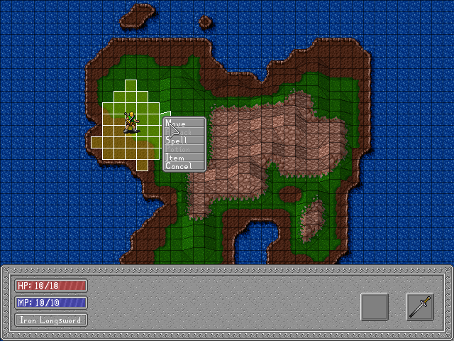
I've added the drop menu and combat movement! That shot 'shows' the new Majestic map engine cell loader, as well. 'Shows', in that the game is using it, not that it's visible. It's actually four maps, being tiled graphically and having their tile info concatenated for the engine. It can also load maps in advance in the background to at least try and prevent any loading times.
LockeZ

I'd really like to get rid of LockeZ. His play style is way too unpredictable. He's always like this too. If he ran a country, he'd just kill and imprison people at random until crime stopped.
5958
Hmm those windows make the game look about five years older than it did when it was just the map. Mostly it's the textured gray windowskin on the main bottom window, but also that font is just somehow really... Windows 3.1ish.
The font is supposed to look like it's circa 1995 or so. I'm going for a good ol' fashioned RPG look.
I've designed it so that the windows can be both skinned and tinted.
Those tiles are actually from 1989. They're from an unreleased and unfinished Amiga game. They come out looking better than they are since they are 20x20 tiles being used on a 16x16 map. That way when the elevation stretches it there is still more resolution to see.

The amount that I hate that font and menu is pretty high! I don't care if you're looking for an "oldschool" feel, it's ugly -- which is a shame, since your mapping engine is good-looking and pretty nifty.
Well, I thought about using a style more like this: http://spheredev.org/smforums/index.php?action=dlattach;topic=5027.0;attach=5574;image
But with more defined edges and a different palette.
Any suggestions (ideally with an example) for better window styles?
But with more defined edges and a different palette.
Any suggestions (ideally with an example) for better window styles?
LockeZ
I'd really like to get rid of LockeZ. His play style is way too unpredictable. He's always like this too. If he ran a country, he'd just kill and imprison people at random until crime stopped.
5958
I don't know, there are somewhere around approximately a gazillion window skins you could use. I can't comment much on the layout of the window since it's obviously still missing about 90% of what's supposed to be on it.
You can look like old school without looking terrible! Look at this menu from X-Com: Apocalypse, which is cluttered with tons of stuff that your game doesn't have, but might offer inspiration. http://chinwags.files.wordpress.com/2010/07/dosbox-2010-07-07-13-07-45-97.jpg Notice that there's not a solid background; instead the window is split into segments that reflect the parts of the menu. And it's mostly just two solid colors (gray and black), with a few lines scattered around in different spots for decorations and to further split up the different segments, and some shading on the edges of the buttons to make them look like buttons.
You can look like old school without looking terrible! Look at this menu from X-Com: Apocalypse, which is cluttered with tons of stuff that your game doesn't have, but might offer inspiration. http://chinwags.files.wordpress.com/2010/07/dosbox-2010-07-07-13-07-45-97.jpg Notice that there's not a solid background; instead the window is split into segments that reflect the parts of the menu. And it's mostly just two solid colors (gray and black), with a few lines scattered around in different spots for decorations and to further split up the different segments, and some shading on the edges of the buttons to make them look like buttons.
author=Craze
The amount that I hate that font and menu is pretty high! I don't care if you're looking for an "oldschool" feel, it's ugly -- which is a shame, since your mapping engine is good-looking and pretty nifty.
i do not find it nearly so aesthetically displeasing as does craze

I don't mind the menu shape, but white text on a light gray background with a light gray cursor... please add some contrast!
(Light gray sword, too.)
I would add that LockeZ's example is using a sans serif typeface. General (though not 100% accepted) wisdom is that sans serif is easier to read off a screen - might be worth a look, anyway.
(Light gray sword, too.)
I would add that LockeZ's example is using a sans serif typeface. General (though not 100% accepted) wisdom is that sans serif is easier to read off a screen - might be worth a look, anyway.
The menus and cursor can all have their color changed to preference in game (and can be no matter what images they end up using). So can the fonts (although I haven't actually exposed that yet). But both are the key colors right there, white and gray.

Definitely add some Zoom-In-Option. I don't like the graphics that far away but on a 320*240 base I could fall in love with your Battle System :)
@FlyingJester
Be careful how willingly you accept C&C. You can't waste your time chasing petty details like menu style based on one single person's opinion. If they raise a concern you think might be valid, get a bunch of opinions.
I second DFalcon's motion though. I didn't even see the cursor.
Otherwise, it looks fantastic!
LockeZ
I'd really like to get rid of LockeZ. His play style is way too unpredictable. He's always like this too. If he ran a country, he'd just kill and imprison people at random until crime stopped.
5958
Menu style isn't a petty detail, it's one of the most important graphical things in your game :/ It's one of the few things that's going to show up on practically every single screen in the entire game.
That said, it's an easy thing to change after the game is totally done, too. So you can ignore it for now if you don't really have a good idea for it or would rather work on systems or maps or events.
That said, it's an easy thing to change after the game is totally done, too. So you can ignore it for now if you don't really have a good idea for it or would rather work on systems or maps or events.
@FlyingJester
I think, that message box thing looks good, and I neither have any problems with the font... maybe do away with those borders, and add some contrast. But thats not top priority either.
Oh and about the zooming. I dont think its necessary. I like this birds eye view, reminds me of heroes of might and magic series ^^

More progress to come on Sword Of Babylon.


