


THE SCREENSHOT TOPIC RETURNS
Posts

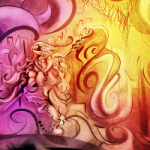
author=Link_2112author=CazExcept for those hairy arms and legs!
It gives her clothing appropriate texture (her clothing seems to have a fabric-feel to it, unlike her skin which is smooth) and flows from colour to colour very well.
Those large puzzles pieces look awful
It's rotation in progress:
Music is made by me as well.

author=Link_2112author=CazExcept for those hairy arms and legs!
It gives her clothing appropriate texture (her clothing seems to have a fabric-feel to it, unlike her skin which is smooth) and flows from colour to colour very well.
Those large puzzles pieces look awful
One person's awful is another person's art.
Itaju obviously has a certain graphical style in mind for his game and just because it isn't what YOU expect, doesn't make it awful.

ankylo
One person's awful is another person's art.
Itaju obviously has a certain graphical style in mind for his game and just because it isn't what YOU expect, doesn't make it awful.
ankylo, stop being an eternal douche; the rotating puzzle piece DOES look awful as a still image because of the way the low-resolution graphic is redrawn at an angle without any smoothing. It looks great in motion, but not as a still. The guy saying that was awful didn't necessarily know that it was a still shot of something in motion.
Itaju, looks great as always. The music is quite nice!

author=ankylo
Itaju obviously has a certain graphical style in mind for his game and just because it isn't what YOU expect, doesn't make it awful.
I thought that was a pretty important thing to say as it's bound to happen every time someone makes something different, and can it be said too many times? then maybe I am also a douche..?
it makes more sense to look at them as being covered in shag carpeting, or run over with a lawnmower. it's art
@Itaju: My only issue is that the rotating pieces seem to come out of her ass. Otherwise I think you're doing a good job.


LockeZ

I'd really like to get rid of LockeZ. His play style is way too unpredictable. He's always like this too. If he ran a country, he'd just kill and imprison people at random until crime stopped.
5958
author=chanaIt is possible to become better at making artauthor=ankyloI thought that was a pretty important thing to say as it's bound to happen every time someone makes something different, and can it be said too many times? then maybe I am also a douche..?
Itaju obviously has a certain graphical style in mind for his game and just because it isn't what YOU expect, doesn't make it awful.
Saying "it's art, therefore it's fine no matter what you do" is a sloppy excuse that breeds sloppy art
If you disagree, then page 249 of the thread devoted to critiquing how to improve artwork probably isn't the best place to hang out...
dhm, each individual piece of that screen looks nice, but some of it looks odd together; for example, the trees and the background are "lol wut" when juxtaposed like that. And then the leaves on the... bushy mounds...? are half the size of the trees' entire trunk! It's all quite consistent in quality, but inconsistent in making sense.
Also, I feel like the reddish trees have a bit too much purple in the shading.
Also, I feel like the reddish trees have a bit too much purple in the shading.
author=CrazeYeah there's no consistent size of any of the trees. Thanks for the feedback! I'll keep working at the pixels.
dhm, each individual piece of that screen looks nice, but some of it looks odd together; for example, the trees and the background are "lol wut" when juxtaposed like that. And then the leaves on the... bushy mounds...? are half the size of the trees' entire trunk! It's all quite consistent in quality, but inconsistent in making sense.
Also, I feel like the reddish trees have a bit too much purple in the shading.
author=UPRCThanks, I was certainly inspired by both of those graphically. I'm also using DB's 16-color palette for all of the game's assets. (Though in-game screenshots will have more than 16 colors due to opacity, lighting effects, sprite flashing, and so on.)
Looks very cool dragonheartman, sort of like a cross between Actraiser and Castlevania.


Working on the title screen; I went with the graffiti-style title because trying to put it anywhere else made the screen feel too busy. I think I want to end up with something like this, but I'm not 100% sure yet.
(The bottom part scrolls along like a stock-ticker, picking random quotes about octopuses, so it's always moving)
slashphoenix, it looks good in all it's simplicity. I lol'd at the "some of my best friends are octopodes" :D Is this made for phones?
dragonheartman, very nice look you got going. Are those custom gfx?
UPRC, love ya avatar!
dragonheartman, very nice look you got going. Are those custom gfx?
UPRC, love ya avatar!
Thanks! I decided on cartoony and simple because I honestly didn't have the time or skill to attempt something harder... and I prefer stylized art anyway.
Yup, it's for the phone; although a web build exists, the controls feel much better on a phone.
@dragonheartman: I am suddenly reminded how much I like parallaxing fog effects. I can see you've really grabbed the SNES-level art style and gotten every ounce of detail out of your space. Although the level-up is covering your little dude's face :P


I've been working on some custom tilesets for RPG maker vx. This is part of my intro whick occurs on a desert, the main reason it looks empty. It suppoosed to show the height of the mountain, main reason I din't put any cactus or stuff there. Ralph's story at least until I finish my characters.
author=LockeZauthor=chanaIt is possible to become better at making artauthor=ankyloI thought that was a pretty important thing to say as it's bound to happen every time someone makes something different, and can it be said too many times? then maybe I am also a douche..?
Itaju obviously has a certain graphical style in mind for his game and just because it isn't what YOU expect, doesn't make it awful.
Saying "it's art, therefore it's fine no matter what you do" is a sloppy excuse that breeds sloppy art
If you disagree, then page 249 of the thread devoted to critiquing how to improve artwork probably isn't the best place to hang out...
I don't see the words "...it's fine no matter what you do..." in my post. I must be blind, or something. But saying, "It's awful" and offering nothing on WHY you think it is awful or maybe what you think the artist can do to "improve" is pretty damn useless. You are free to not like Itaju's art style. You are free to make suggestions on what you feel could improve his style, or perhaps ask to find out what type of style he is going for to know whether or not he has accomplished it. But just outright calling it awful is just plain ignorant.
Define "better". Yes, it is possible to practice and/or be taught how to replicate certain artistic styles. If I want to draw stick figures and stick figures are what I am looking for, how do I become "better" at drawing stick figures?
author=slashphoenixYes! Eventually there will be visual equips but for now he's not wearing much clothing. :P The fog doesn't auto-scroll yet, but...
@dragonheartman: I am suddenly reminded how much I like parallaxing fog effects. I can see you've really grabbed the SNES-level art style and gotten every ounce of detail out of your space. Although the level-up is covering your little dude's face :P
dragonheartman, very nice look you got going. Are those custom gfx?
Yes, all the graphics are custom-made by me, staring at lots of SNES game screenshots in excruciating detail for inspiration.
Here's a video:

