


THE SCREENSHOT TOPIC RETURNS
Posts

Very swampy, I like that, the plants at the bottom of the grass and elsewhere are great, much better color for the bridge.

author=alteregoThanks; I think that's consistently what people have mentioned. I put in an enhancement ticket to adjust the HUD in the future. Smaller health bars over the players are also not a bad idea because multiplayer will require keeping tabs on other players as well, if you are fulfilling some sort of healer/tank role.
@dragonheartman:Cool game! I'd nag you about the shape of some things (Trees, mostly) that aren't exactly aesthetically pleasing, imo, but I'd rather not. One thing that I've been meaning to tell you, though, is about the size of the HUD - It's too tiny. In most games I can still keep tabs with the HUD even if I'm focusing on the character, but in here I feel I have to look completely away in order to see it. ...Something similar can be said about the message box. It's too far up, but that's less of an issue for obvious reasons.
@Itaju, I'm liking the changes.


I think it'd looks tons better if your events didn't stick out as much. The characters and the paintings on the walls are way more colorful than your theo tiles.
Only character that somewhat fits in is the brown-haired girl in the bottom section of the map.
Only character that somewhat fits in is the brown-haired girl in the bottom section of the map.
Been playing around with this for a couple of days. 10 minutes spent looking for ambient sounds was well worth it, I guess :3
I'll probably tone down the door's sound effect in the main release.

Tao, the sprites work with theo, it creates a good contrast. The only thing I would change is the first screen, the depth of the bottom floor is hurt by those light tiles. If you leave the bottom floor all dark, and the top floor all light, then it will really push the perspective/depth.

Behold minions with the power of (my limited very limited free)time, the Swan has moved from desert to coast..

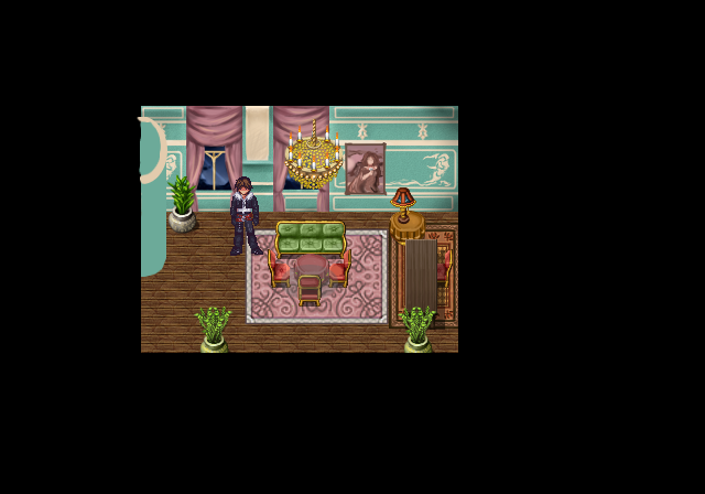
I think I might adjust the furniture to make it larger, and I still have to detail the part of the wall that protrudes.
^ That would be a FF8 sequel. http://rpgmaker.net/games/4070/
I've been working on a Dragon Quest fan game this past week, and I've made a few maps in it.
Here's a town:
And here's a castle:
Here's a town:
And here's a castle:

I like the town a LOT, but the castle is too open and bare. Classic DQ castles were a bit of a labyrinth.
random, big maps with lots of space = no. You can make things feel 'big' without forcing the player to waste time traversing something that could have easily been condensed.
The town is awesome though.
The town is awesome though.

author=Commissar_Thule:> i've always loved that duck
Behold minions with the power of (my limited very limited free)time, the Swan has moved from desert to coast..
After looking at some Dragon Quest maps, i see what you guys mean. So, I'll completely redesign the castle. Thanks for the feedback, guys!

@Arandomgamemaker:
The town is great, but like others have said, the castle could use some work. If I've learned anything from making a good many Dragon Warrior-inspired projects, it's that those games had very small, condensed maps. Because of that the walking speed never really felt "slow," and you always made good progress. The main problem I always used to have was making maps too big while still having the character walk at a snail's face. But the other problem I faced was that having a character in a game of that style walk at NORMAL speed just didn't feel... RIGHT.
Seeing your maps really make me want to make more detailed areas in my current project, but because I'm trying to style it after EARLY Dragon Warrior titles (1 and 2 specifically) I have to resist the urge. I recommend checking out Kentona's project Generica: The Next Generation to see some awesome maps using the DW chipsets.
LockeZ

I'd really like to get rid of LockeZ. His play style is way too unpredictable. He's always like this too. If he ran a country, he'd just kill and imprison people at random until crime stopped.
5958
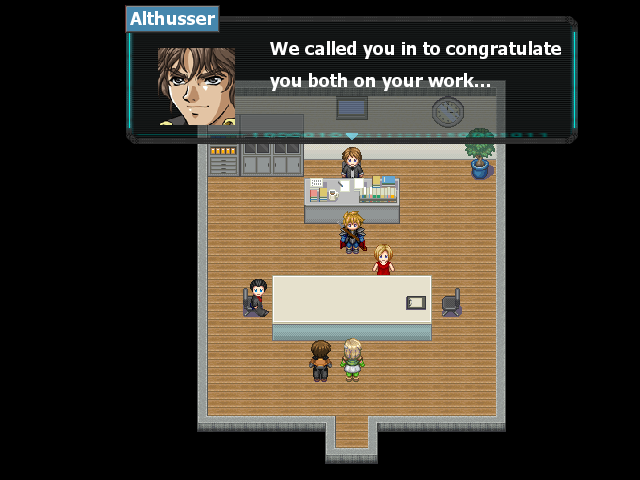
You imported the tilesets wrong; the shadows aren't transparent. Other than that, nothing looks out of place, unless you think a spiky-haired guy with a sword, cape and armor in an office building's meeting room is out of place (and we all know that's perfectly normal).
Not sure I'm a fan of the way the nameplate and face look on that text window, but I like the window itself.
Not sure I'm a fan of the way the nameplate and face look on that text window, but I like the window itself.
Swords you say. Combat Specialists have weapons no doubt. I guess it is kind of weird but the swordsman is Althusser's Guard and Rank Number 2. The woman in Red is Menethil's Secretary and can rival the strongest of Combat Specialists physically. She's does missions for him. In the scene you actually see them engage conflict because they both have different ideas in politics. ("Also in order to obtain information from both parties, both guards slept with each other and were briefly intimate so there is conflict there too...")

