


THE SCREENSHOT TOPIC RETURNS
Posts

The title screen and class selection screen is very simple looking but I like it and judging by your game page that was the direction you were going for.
So I finished the first part of my city

And I also finished most of the interiors and I would really like some feedback on them.I always tend to make the indoor places too big in comparison to the outdoor version and I'm trying to get rid of that habit >.<
The order of the interiors are from left to right


Inn^^

Item Shop^^

So I finished the first part of my city
And I also finished most of the interiors and I would really like some feedback on them.I always tend to make the indoor places too big in comparison to the outdoor version and I'm trying to get rid of that habit >.<
The order of the interiors are from left to right
Inn^^
Item Shop^^

author=alterego
@Mr_Detective: Are those two different locations, or are you deciding in which one to use? In any case, in the top one the fences kinda get lost against the floor. Don't you have some different ones? Ones made of stone maybe? - In the bottom one, the vending machines look kinda out of place, imo. Where do they plug into? ...As for the lily-pads. Maybe if they moved around, arranging them wouldn't be a problem.
Those are two different locations. Yes, I am aware that the fences aren't clear, so I was hoping someone could help with that. :P I do have some stone tiles, but I think they looked out of place. Not sure if it's because I didn't use them correctly, though.
As for the vending machines, we could assume they are plugged underground. It's modern technology, I suppose. :P
Pretty sure that houses are lined up in straight lines in real life unless you live in the middle of nowhere where "street" is "fancy city person talk."
This has been a long time in making and it's not even 1/4 done yet but I thought I'd share something awesome with you guys.
Oh it's Mister Big T.. I remember the games you used to make :P


This game is ultra tempting to work on but I have OTHER THINGS TO DO ;A;
damn you super alluring planning stages where the game feels awesome and you have 100 million ideas
Is the rope part of the map? If not, you should remove it. It looks very inviting:p Nice map.
I have some simple snow maps mapped with RPG Maker 2003 for my leisure.
A part of a small town

Base of a snowy mountain

Atop the mountain

I have some simple snow maps mapped with RPG Maker 2003 for my leisure.
A part of a small town
Base of a snowy mountain
Atop the mountain
@sbj: about 30 people were restrained and then sacrificed in that room, so yeah, I'd say it's part of the map.

Actually... If Minecraft does anything it validates the height of stairs=height of tiles. So no, forget making it one tile further down. It's in 3/4 view. It's fine. You can 'read' that map that it cuts into the mountain instead, if you prefer.
He is right about the ladders though.
He is right about the ladders though.
LockeZ

I'd really like to get rid of LockeZ. His play style is way too unpredictable. He's always like this too. If he ran a country, he'd just kill and imprison people at random until crime stopped.
5958
author=LibertyI'd love to see a screenshot of this, because although I know Minecraft has the worst 3D of any video game in existance, I was pretty sure it was at least geometrically plausible. We just had this argument about another map and you were being equally dumb then. If it's cutting into the mountain then the top of the stairs should actually cut into the mountain, and end a tile or two north of where they start. Not end directly vertically above where they start.
Actually... If Minecraft does anything it validates the height of stairs=height of tiles. So no, forget making it one tile further down. It's in 3/4 view. It's fine. You can 'read' that map that it cuts into the mountain instead, if you prefer.
For the jury:

Exhibit A: A vertical wall. The top pixel of this red indicator is vertically directly above the bottom pixel. It is not a single inch further north.
Exhibit B: The same screen area as the vertical wall. If the stairs were exactly this big on the screen, they would be a wall.
Exhibit C: The difference between exhibit B and the total visible screen space taken up by the stairs. This is horizontal distance that the player has walked north while walking up the stairs.
The perspective is assumed to be approximately 3/4 - that is, we're looking down at a 45 degree angle. Therefore, because B is five times bigger than C, these stairs are five times as steep as a 45 degree set of stairs. This would be unascendable without at least handholds; it would rise at an 81 degree angle.
I will grant, however, that in this particular map, the problem is not nearly as noticable as it was in Mr_Detective's shitty wall map. This is mostly because the irregular cliffs obfuscate and distract from the impossible geometry.
However, if you want to fix it, here is how the stairs should look:

These stairs are 45 degrees. They go as far horizontally as they do vertically. (Stairs are sometimes a shallower incline than 45 degrees, but they're almost never steeper than 45 degrees.)

Actually actually, the ladders aren't even that bad because ladders often don't reach to the floor of wherever they're set up, for example, in a swimming pool. Very often they are placed at a height where people have to reach and step up to the first rung.
While the stair height thing might be correct realistically, I can't imagine ever noticing that during a game. Still, I suppose it wouldn't hurt to fix it.
While the stair height thing might be correct realistically, I can't imagine ever noticing that during a game. Still, I suppose it wouldn't hurt to fix it.


hI notice it all the time. actually interacting with them makes it even more obvious, at least to me.
but yeah, this is a super-common mapping mistake that messes with a lot of otherwise-excellent scenery more often than I'd prefer. always keep your perspective in mind! something extending five tiles in both length and height will always appear longer to someone viewing from an angle than something that's just five tiles high.
he wasn't arguing that they weren't. just that their bases should touch the ground.
but yeah, this is a super-common mapping mistake that messes with a lot of otherwise-excellent scenery more often than I'd prefer. always keep your perspective in mind! something extending five tiles in both length and height will always appear longer to someone viewing from an angle than something that's just five tiles high.
author=harmonic
Elongate ladders: no. They are vertical.
he wasn't arguing that they weren't. just that their bases should touch the ground.

Heh; both are right to an extent. Inclination just doesn't translate well in this kind of perspective and with 2D graphics, so part of how the map is 'read' depends of one's own "suspension of disbelief" or whatever. For example if I show you this: Link You may think this is a vertical wall. But if show you this: Link The illusion that the front wall is inclined as well becomes possible. -The brain completes it that way at plain sight- But notice how it would be almost indistinguishable from any other front wall! Also, you can't really tell if the ground is flat or if it is a slope, making up for the apparent inclination of the stairs: Link
It's all about the big picture, really. I doubt most people think about this long enough, though, that's why you rarely see any consistency. They just go with what they're comfortable seeing. -- But for the sake of aiding the illusion, I see no problem in extending the stairs one, two, or three tiles, depending on the case. More than that will probably start eating more space than its worth and it should be time to consider changing the stairs for a stairway... or maybe an elevator. =P
It's all about the big picture, really. I doubt most people think about this long enough, though, that's why you rarely see any consistency. They just go with what they're comfortable seeing. -- But for the sake of aiding the illusion, I see no problem in extending the stairs one, two, or three tiles, depending on the case. More than that will probably start eating more space than its worth and it should be time to consider changing the stairs for a stairway... or maybe an elevator. =P

Hehehehehe, some more from WHORE of BABYLON :D
(Don't ask why the system changed, there are multiple universes in the game and each has its own battle system.lol).
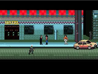
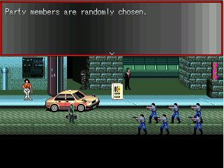
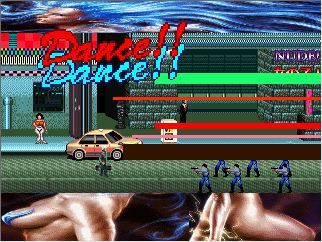
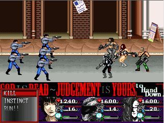
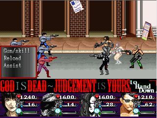


What do you guys think about the sprites?
Are they good or fucked up or just what's your opinion?LOL
(Don't ask why the system changed, there are multiple universes in the game and each has its own battle system.lol).
What do you guys think about the sprites?
Are they good or fucked up or just what's your opinion?LOL

