


THE SCREENSHOT TOPIC RETURNS
Posts


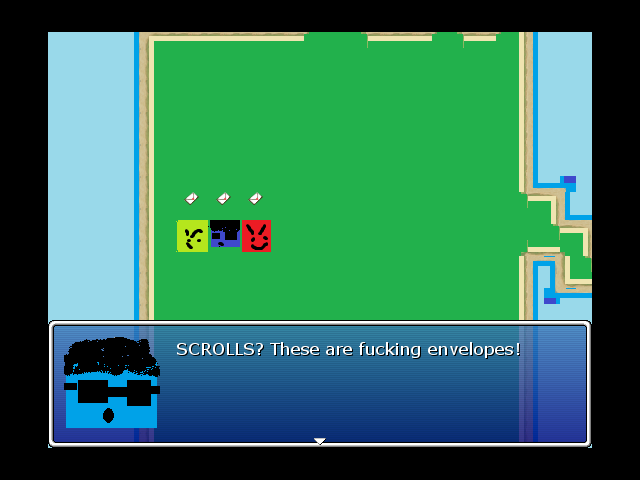
@Slashphoenix: Aren't bombs typically items in LoZ? :P
The pixel styles are kind of clashy. Its the grass. To make it more like the GB LoZ games, I'd just use a solid, single color.
What engine are you making this game in? (Please tell me it's Zelda Classic! :D)
The pixel styles are kind of clashy. Its the grass. To make it more like the GB LoZ games, I'd just use a solid, single color.
What engine are you making this game in? (Please tell me it's Zelda Classic! :D)
@Ratty: 'tis true, but in this game getting a bomb in a chest is nothing but bad news. Thankfully they're only gonna be in obviously-marked skull chests. The dark grass does look kinda bad, doesn't it? These are all placeholder tiles at the moment but I'll keep that in mind when I make the final ones.
And it's being made in Unity, but limited to 2D :) The exploration is very inspired by Zelda but the combat is actually much closer to Paper Mario!
And it's being made in Unity, but limited to 2D :) The exploration is very inspired by Zelda but the combat is actually much closer to Paper Mario!
have you ever played Four Swords Adventures on the Gamecube? it had a similar thing, and it was pretty awesome slash terrible whenever it happened.
as for the sprites, for me it isn't the style that clashes so much as the resolution. most of these things seem like they were scaled unevenly, so you have pixels of inconsistent sizes and sprites that look stretched. I haven't worked in Unity so I'm not sure how difficult it is to keep sprite-based graphics looking clean, but I'd say it's something to keep an eye on at least.
as for the sprites, for me it isn't the style that clashes so much as the resolution. most of these things seem like they were scaled unevenly, so you have pixels of inconsistent sizes and sprites that look stretched. I haven't worked in Unity so I'm not sure how difficult it is to keep sprite-based graphics looking clean, but I'd say it's something to keep an eye on at least.
You're right about the resolution loss, but it's due to the dumb way I'm resizing pics in Photoshop so they fit well in forum posts. I'm sure there's a better way to shrink pixel stuff than what I'm doing...
oh, if that's the issue then shrink them by some big round percentage such as 50%. or you can just link the images full-sized and not worry about embedding them.

@Pizza: That looks nice, but I'm not a fan of putting such different fonts together. I mean, the way the 'A's or the 'N's are drawn, make their difference very obvious. Find out if whoever made the font you're using for the main title also made an extended version of it, or look for one that more closely matches it... Also, didn't the old logo had a cog or something? I kinda liked that.
@LockeZ: There seem to be many inconsistencies with your maps. You have walls of different thickness, rooms of odd shapes, and lots of negative space unaccounted for. For example, look, this is how I think things should be: Link Now, I don't know to what extent this is because of how you spliced the rooms together or because you're not giving proportions the proper consideration (In which case, IT DOESN'T MAKE SENSE! Bad, LockeZ! Bad! ;P) but either way, I think it's something worth keeping an eye for.
Something else I'd like to point out is that some colors, particularly some reds and blues, stand out too much. I'll give a pass to the big red button, but those traffic cones, for example, should match the orange-ish red on the lifesavers.
@Newblack: You're alive! O_O ...Nice to see you post again. =)

author=alterego
@Pizza: That looks nice, but I'm not a fan of putting such different fonts together. I mean, the way the 'A's or the 'N's are drawn, make their difference very obvious. Find out if whoever made the font you're using for the main title also made an extended version of it, or look for one that more closely matches it... Also, didn't the old logo had a cog or something? I kinda liked that.
The noticeable difference is only bigged up by the shitty resolution. When put together as a logo in photoshop things look fine. Yes, the old logo did have a cog. That version of the game is 4 versions old right now, so it's hardly relevant at all.

Been working on the following:

Got a good shot, got the shades to blend in, and have the character shrink in real time as he is going forward.
Got a good shot, got the shades to blend in, and have the character shrink in real time as he is going forward.
I'd scale down the picture a bit, all the same. your character is supposedly at the same depth in that shot as the first row of small plants, and yet they tower over his head. unless the intention is for him to be tiny, some tweaking is necessary.
very nice shot, though.
very nice shot, though.
LockeZ

I'd really like to get rid of LockeZ. His play style is way too unpredictable. He's always like this too. If he ran a country, he'd just kill and imprison people at random until crime stopped.
5958
@jakandsig: Agree with Mawk, it'd make more sense if the character were about six times as tall as he is right now. Impressive that you got the vanishing perspective to work; now just blow the character up to the right size. Something like FF8 sprites might work better, since RTP at that scale is going to have some really giant pixels.
I am actually paying attention to this! That space at the south end of the computer room is only that way because of how I spliced the rooms together for the screenshot. The high walls take up space in the screenshot, but don't take up floor space. It should line up perfectly if you erased the walls and only looked at the floor. ...I think.
The west side of the computer room is at the edge of the map, so I don't actually care that nothing's there. Nothing has to be there. It's outdoors. But I'll probably scoot it over like you suggested anyway.
The big gap between the computer room and the bridge annoys me, but not as much as it would annoy me for the central hallway to be shorter on some floors than others. And I just have nothing to put there. I like to think there's another room in between, and you just can't see the door leading into it because it's accessed from a side door in the computer room or from an unconnected part of the dungeon or something. Open to suggestions though. You think it would be more or less confusing to add an unopenable door in the hallway in front of that gap?
author=alterego
@LockeZ: There seem to be many inconsistencies with your maps. You have walls of different thickness, rooms of odd shapes, and lots of negative space unaccounted for. For example, look, this is how I think things should be: Link Now, I don't know to what extent this is because of how you spliced the rooms together or because you're not giving proportions the proper consideration (In which case, IT DOESN'T MAKE SENSE! Bad, LockeZ! Bad! ;P) but either way, I think it's something worth keeping an eye for.
I am actually paying attention to this! That space at the south end of the computer room is only that way because of how I spliced the rooms together for the screenshot. The high walls take up space in the screenshot, but don't take up floor space. It should line up perfectly if you erased the walls and only looked at the floor. ...I think.
The west side of the computer room is at the edge of the map, so I don't actually care that nothing's there. Nothing has to be there. It's outdoors. But I'll probably scoot it over like you suggested anyway.
The big gap between the computer room and the bridge annoys me, but not as much as it would annoy me for the central hallway to be shorter on some floors than others. And I just have nothing to put there. I like to think there's another room in between, and you just can't see the door leading into it because it's accessed from a side door in the computer room or from an unconnected part of the dungeon or something. Open to suggestions though. You think it would be more or less confusing to add an unopenable door in the hallway in front of that gap?
author=slashphoenixOpen the original-size image in MS Paint, select all, and just hold Ctrl and press the Minus key.
You're right about the resolution loss, but it's due to the dumb way I'm resizing pics in Photoshop so they fit well in forum posts. I'm sure there's a better way to shrink pixel stuff than what I'm doing...

author=jakandsig
Been working on the following:
Got a good shot, got the shades to blend in, and have the character shrink in real time as he is going forward.
Oooh, I like this. Also, unlike mine, it's a head-on shot. Probably could've cut out the electric wires and silo though.
The character does not have to shrink if the screen scrolls/changes (the perspective in that case follows the character instead of standing still, so the character does not shrink). But that would involve instead updating the parallax several times.
author=slashphoenixguess what I added suckers
Oooh, I have the zelda chest open wav as a SE.
author=mawk
I'd scale down the picture a bit, all the same. your character is supposedly at the same depth in that shot as the first row of small plants, and yet they tower over his head. unless the intention is for him to be tiny, some tweaking is necessary.
very nice shot, though.
author=LockeZ
@jakandsig: Agree with Mawk, it'd make more sense if the character were about six times as tall as he is right now. Impressive that you got the vanishing perspective to work; now just blow the character up to the right size. Something like FF8 sprites might work better, since RTP at that scale is going to have some really giant pixels.
I have it zoom while the character is moving forward and mid zoom blend a closer view of the shot so it's as if you are walking behind the character.
I don't think you understood me.

in short, he looks like he'd get lost even in the grass at the side of the road. he looks like he's about eight inches high. if this wasn't intentional, you're going to need to change the scale of your shot.
in short, he looks like he'd get lost even in the grass at the side of the road. he looks like he's about eight inches high. if this wasn't intentional, you're going to need to change the scale of your shot.
haha if he made that sprite to scale it would look awful. if this is supposed to be some sort of mapping for a game then you need room to walk around. and put npcs and objects and stuff. its fairly obvious that the characters are not to scale with the bg. i don't think a diagram would be the thing that makes him realize it's not realistically sized xD
it should probably be posted as a video instead of a screenshot. as a single frame with only 1 sprite there isn't much to comment on, other than scale.
it should probably be posted as a video instead of a screenshot. as a single frame with only 1 sprite there isn't much to comment on, other than scale.

Nobody is going to comment on the fact that it looks bad with a low-pixel character in a irl photo?
Unless that's a thing during the whole game I would turn off the game if suddenly this happened.
Unless that's a thing during the whole game I would turn off the game if suddenly this happened.
LockeZ
I'd really like to get rid of LockeZ. His play style is way too unpredictable. He's always like this too. If he ran a country, he'd just kill and imprison people at random until crime stopped.
5958
Well, that's so obvious I didn't feel the need to point it out; obviously either the character's a placeholder, or this is just for script coding purposes and not for a game, or something like that.
I guess I shouldn't give people the benefit of the doubt though so uh yeah: just FYI in case you didn't notice, jakandsig, you are using a photo in the background and a chibi pixel-art sprite in the foreground. I assume you knew that, but maybe you thought that Ralph was a photo also and therefore matched fine. Or maybe you were not aware that photos and sprites do not appear together in nature. One has to be careful not to overestimate the intelligence of the general public, I suppose.
I guess I shouldn't give people the benefit of the doubt though so uh yeah: just FYI in case you didn't notice, jakandsig, you are using a photo in the background and a chibi pixel-art sprite in the foreground. I assume you knew that, but maybe you thought that Ralph was a photo also and therefore matched fine. Or maybe you were not aware that photos and sprites do not appear together in nature. One has to be careful not to overestimate the intelligence of the general public, I suppose.
author=Link_2112
haha if he made that sprite to scale it would look awful. if this is supposed to be some sort of mapping for a game then you need room to walk around. and put npcs and objects and stuff. its fairly obvious that the characters are not to scale with the bg. i don't think a diagram would be the thing that makes him realize it's not realistically sized xD
if it's intentional, it's intentional. I just clarified because I don't think I was understood the first time.
author=Link_2112
haha if he made that sprite to scale it would look awful. if this is supposed to be some sort of mapping for a game then you need room to walk around. and put npcs and objects and stuff. its fairly obvious that the characters are not to scale with the bg. i don't think a diagram would be the thing that makes him realize it's not realistically sized xD
it should probably be posted as a video instead of a screenshot. as a single frame with only 1 sprite there isn't much to comment on, other than scale.
Well, this is a screenshot topic, but you would be correct, a video would show more than the still picture.
Speaking of screenshot topics :)


