


THE SCREENSHOT TOPIC RETURNS
Posts

Can you make the screenshots bigger? That would be easier to see.
The last map looks kinda odd. You need to make the wall higher, so the door wouldn't look too big, or the room would seem too small. That walkway down the stairs is only 1 tile, make it 3 tiles. Move the table and the chairs over. Also, why would there be two water fountains inside like that? :O
The last map looks kinda odd. You need to make the wall higher, so the door wouldn't look too big, or the room would seem too small. That walkway down the stairs is only 1 tile, make it 3 tiles. Move the table and the chairs over. Also, why would there be two water fountains inside like that? :O

Ogre Battle reputation meter on previous page.
So this is what I did. I did partial fade, but not so much that it looks faded out, more or a reduced/washed-out look. Then I tinted it.

Crystal blueness is the tears of the outside world.

Made it deeper green. Though that one light spot is still a problem around Elias.

Since yellow is my main color, I made it washed out and gave purply tones.
Is that enough? I can do more. (Once it's done, I'm gonna figure out the best color for the new game so I can correct that text already)
Is that enough?
I don't know, is it? Have you tried it in the game to see how the font looks on it? We didn't.
Right... screenshots. Holdon.

(This stands out pretty well)

(Considering this used to be pretty heavy yellow, this does okay too. But I dunno)

(Yea... I'm not sure about this one in particular)
And then there's three more which are basically grey(twilight)/white/black clouds. I'm not really that concerned with it though.
Day
Night
Gamma correction?
How much? I went to about 1.55 before it started to look really faded.
Oh, the left? You want to darken it? 0.65 is the limit before the green in the trees turns to black.
How much? I went to about 1.55 before it started to look really faded.
Oh, the left? You want to darken it? 0.65 is the limit before the green in the trees turns to black.
Mkay, so, it should be darker than the text but not dark enough so it's blacked out. How about this?


I'd focus next on making that image's contrast more uniform. things like the left half of Nevras' statblock are nicely readable, but things like the big white waterfall and big grey sky throw that off.
Hmmm. I have no idea how to do that. Reducing contrast does work, but at the expense of making the overall very grey. And reducing both brightness and contrast, but adding back in color seems to add back in contrast...
Is it passable? Meaning, without major adjustments of the text, BG, or both, can it now be read? I know the contrast is extreme in places, but if I reduce to the point where they are the same, I run into this problem...

Try one

Try two (I seriously can't tell the difference)
No matter what I do, darken/brighten/etc it gets progressively more grey.
LockeZ

I'd really like to get rid of LockeZ. His play style is way too unpredictable. He's always like this too. If he ran a country, he'd just kill and imprison people at random until crime stopped.
5958
Yeah, getting more gray is the effect of reducing contrast. However as a background image, that might be ideal. You want to get rid of the really bright and really dark parts and make them closer to the middle; the middle between bright and dark is gray. Although it will look a little washed out, you can darken or lighten the image to suit your tastes (with yellow text you probably want it darker). If you think it looks bad when grayed out like that, though, maybe you could just select the brightest parts and reduce brightness locally, instead of applying an effect across the whole image?
Actually I kinda liked the washed out blue-er version, though. I think if you took this one and gave it dark navy blue text and maybe just lightened the background very slightly it would look really good!
Yellow on green screenshot is :( Maybe make the background about 50% less dark, and then use a much darker yellow or even a brown?
If possible I would probably try to change the text color to suit the background image, not the other way around... Although I realize sometimes a background image is not suited to any text color and requires this kind of manipulation. But I think the edits you did to them so far are enough that you've accomplished that. You can almost certainly find text colors that are readable on these images now, because they're more uniform in color.
The problem with changing text is if it runs into a problem reading the actual game text (I mean, seriously, the menu is secondary to the overall game), you have to change it back.
I think I'll have it blueish then (but less so than before, since that added contrast to the waterfall). And maybe have the forest a sort of fall browning tone (yellow/dark brown are alot farther on the color wheel than light green/yellow). I dunno with the trippy fish painting.
I think I'll have it blueish then (but less so than before, since that added contrast to the waterfall). And maybe have the forest a sort of fall browning tone (yellow/dark brown are alot farther on the color wheel than light green/yellow). I dunno with the trippy fish painting.
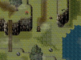
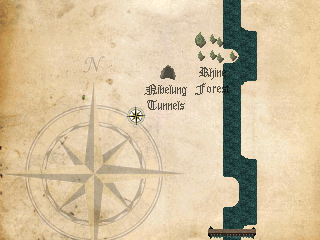
Nibelung Cave, Rhine Forest? All you need now is a sword stuck in a tree, and a giant dragon. And a Ring.
Wagner much?
Map needs more to it, probably.
Wagner much?
Map needs more to it, probably.
I'm making a game based on that, yes. So, the ring the dragon, etc. Will all be there.
The idea is the map will grow as you discover new locations.
The idea is the map will grow as you discover new locations.

@Dreaded
The dirt and the darker grass cut off into squares, instead of smoothly transitioning in the upper left and upper right.
The left cliff somehow has a shadow while the right one doesn't, also. Apart from that it's pretty neat. I like the character sprite.
The dirt and the darker grass cut off into squares, instead of smoothly transitioning in the upper left and upper right.
The left cliff somehow has a shadow while the right one doesn't, also. Apart from that it's pretty neat. I like the character sprite.
author=Dreaded
I'm making a game based on that, yes. So, the ring the dragon, etc. Will all be there.
The idea is the map will grow as you discover new locations.
Huh. The whole story or just the Rheingold? I never got to the Götterdämmerung (we've got a boxed set, I've not gotten to it though).
Oh, you should look up some of the midi music!

