


THE SCREENSHOT TOPIC RETURNS
Posts
Sooz

They told me I was mad when I said I was going to create a spidertable. Who’s laughing now!!!
5354
author=MinnowFrom my entry with Gourd_Clae for the RM event.
Any feedback is appreciated! (The black doorway on the right is a placeholder.)

You see that hella bright red in the store area? You're probably going to want to bump down the value and saturation on it (make it darker and less red). Right now, it's the brightest thing on the map, which draws the eye and overpowers all the nice details in subtler colors. (Like those sexy bricks!)


I like seeing all the different styles people are posting now! Is there a name for that hard-pixel style like that and Sworcery?
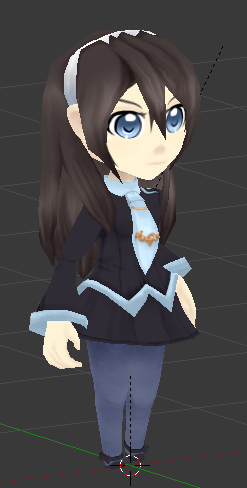
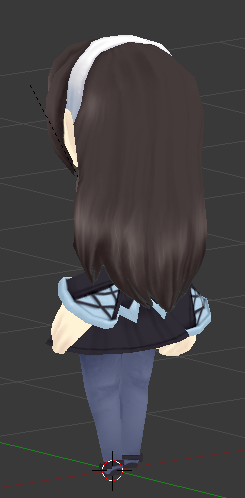
Female template successfully used! Long hair and a short skirt are working fine.
Female template successfully used! Long hair and a short skirt are working fine.

author=Anaryu
I like seeing all the different styles people are posting now! Is there a name for that hard-pixel style like that and Sworcery?
hipster pixel art
^ sums it up.
I'm not sure if there's a name for it, I just went with it because it's easy and fast and there's only a week do to the game.
Was definitely inspired by Swords & Sworcery though.
I'm not sure if there's a name for it, I just went with it because it's easy and fast and there's only a week do to the game.
Was definitely inspired by Swords & Sworcery though.

Yeah, the whole minimalist aspect being used well is what makes it click for me. It just looks so unique.

I'm surprised there haven't been more games that stole the style after Sworcery.
Anyway about the screenshot, personally I think you could turn down saturation on everything a notch. I would love to see some outdoors scenes.
Anyway about the screenshot, personally I think you could turn down saturation on everything a notch. I would love to see some outdoors scenes.

@Minnow I'd like to know is it done via parallax or tiles? I'm assuming parallax even though I'd kill for a tileset in that style.

I'd say tileset. A lot of the tiles repeat and it seems to be somewhwat evenly spaced. I don't know, it's not really involved enough to be parallax mapping.
But I'm drunk so WHO KNOWS?>>????
But I'm drunk so WHO KNOWS?>>????
I doubt it, because of dat gradient and dem obtusely slanted walls. Either way, it's brilliant and I love it. I hope the gameplay lives up to the hype I'm expecting of it.
Well it;s obviouslt VX/VXA so either of those wiuld be pretyty easy for the caring mind to fdo
Jesus the alchohola its me
Jesus the alchohola its me
@SnowOwl
Thanks for the feedback! I did tone down the orange a bit already as was suggested but I'll play around with the other colours too.
I actually really want to make some outdoor stuff as well but unfortunately there isn't any that fit into our plot at the moment. I might make some just for fun at some point idk.
@thatbennyguy
It's parallax only because it's faster for me than arranging everything into a tileset and then mapping it. But I made everything on a 32x32 grid that could easily be put into a tileset if I had more time.

@kory_toombs I like the gradient of the lava. The biggest here is the hole in the ground - it's the tile that's supposed to be in the wall. You can see the way it is shaded down the bottom makes it seem as if the ground is actually a wall. I'd recommend using another graphic for a hole in the ground.

Thatbennyguy, every time I see your name come up, I think of "Benny the 1980-somethign spaceguy" from the Lego movie. I can't help it anymore. XD
LockeZ

I'd really like to get rid of LockeZ. His play style is way too unpredictable. He's always like this too. If he ran a country, he'd just kill and imprison people at random until crime stopped.
5958
You could probably just flip the hole graphic upside-down, I think.

