


THE SCREENSHOT TOPIC RETURNS
Posts

Well, just an update to the previous image (yes yes, I know I shouldn't do this, but I feel like this makes it look better).
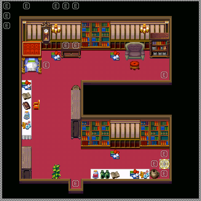
Spent a pretty decent amount of time just looking at all of my various chipsets to throw tiles onto this one. A lot of junk removed that I didn't need, and...I have 16 available slots left. Out of all of the chipsets I have, I cannot figure out what to place in those slots. It's kinda funny in a way, when originally I didn't know what to put in rooms, and then I get the spaces filled out, remove stuff, and now don't know what to fill THOSE spots with lol. *Sigh* Also, there's no good horizontally placed beds, which is going to make some events look really awkward (like the one on this bed. The character is lying horizontally here...so you can imagine it looking weird a bit...).
Spent a pretty decent amount of time just looking at all of my various chipsets to throw tiles onto this one. A lot of junk removed that I didn't need, and...I have 16 available slots left. Out of all of the chipsets I have, I cannot figure out what to place in those slots. It's kinda funny in a way, when originally I didn't know what to put in rooms, and then I get the spaces filled out, remove stuff, and now don't know what to fill THOSE spots with lol. *Sigh* Also, there's no good horizontally placed beds, which is going to make some events look really awkward (like the one on this bed. The character is lying horizontally here...so you can imagine it looking weird a bit...).

Xenomic I just want to say that the way you are posting all your screenshots for feedback has an irritating manner to it. You have posted several versions of screenshots very very frequently, sometimes with iterations showing very little change and asking for feedback. You hardly ever, if never, give feedback to others, and it just feels like you want all the attention to yourself and your own screens. I'd advise that perhaps you should go and create some maps for a few days and then come back to this topic, because it's currently being overrun by all of your screens that quite frankly I am sick of seeing. You tend to post the same room several times, and it gets annoying.
So yeah, just stating how I feel. Not trying to hate or anything, but it's just the combination of the nature of your posts and the frequency of them that irritates me, and I'm sure it does at least a couple of others.
So yeah, just stating how I feel. Not trying to hate or anything, but it's just the combination of the nature of your posts and the frequency of them that irritates me, and I'm sure it does at least a couple of others.
I don't really have anything to say about the majority of the screenshots posted here, hence why I don't say anything. What's there for me to really give feedback on?
I did state in a previous post (before the previous) that I was only going to post those screenies and then not post anymore until the rest of the mansion was done and I was working on the library/basement.
I did state in a previous post (before the previous) that I was only going to post those screenies and then not post anymore until the rest of the mansion was done and I was working on the library/basement.

I'm inclined to agree. If you need to post every new area you make after having used RPG Maker for 5-6 years you're probably overdoing it.

Perhaps it would be best if you uploaded them to your game page and ticked the 'want feedback' button. They'll be sent to the screenshot feedback area, you can keep updating the same image when you've changed something instead of uploading a new one and all comments will be focussed on that map. Also, I highly recommend you only post one or two maps and focus on doing and redoing them instead.
To be frank, I think that it would be a great idea for you to try hone your mapping skills a bit more by creating a new project and just messing with maps. In fact, one thing that I recommend to all newbies who ask me (and yes, I know you're not a newb but when it comes to mapping, you're still in newbie territory) how to get better is to take a screenshot from a game that you like (I recommend Ara Fell which uses the same tiles but is at the least intermediary skill required) and remap it out in your 'testing' game. It should not only give you a better feel for the chips themselves, but also help you recognise good and bad design. Also, lots of practice.
Don't worry, we've all been through these stages - I wasn't born with good mapping sense, believe it or not. ;p It takes a lot of practice and a lot of playing games to understand the good and bad. That's also something I recommend - playing bad games. They will give you a much better feel of how annoying something is, especially if you play a good game right after. Go play a few bad games. Go play a good game. Experience maps and how they affect gameplay.
It can help you go from this:

to this:

To be frank, I think that it would be a great idea for you to try hone your mapping skills a bit more by creating a new project and just messing with maps. In fact, one thing that I recommend to all newbies who ask me (and yes, I know you're not a newb but when it comes to mapping, you're still in newbie territory) how to get better is to take a screenshot from a game that you like (I recommend Ara Fell which uses the same tiles but is at the least intermediary skill required) and remap it out in your 'testing' game. It should not only give you a better feel for the chips themselves, but also help you recognise good and bad design. Also, lots of practice.
Don't worry, we've all been through these stages - I wasn't born with good mapping sense, believe it or not. ;p It takes a lot of practice and a lot of playing games to understand the good and bad. That's also something I recommend - playing bad games. They will give you a much better feel of how annoying something is, especially if you play a good game right after. Go play a few bad games. Go play a good game. Experience maps and how they affect gameplay.
It can help you go from this:
to this:

@Skyrockerable: Some might disagree with the following, but if the sand tiles should indicate a way, I'd suggesting making a proper way, right now the placement seems pretty random.
The pile of firewood seems to be a bit far away from the house and there is no seperate fireplace nearby, so don't know why you placed it there.
I'd also like to know if this is the whole map, or just part of it. If its the whole map you might want to add some kind of obstacles/boarders to the edge areas that don't lead to another map, to help the player recognise where he can get to the next map. (I am assuming you don't place teleport events on the whole two open sides)
@Topic: I am in the middle of remaking some older maps, the original was pretty horrible compared to the new one, but I still have the problem of too much empty space and not much to fill it with. (Except for the southern open area inside the castle, there will be a big greenhouse placed there later on)
Whole map as seen in the Town Building System:

Close-up view:

I don't really want to make the map smaller, as it is supposed to be a big castle. I tried adding a different ground patternas well as torches and spread some boxes and pots to make it less boring. (Not sure about the boxes and pots though, I don't want to use too many, they really belong in a storage room, not out in the open)
Edit: Added basically all the shops, that I wanted to place inside, on the outside.
The pile of firewood seems to be a bit far away from the house and there is no seperate fireplace nearby, so don't know why you placed it there.
I'd also like to know if this is the whole map, or just part of it. If its the whole map you might want to add some kind of obstacles/boarders to the edge areas that don't lead to another map, to help the player recognise where he can get to the next map. (I am assuming you don't place teleport events on the whole two open sides)
@Topic: I am in the middle of remaking some older maps, the original was pretty horrible compared to the new one, but I still have the problem of too much empty space and not much to fill it with. (Except for the southern open area inside the castle, there will be a big greenhouse placed there later on)
Whole map as seen in the Town Building System:
Close-up view:
I don't really want to make the map smaller, as it is supposed to be a big castle. I tried adding a different ground pattern
Edit: Added basically all the shops, that I wanted to place inside, on the outside.

The real problem is that even big castles aren't that huge in real life. If they are they probably have a town built inside of their walls. I've been in several castles before, and I'd say that a lot of people overestimate their size.
If you want to break it up, add more courtyard space. Some wooden buildings inside the walls of the big courtyard, for a blacksmith/general/whatever you want. If it's supposed to be a huge castle then make it elaborate, but give it a reason to be big.
If you want to break it up, add more courtyard space. Some wooden buildings inside the walls of the big courtyard, for a blacksmith/general/whatever you want. If it's supposed to be a huge castle then make it elaborate, but give it a reason to be big.
@Liberty: Oh right...I forgot that even existed. I don't even recall getting much feedback the few times I DID use those too, but...eh. I still feel like working on the mapping while working on the game is the better idea, since not only does it give practice, but it gives progress towards the game being closer to being updated. I'mma stick to that myself. I recall actually DOING that to a degree too with some screenshots (or maps rather) with various FF rooms (I did that for my final dungeon of beta4, the halfway point). Course, since they're not exact replicas, they're not exactly well...exact but eh. I digress!
Can't say there's many issues I have with maps in any of the "bad" games I've played, per say, so much as other things though...hmmm...
Can't say there's many issues I have with maps in any of the "bad" games I've played, per say, so much as other things though...hmmm...
@Lihinel: Think for a moment. One step a player takes is equal to about a meter in length (because it's really two steps in the animation). What does this mean? Easily, one square in-game is a meter long. So... how big is your castle again? Too big.
Castles like that usually had buildings inside the walls that weren't connected to the actual castle itself. There was usually barracks, stables, smithy, kennels, gardens, storehouses (for foods) and livestock areas. Why? Because in times of siege they'd be fucked if there weren't at least some of those things within the actual castle walls.
What I'd recommend is actually making the storied area it's own building and cutting it short so that there's room at the bottom to add some more buildings.
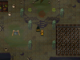


Not so much a place of despair - this is where the Nibelung dwarves live, underground. This is actually a place of faith - a tree grows in the underground. I'm trying to stick to the true depiction of Germanic pagan faith in which places of worship are near a natural phenomenon. The blood is due to the sacrifices to the Gods.


@Dreaded Hm, those maps look like they could use some details, buddy! They look to be sized well though - which is a pretty common mistake I see.
@Libby That map is hot, Libby~<3 I tend to forget you're the RTP Princess until, you know, you do better than the engine creators are doing with the RTP.
@Libby That map is hot, Libby~<3 I tend to forget you're the RTP Princess until, you know, you do better than the engine creators are doing with the RTP.


@Liberty - Fuck me that has to be some of the best RTP mapping I've seen for the VX/Ace style. I love the expanded surrounding farms, makes it more authentic to me for some reason. Though I shouldn't still be surprised by your RTP mapping skills by now consider your back catalogue of work but again you out do yourself.
Going through my old photobucket account and found this little gem from the Nigsek Remake...
Going through my old photobucket account and found this little gem from the Nigsek Remake...

author=Pizza
The real problem is that even big castles aren't that huge in real life. If they are they probably have a town built inside of their walls. I've been in several castles before, and I'd say that a lot of people overestimate their size.
If you want to break it up, add more courtyard space. Some wooden buildings inside the walls of the big courtyard, for a blacksmith/general/whatever you want. If it's supposed to be a huge castle then make it elaborate, but give it a reason to be big.
Uhhh, what now?

I've been to actual castles, both in Britain, and one in the US. They can be that huge. Just because you read it in a history book, and it's the average, doesn't mean it's so. There are above average size castles.
That said, yes, that courtyard could be lined with houses. If not, possibly there would be evidence of farming.
What I have a bigger issue with, is the slow wall progression... An actual castle typically has maybe two stories, plus the building part (which serves as both residence for all people living inside, and stronghold for people to spot danger in the event of attack). Having more than two essentially means you are piling wall on top of each other, which will likely cause a structural collapse. It would make more structural sense for a castle to be there in a gap rather than on top of wall, than it would to have five stories of structure.
@Tau: Oh man, I opened up NigSek a while ago and was wondering why that screen wasn't there. Now I remember - it was for the remake, right? Sadly never got done, iirc. :< I remember it really wowed the GW crowd, way back, and it still looks great by today's standards, too.
As for surrounding farms - it's something I started doing with my towns, since it makes no sense that there be about 15 houses in a town, total. Besides, larger towns need farmland and it just kinda made sense that the farms would be close to the outer wall, in case the farmers needed to run to safety. I rather like the effect, too. ;p
@Aegix: To be fair, there's been a lot of practice to get that good. It takes time, but I'm sure you can do it too, if you put your heart into it. ^.^
@Gourd: Thanks! ^.^ You know how it is; every day's a constant battle against auto-tiles, but perseverance (and a love of the graphics being used) will see ya through... eventually.
Those castles are incomparable. One is jutting towers and buildings, walls within walls, defences apon defences and decorative architecture (being as it was made for the wife of the man who commissioned it, he wanted it to be lovely for her. IIRC, it was something of a summer home, thus why it is like it is. It was also not meant for protecting against armies ravaging the lands - unlike other castles that were on more open lands set at critical points which could house a populace, animals and the locals. Yes, I've studied and been to castles too, bulma. ;p )
You are correct that there are bigger castles but that doesn't mean they make sense in a game prospective, or that they were barren expanses of wasted space like the screenshotted one is.
Keeping in mind that it's being created for a game, and that people do not want to spend forever walking back and forth across a screen of empty every time they go to that map, it needs a lot of work to make it look like it's not empty. It doesn't even work for abandonned because, well, wear and tear. Also, that cliff-face needs work.
"Wasted space" doesn't automatically make a bad game. It just creates a sense of openness, which is fine, provided it was the desired effect. If it wasn't then, yes, you have a bad game. But the same can be said of overcluttered areas space. If the items in question are just obstacles, you don't have effective use of space either. If you have bookshelves, but nothing can be read, seriously, why have books? The point of books is immersion, so whenever I see this decoration without substance crap, I quit the game.
...In any case, the OP of this should look at the castle in question. The outer wall is possibly reasonable, considering it needs land to farm, place peasant/serf houses there, etc. So...

Cut out all the red areas, shift the castle build so it touches the ground, and extend the top tower part in height.
Also, do something about the cliff face. Cracks, ledges, or vines. Something to break up that solid wall effect. I'm of the mind that space actually lends to the scene, if done effectively. Hence the prevalence of games like final fantasy 8 with the massive wasteland (5:30). Or stuff like kingdom hearts with the end of the world area.
So, yes, emptying out the castle in favor of more space inside the walls makes sense. An invading army has to break through the castle, and march through the court, which can be filled with troops, in addition to those stationed on the outer walls. That said, there are all types of castles, and you could conceivably build a "warehouse" style castle if so inclined.
...In any case, the OP of this should look at the castle in question. The outer wall is possibly reasonable, considering it needs land to farm, place peasant/serf houses there, etc. So...
Cut out all the red areas, shift the castle build so it touches the ground, and extend the top tower part in height.
Also, do something about the cliff face. Cracks, ledges, or vines. Something to break up that solid wall effect. I'm of the mind that space actually lends to the scene, if done effectively. Hence the prevalence of games like final fantasy 8 with the massive wasteland (5:30). Or stuff like kingdom hearts with the end of the world area.
So, yes, emptying out the castle in favor of more space inside the walls makes sense. An invading army has to break through the castle, and march through the court, which can be filled with troops, in addition to those stationed on the outer walls. That said, there are all types of castles, and you could conceivably build a "warehouse" style castle if so inclined.

