


THE SCREENSHOT TOPIC RETURNS
Posts

@megaman8x: Pretty interesting and unique style.
Are those things at the lower left cannons? If so they look like they are missing a bottom. Maybe either add a bottom or make the hole of the barrel smaller.
@Topic: Did make some changes to the castle, after that flood of feedback.
There is still like 50% emptiness, but I am feeling very Zen about it. ;)

The one thing I have not added is more snow.
Some more just didn't feel right and going all out didn't seem like a good option either. Not going for realism anyway.
Are those things at the lower left cannons? If so they look like they are missing a bottom. Maybe either add a bottom or make the hole of the barrel smaller.
@Topic: Did make some changes to the castle, after that flood of feedback.
There is still like 50% emptiness, but I am feeling very Zen about it. ;)
The one thing I have not added is more snow.
Some more just didn't feel right and going all out didn't seem like a good option either. Not going for realism anyway.

Much better, but I would say it could still be improved by removing some empty space and/or filling it up with random eye candy.

You can fill up the rest with people, honestly guys it looks fantastic, anything more and it's just nitpicking. Though it would make more sense to have snow on the houses and walls.
@megaman8x - looks cool man, though the side of the boat just... Something's off about it. Too flat maybe? I don't know. I've never worked with isometric so I can't give too much advice sadly.
@megaman8x - looks cool man, though the side of the boat just... Something's off about it. Too flat maybe? I don't know. I've never worked with isometric so I can't give too much advice sadly.

This is a quick mockup of some tilesets/rips I combined (mainly Legacy of Kain and Theodore's chipsets). My intention is to use this for one of the more true-to-their roots Germanic tribes that Brunhilde encounters during Act 2 of the game. How does this combination look?
EDIT: Forgot to mention the stick structure above the fire is for a spit, I didn't stick an animal on there yet

@Lihinel: That looks amazing. A real improvement! Those cliffs in the background are screaming for a secret path, though.

@Lihinel
WAY better, and I suppose as Tau said this would be nitpicking, but thats the point of this topic, no?
Lets look at how the masters did it in FF6 Figaro Castle Map(I remember getting lost in this place many time, and it FEELING like a big ass castle.)
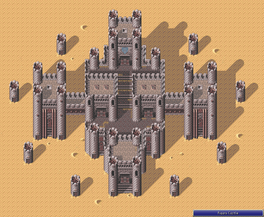
Look how tight and small the walk areas are.
I have a feeling you've been designing the castle at a very zoomed out perspective, which is fine, but remember the player never sees from this angle, and in the game, perception is reality.
NITPICKS:
I'd reduce tower height so the player can see the tops of the towers from the walkways.
I'd also tighten up the walk areas on the 4 tier main castle structure so they can see the wall above and below from any point on the walkway.
- Maybe give a color or two to the Roof tiles inside the walls(even if another darker shade of brown or something) As they stand they look like uncompleted buildings. (Maybe only add the extra snow on these building rooftops?)
- Add some flags or banners or something to give it a little more flavor and to help make this map stand out.
Say you have 2 other castles, what makes this one any different other than that its "in the snow."
For example: Figaro had the animated machinery (propellers) and they eventually tied that into the games story too. Vektor was rust and metal with those huge red banners.
Whoever suggested secret path was right on the money. That would be very cool. Maybe even show a few hints than you'd be able to get up there visible from the rear wall (like a treasure chest or something)
Its looking great from far away, but I bet semi dull in any one-off screen.
Forget realism, it's about design. The player will never see from a 1/4 or 1/8 zoom. Tight and concise always beats out large and overblown.
Sorry for the long post, the Map is definitely coming along and if you don't feel like modifying further that's your call!
WAY better, and I suppose as Tau said this would be nitpicking, but thats the point of this topic, no?
Lets look at how the masters did it in FF6 Figaro Castle Map(I remember getting lost in this place many time, and it FEELING like a big ass castle.)
Look how tight and small the walk areas are.
I have a feeling you've been designing the castle at a very zoomed out perspective, which is fine, but remember the player never sees from this angle, and in the game, perception is reality.
NITPICKS:
I'd reduce tower height so the player can see the tops of the towers from the walkways.
I'd also tighten up the walk areas on the 4 tier main castle structure so they can see the wall above and below from any point on the walkway.
- Maybe give a color or two to the Roof tiles inside the walls(even if another darker shade of brown or something) As they stand they look like uncompleted buildings. (Maybe only add the extra snow on these building rooftops?)
- Add some flags or banners or something to give it a little more flavor and to help make this map stand out.
Say you have 2 other castles, what makes this one any different other than that its "in the snow."
For example: Figaro had the animated machinery (propellers) and they eventually tied that into the games story too. Vektor was rust and metal with those huge red banners.
Whoever suggested secret path was right on the money. That would be very cool. Maybe even show a few hints than you'd be able to get up there visible from the rear wall (like a treasure chest or something)
Its looking great from far away, but I bet semi dull in any one-off screen.
Forget realism, it's about design. The player will never see from a 1/4 or 1/8 zoom. Tight and concise always beats out large and overblown.
Sorry for the long post, the Map is definitely coming along and if you don't feel like modifying further that's your call!


I needed some motivation to get back to Rpg maker so I made a map for this contest : Farm contest map
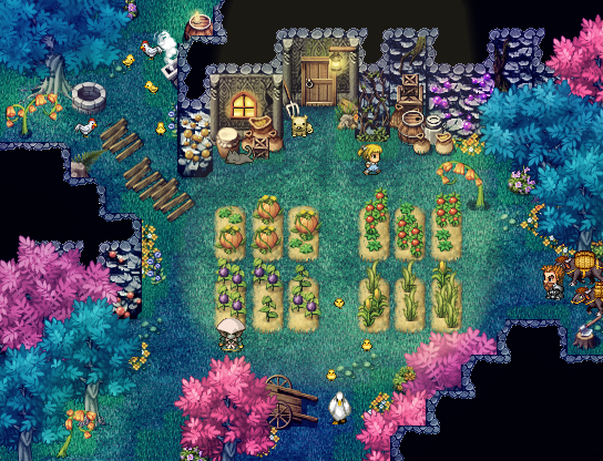
Inspired by Dwarf Fortress and Rune Factory.
It's a moss cave farm.
Edit : contest rules
Use only RTP or Celianna on a farm theme.
Inspired by Dwarf Fortress and Rune Factory.
It's a moss cave farm.
Edit : contest rules
Use only RTP or Celianna on a farm theme.
That is one lush cavern. Looks good, but unless you said it was a cavern I would have guessed it was outdoors at night.

Echoing Snow Owl, looks great, but I don't really associate trees with caverns.
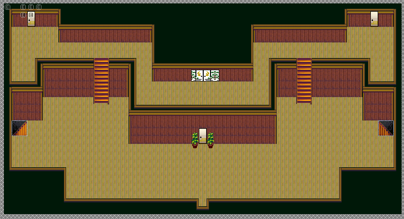
Elevation practice. I want to suggest changes in height without using stairs.

Elevation practice. I want to suggest changes in height without using stairs.

author=Alichains
Elevation practice. I want to suggest changes in height without using stairs.
Looks good, though you may want to change the top left-most side of the cliff so it looks less square. Also, those shadows look kind of weird as they don't extend to the walls.
I'd say there is the same potential problem as there would be if you used stairs there: The angle.
Right now in side-view its like 90°:
It should be like 45°:
(thats not 45 I know, but I think you get the point)
Fix would be to make the way longer by 1 or 2 tiles.
(to be precise it should be like: height_of_cliff * squareroot(2))
Right now in side-view its like 90°:
      |
      |
......|
It should be like 45°:
    /|
   / |
../  |
Fix would be to make the way longer by 1 or 2 tiles.
(to be precise it should be like: height_of_cliff * squareroot(2))


Did somebody say "elevation"!? Welcome to the club!
I take issue with using curved walls next to the ramps. The curved walls with the straight cliff-edge just looks weird too.
*Edit: I think you probably want to use the other water tile.
author=Alichains
I take issue with using curved walls next to the ramps. The curved walls with the straight cliff-edge just looks weird too.
*Edit: I think you probably want to use the other water tile.

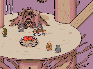
So...this is a thing that I'm working on right now. Yes, it's very VERY bare (this is the BARE minimum for the map right now), and I will be updating the chipset with more fancy items...assuming I have good enough stuff to use for it, as well as probably trimming down the main room below if there's not enough stuff to stick in there. You see, this area (Eientei) is supposed to be like an old Japanese mansion. And as it USUALLY is in every other game it's in, it's usually a kind of maze (which I'm trying to avoid really because...Bamboo Forest, while only being 2 screens long, was already a maze. And the previous dungeon, Scarlet Devil Mansion, is pretty maze-like in itself, especially the library and basement).
Whether or not this tileset works for that old Japanese mansion style I'm going for, I don't know. However, tileset aside, I'm having other difficulties mapping this area in general. You see, while I'm trying to avoid a maze-like dungeon while also making this dungeon not as terribad as before, it might be hard to do. I have a few ideas for this dungeon but I don't know WHICH is the best way to handle it:
A) Phoenix Tower, ala FFV: Basically, the dungeon would have the door to the next area right there and a puzzle in the same room. If you solved the puzzle, you could continue on. HOWEVER, you'd also be able to just skip to the door, but in doing so you'd have to fight a much more difficult "boss", so to speak. I'm not sure on this one because A) I'm not sure what puzzles to put in that wouldn't be terrible, and B) I'm not sure how long rooms should be or the orientation of said rooms, due to the escape sequence (the dungeon needs to be long enough for the 7-8 minutes to escape to matter, but not TOO long where it feels like it's dragging on).
B) Another "Find Keys" dungeon: Following the space/star theme (since Eientei is linked to the moon itself, as well as the inhabitants in it), I was going to have it set so that there'd be 4 doors that'd require special keys, based on the Chinese/Japanese Zodiacs (or Cardinals?? I forget if it's cardinals or zodiacs...). Hence, the multiple paths in the first room. However, I'd also like to have puzzles for getting said keys, but don't know what to do with those nor how to orientate rooms for them.
In addition to the escape sequence, there's also overworld enemies in this dungeon (no random encounters at all, just touch encounters).
In short, I am bad at making puzzles, but I want this dungeon to be the puzzle-themed dungeon.
Sorry for the loooooong post but...this is something I've been having troubles with for the past 5 years and just NOW started redoing because gods...it needs it. >_<
@Alichains: I agree with Marrend. That water tile kinda clashes badly...

@Xenomic There is not enough stuff in this screenshot to give any sort of valuable feedback. Come back with something decent, and maybe we can critique it.
@Alichains The grass at the top of the upper-right cliff looks like my pubes when I was a teenager. Trim it, son.
@Alichains The grass at the top of the upper-right cliff looks like my pubes when I was a teenager. Trim it, son.


@CashmereCat: What? Not even a "IT'S TOO BIG!!!" clause or anything? Gosh...
In all seriousness though, I -DID- say bare minimum and that more will be added later (if I can get the right tiles for it anyways). I figured at least there'd be enough in terms of layout or whatnot, or at least SOMETHING to help with maybe with future maps for this or something?
@Dookie: Oh! This looks pretty nice so far. Really captures that good ol' Earthbound vibe (I've never played the game but seen it enough so...). What is that done in? o.o?


