


THE SCREENSHOT TOPIC RETURNS
Posts

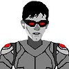
@ProjectKyle Nice setting. You might want to use SHIFT-mapping to make the tops of the stone walls not blend in with each other, on the left and the right sides of the screen. Also, the waterfall tile is of a different tile to the rest of the brick, i.e. it's flowing over a different type of wall. I think I'd make the flat platform at the top stretch down one more tile, because of depth. Perhaps you can make the long vines flow better. Also I'm not sure for any particular reason why the vines would grow symmetrically like that. Usually vines grow in random directions, so symmetricality in that regard is not really that natural unless they were planted there, but they seem to be naturally caused because there's no supports for them to hang off, or soil to plant them in. Also, those little fence tiles on the stone wall look like nice little supports, but for what? It'd be nice if they were there for a function otherwise they look nice, but have not much purpose. If they were for aesthetic purposes, I'd reckon there'd be more of them lined all around the wall, maybe 3 tiles apart or something. The grass area behind the monument is a bit plain.
That's all the advice I can give. Hope it's useful!
That's all the advice I can give. Hope it's useful!

It's not too bad. You probably need to learn a bit of shift mapping so that the walls on the sides aren't attached to the inner ones, and the tile for the waterfall is wrong (look at the bricks behind the water - it should be the same as the bricks of the wall.) Not sure why you've added fences to the wall? Also, the thickness of the top structure is in question due to how short the wall that goes around it is. It'd be about two tiles thick which would lead to a very thin room inside. It's pretty odd.
Here's a playlist of mapping tutorials (there's a shift-mapping one in there among a few others). Maybe check them out. So far it's not bad but it does have a few little issues.
Here's a playlist of mapping tutorials (there's a shift-mapping one in there among a few others). Maybe check them out. So far it's not bad but it does have a few little issues.
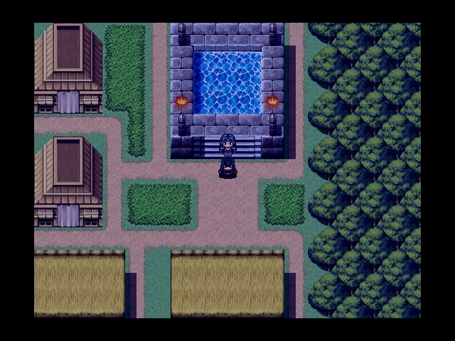

the castle...(?) looks ok to me. : )
the weaponry.. umm.. well the colors are too bright to be "old"... and must it really be so big..?
(Also, if the weaponry has been abandoned, why didn't random people steal all the weapons?)
the weaponry.. umm.. well the colors are too bright to be "old"... and must it really be so big..?
(Also, if the weaponry has been abandoned, why didn't random people steal all the weapons?)
You would have to play the game to understand. To make a long story short. The land surrounding the tower is guarded well. Vary well :)

@Kyle
Too much empty space in all your screenshots. You could easily remove 50% or more of those maps.
Too much empty space in all your screenshots. You could easily remove 50% or more of those maps.
This is part of a small side quest where you dress up as a girl to break Biggs' heart. He didn't do anything to you, you're just doing it because you were asked to. No lie. The sequence ends when the bar up top is empty or full (fills as you give positive answers, drains as you give negative answers).

@Project Kyle: The castle looks okay, but those indoor locations are yuck.
They need to be much smaller. Why do you need so much stuff in the first one? (I'll tell you why? Because its too big.) The second one just has absolutely nothing in the bottom half.
@UPRC: You look like you know what your doing.
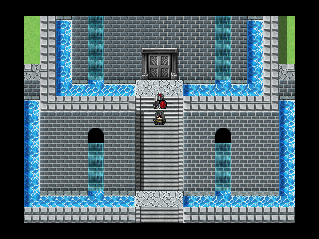
An example of a shop I mapped.

author=SnowOwl
@Kyle
Too much empty space in all your screenshots. You could easily remove 50% or more of those maps.
Changed the shop. The map dosn't go any smaller so I had to add more wall and fill in more space
@UPRC Looks awesome! One super nitpicky thing is Biggs' glove blends in with his pants a little too well. Maybe make the glove a shade lighter than the pants so the eye can differentiate between the two.

Just because a map is set to a certain size doesn't mean you have to fill it up. The above is a pretty decent shop with many items for sale. It doesn't fill the whole map space but has more than enough room to run around in and even hold an NPC or two. And it looks good as well as being functional.
@Kory: Try using a different table or switching your map mode from what it is to another option. It might make all the difference in the table height (pro tip, the Area Type option in Ace will move the legs of the tables/counters lower 8 pixels so as to create more room for items to sit on them comfortably. If there's still an issue, perhaps edit the tables to get rid of a bit of the legs or move the items up a few pixels in the tileset (if able)).
@Kyle: The reason your map is looking a bit bland is that you're trying to fill up extra, unnecessary space with unnecessary items (due to there being unnecessary space). Make it smaller and try using less. Less is more when it comes to mapping. Large maps should be glared at and not used too often, especially inners.
Also, don't double post. It's against site rules. Just keep that in mind, okay? ^.^
I wont double post again. I didn't realize it was agents site rules when I did it. Thanks fore the help! Ill get to work on my maps :)
@Liberty: I will certainly try to adjust those tables. I didn't realize how bad it was until I took a closer look at it. I Won't be able to do anything to the project right now (My partner who is working on it is still doing his part before passing it off to me again.)
@Kyle: I noticed that you changed your screenshots above. The problem with this is that no one can really see the improvements you have made. ie. the old screenshot was completely replaced. It also might confuse people and think we were referencing the new versions of your screenshots.
And it now looks a bit better by the way, but are those shelves hanging from a curtain?

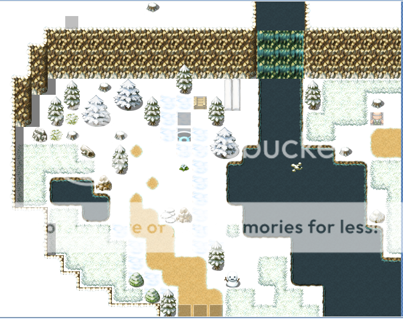
Been trying to make a winter wonderland type area. I'm not really good at mapping but I tried to make two of them.
@Kory: The shelves are being held up by a tent wall.....Which isnt much better then a curtain Lol! I wasnt really thinking there :D Ill fix that

@AquaXranox: Right now, it's a bit bare looking. I'm not familiar with VXAce's tileset ( since I use VX ) but maybe try changing the path like Kory suggested and add a couple of trees on either side of the path. Some snow and a cool blue-grey screen tint wouldn't be too bad either. =)

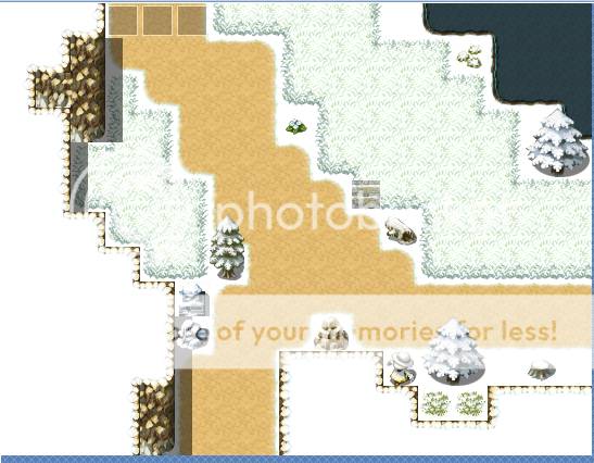
Redid the exterior of one of my maps. Not too sure if I should move the trees down a bit. Or to get rid of those crystals ( they serve a mystic purpose in a country full of natural-born magic users.

And a simple shack interior. Racism is widespread in the Empire.
Redid the exterior of one of my maps. Not too sure if I should move the trees down a bit. Or to get rid of those crystals ( they serve a mystic purpose in a country full of natural-born magic users.
And a simple shack interior. Racism is widespread in the Empire.

