THE SCREENSHOT TOPIC RETURNS
Posts
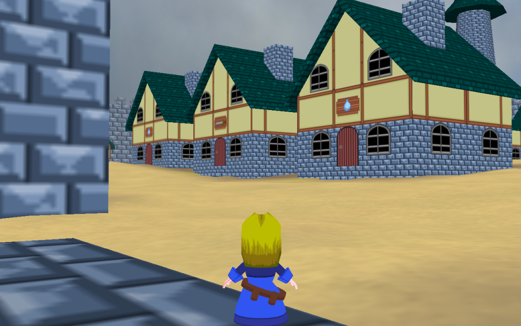
Decided to practice some Parallax mapping while I'm waiting for my partner to finish his part of our game. (Image has been resized to fit on this webpage.)

@kory_toombs
While it looks realistic, it's also pretty uninteresting, I'm afraid.
Also, that is one weird shape for a house.
While it looks realistic, it's also pretty uninteresting, I'm afraid.
Also, that is one weird shape for a house.

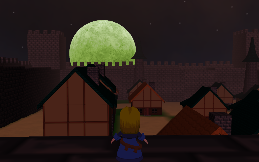
Moonrise at Teston(The sun is setting behind me, hence the red tint everywhere)
Randomly generated city in my randomly generated RPG The Grimoire of Worlds.
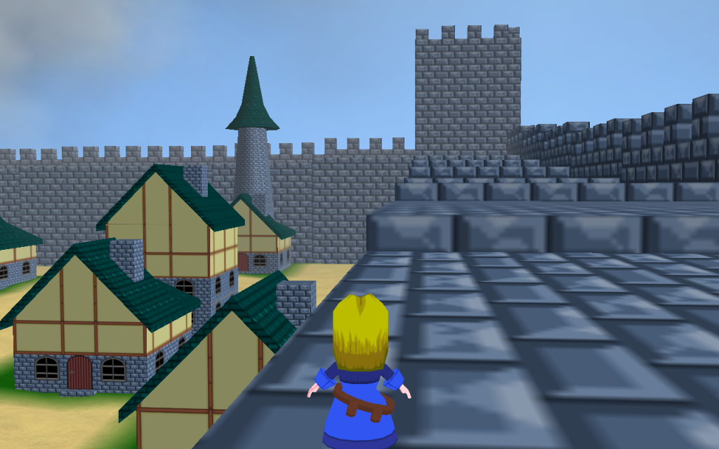
Another shot during the day
Not really.
Im making the game in Blitz3D by myself. All 3D models and textures are made by me. Except for the trees which were made in a really old tree making program that was to low poly so I added to their leaf mesh and re-uv textured them.
I will make a profile for the game here at some point.
Im making the game in Blitz3D by myself. All 3D models and textures are made by me. Except for the trees which were made in a really old tree making program that was to low poly so I added to their leaf mesh and re-uv textured them.
I will make a profile for the game here at some point.
There is a something that is missing...
But I don't know what...
Edit:
Ignore the lower right corner, oopsy!
But I don't know what...
Edit:
Ignore the lower right corner, oopsy!

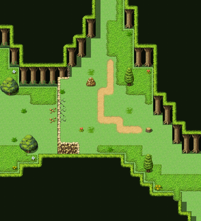
Well, to start with you've got issues with your height levels on the upper left. The fact that the tree canopy is only two tiles high, but then half of the trees (under that same canopy) are on the cliff, which is at least two tiles high from the looks of the bottom area of the cliff, makes it odd. You could Shift-map two canopies next to each other getting rid of the issue.
Make the lines a bit more jagged. You started with the canopies, but the one down the bottom is too straight in the middle and the cliff line is far to straight. I'll do a fast example at the bottom of this to give you an idea.
Lastly, your details are minimal at best. Forests have a lot of brush, a lot of trees and are not easy to navigate even if they do have paths through them. Try shrinking down the walking space a bit more by putting more trees, stumps and grass in. Add a feeling of height to the bottom layer of canopy by making some overlap with trees, too.
Here's that fast example:

Basically, many more details to make it feel more like a real forest. It's a normal default sized map and uses only RTP, but there's enough in it to make it feel like a natural area, instead of a man-made one.

Here's a different view, I guess you could say. Basically 1 is where the player will walk to leave the map. 9 indicates the areas you can walk around in the map and 63 would be where the teleport is.
Looking at it like this you can see how the path cuts through the details around it and makes a focal point for the player to walk through. It shows the way. I could dispense with the path and just have the green ground and the lack of details would do the same thing (though to a lesser effect as it wouldn't stand out as much). I am guiding the player from one teleport to another.
Another thing this has done is block off the edges of the map - at least in the mind of the player. The spot just two spaces right of the exit can be walked on but the player won't think of it as the exit because there's the illusion of that way being blocked thanks to the overlapping tree. It tells them that just below that is a trunk and thus, they cannot leave that way.
Sometimes it's the little things that make a map work. Hope that helps a bit.
Make the lines a bit more jagged. You started with the canopies, but the one down the bottom is too straight in the middle and the cliff line is far to straight. I'll do a fast example at the bottom of this to give you an idea.
Lastly, your details are minimal at best. Forests have a lot of brush, a lot of trees and are not easy to navigate even if they do have paths through them. Try shrinking down the walking space a bit more by putting more trees, stumps and grass in. Add a feeling of height to the bottom layer of canopy by making some overlap with trees, too.
Here's that fast example:
Basically, many more details to make it feel more like a real forest. It's a normal default sized map and uses only RTP, but there's enough in it to make it feel like a natural area, instead of a man-made one.
Here's a different view, I guess you could say. Basically 1 is where the player will walk to leave the map. 9 indicates the areas you can walk around in the map and 63 would be where the teleport is.
Looking at it like this you can see how the path cuts through the details around it and makes a focal point for the player to walk through. It shows the way. I could dispense with the path and just have the green ground and the lack of details would do the same thing (though to a lesser effect as it wouldn't stand out as much). I am guiding the player from one teleport to another.
Another thing this has done is block off the edges of the map - at least in the mind of the player. The spot just two spaces right of the exit can be walked on but the player won't think of it as the exit because there's the illusion of that way being blocked thanks to the overlapping tree. It tells them that just below that is a trunk and thus, they cannot leave that way.
Sometimes it's the little things that make a map work. Hope that helps a bit.
The funny thing is that I missed a few spots you can walk because I fell prey to my own trick. XD
But yeah, I might start using the regions to point out things like this when making example maps for others a bit more often.
But yeah, I might start using the regions to point out things like this when making example maps for others a bit more often.

@Grindalf
cool 3D character- model.. at least from behind... : )
the buildings could use some more texture / windows.
cool 3D character- model.. at least from behind... : )
the buildings could use some more texture / windows.
Time for bulky diving helmets!

More games with underwater battles seriously need characters wearing diving gear of some sort.
More games with underwater battles seriously need characters wearing diving gear of some sort.

author=UPRC
More games with underwater battles seriously need characters wearing diving gear of some sort.
How absurd! Next you'll be saying that we shouldn't be suplexing trains next!

author=UPRC
Time for bulky diving helmets!
More games with underwater battles seriously need characters wearing diving gear of some sort.
that fire could look cooler if instead of a simple layer with normal blending, you made a 50% transparency layer with normal blending and a 50%transparency layer with multiply blending on top of it. That'd look pretty similar to what FF6 did with the same graphics! Anyways, verrrrry neat screen ;---; BP2 is coming off so awesomely, darn T--T
also get da ref

EDIT: ugly map, testing out graphics. LOLOLO
EDIT2: new HUD

i-i

author=kory_toombs
Decided to practice some Parallax mapping while I'm waiting for my partner to finish his part of our game. (Image has been resized to fit on this webpage.)
@kory_toombs
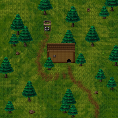
It looks like there isn't going to be much in the map, so does it need to be that big? If so, you could put more trees around the outer part of the map. Try adding some plants or tuffs of grass here and there. Since you're using parallax mapping you could use clumping as well.
The shape of the house is really weird too.
If that's an overlay I see, I like it. If not, idk.
It's my turn...? I think?
A mansion for a noble.

Not sure if I overdid it.

And a pub without the effects.
A mansion for a noble.
Not sure if I overdid it.
And a pub without the effects.