


THE SCREENSHOT TOPIC RETURNS
Posts


The text looks a little large in comparison to the icons and such, but I usually like small fonts. I like the overall design of the screen!
I'd rather prefer this font, it indeed is easy to read. Not often do I see custom RPG Maker menus that are that.
@shadski: The gold mine, while looks cool with all that gold. It becomes hard to see without any contrast. Anyways your 2nd picture looks much better than either your first or third picture. The game just looks much more interesting to play.
author=grindalf
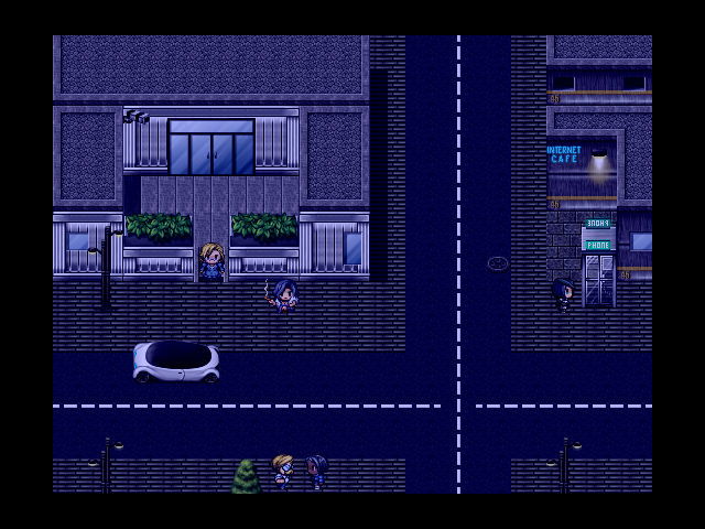
@Shadski if its an abandoned snowy town, why are the lamps still lit
Well, it's not completely abandoned (the player lives there) but really it's because with the effects you can't see the light that emanates from them.

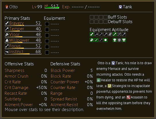
tertiary stats:
average block reduction
average counter damage
omelette success rate
literary aptitude
aggregated stat efficiency index
average block reduction
average counter damage
omelette success rate
literary aptitude
aggregated stat efficiency index

Alright, I fixed up the grass and re-did the mushroom. Kinda feel like the mushroom sticks out like a sore thumb, but maybe it's just me? What do y'all think?


The mushroom sticking out might be due to its size compared to everything else.
Anyway, I'm messing around with the Futuristic and here's what I came up with.
Anyway, I'm messing around with the Futuristic and here's what I came up with.
author=_______
how many bloody stats do you need
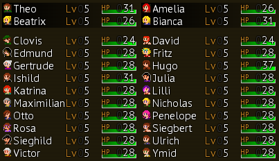
Enough to give each PC different needs in their gear, while still making sure everyone can at least find passable gear. All assassins enjoy additional Crit Rate and Crit Damage, but Clovis enjoys Ailment Power for his Fear abilities while Amelia needs Range to prevent enemy counterattacks.
It's not so much that I have more stats, I just feel the need to give the player control over more of those stats.

author=narcodis
Alright, I fixed up the grass and re-did the mushroom. Kinda feel like the mushroom sticks out like a sore thumb, but maybe it's just me? What do y'all think?
I think it sticks out because of the perspective compared to everything else. It looks kinda flat. Compare the tree stump with it.
author=LouisCyphre
Do I sense a game with low HP values? Those are always refreshing to see for a change!

author=Alichains
The mushroom sticking out might be due to its size compared to everything else.
Anyway, I'm messing around with the Futuristic and here's what I came up with.
Seedy but cute. I'm reminded of Arc the Lad 2.


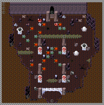
This is the first room in Valley of Corpses, being the room you have to go through in order to get a key to enter the other cave at the start of the area. I think this turned out rather well and conveys the whole "Corpse" part of the dungeon. As always, the flora inflicts statuses when stepping on them (still haven't decided which statuses yet). At one point, upon getting the key, these corpses and whatnot would've came to life (or be ghosts in this area) and attacked the player chasing them, but not sure if I'll do that here or not now...hmmm.


