


THE SCREENSHOT TOPIC RETURNS
Posts
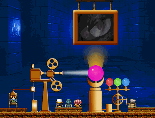
This is a map that combines gameplay sprites, pictures, parallax and movie that I used in a recent game. It is the Psychic Laboratory of Prof. Archibald Collinsworth.


it doesn't look anything like the original deling city train station but maybe they've had a renovation
you know
the train crashed into the platform and all
(ill probably be fiddling with the fire and effects a lot more)
Corfaisus

"It's frustrating because - as much as Corf is otherwise an irredeemable person - his 2k/3 mapping is on point." ~ psy_wombats
7874
Damn, what's that train made out of? I'm surprised that the rest of it didn't distort or bend at all. Also, and this might just be me, but with how it's set up now, wouldn't the top of the train be running pretty close with the walkway? Are there doors in the roof that they use to enter it?
all very good questions
i shall now direct you to my representative

i didn't want to add doors and my train tileset doesn't have a front
i shall now direct you to my representative

I spent a good chunk of my morning doing this:
http://rpgmaker.net/media/content/users/29496/locker/Map.png
(Huge image so I can't post it directly here)
First time I've used the 2k3 RTP in a good while. This is in VX Ace. The roads haven't been added to the map yet- you don't traverse it at your own leisure. It's just a screen like an old Mario game. FUN!


The waterfalls are very strange. They indicate increased ground height however the cliffs all stand on the same height, thus creating a mess. Either removing the waterfalls or adding cliffs to the sides of them would help in that regard.
As for the house, the only thing I'd recommend is shift mapping the carpet in the room so the side borders are gone (bar the bottom most border line) and maybe changing one of the wooden floors to a vertical strip so that they don't look like they run into each other (and thus creates a definite border).
Apart from that, everything is looking pretty neat. One last thing, the tree leaves look a little odd on the right side, as though they've been cut off? It's a little noticeable. Oh, and you could probably add a tree overlapped by the cliff at the back of the map since it looks a little bare-ish (I know that with larger trees, overlapping can be a hassle, but they do look pretty neat when done, even if there's only one variation of it. Adding an overlap behind a cliff allows for more depth to appear in the map too, especially since there's no trees on the ground layer in that screenshot. It just adds a little more oomph.) Oh, and some longer grass under the trees would make the ground look a tad more interesting.
But yeah, besides those small things, it's looking pretty swish. ^.^)b


There's still an issue with the waterfall. >.<;
The issue is that the waterfall is telling you the top part of the water is the height of the first two cliff tiles, but if that were the case, there wouldn't be a ground shown at the back of that cliff area. Indeed, there wouldn't be a separation of cliff/water because the top of the cliff would be the same height as the water - it would be on the cliff. Instead, you have shown that the cliff is two tiles high, that the waterfall is two tiles high and thus that it must be the same height BUT shown at the back that this isn't so as the ground tile that the cliff rests on is at the same height as the water.
To fix this you'd need to either do away with the waterfall altogether (and thus have the water run on the same level as the ground the cliff rests on) or remove both the overlap and sides of the cliff where it meets the water, making it one large cliff with a water stream on top of it. As it stands it doesn't work.
Otherwise, the map looks nice. It could still do with something under the trees - flowers, long grass, mushrooms, something but it looks great non-the-less. As does the house (though I would like to point out that you could put a side-ways facing cabinet against the right wall as that area is currently empty space, but that's just a suggestion.)
Ah, all right, then. I'll do away with the waterfall. And yeah, the area with the trees does look a bit dull.

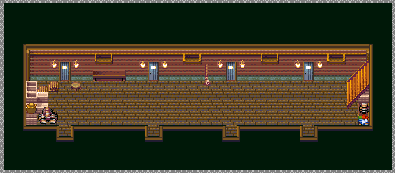
That sure is a ship place. Or at least, it's supposed to be part of the Palanquin Ship dungeon. I'm honestly NOT sure how big to make this dungeon at all, because I don't know how big ships are on the inside (and it's even harder to judge from the official art, found here:

Of note, you will never see the outside of the ship. You transition from the Myouren Temple to inside the ship itself (because, lo and behold, the temple IS the ship. Byakuren can just change it from temple to ship and back again whenever she wants in canon apparently), so that means I don't have to worry about ever mapping the outside (thank god). But yeah...just how many maps/rooms/hallways/etc. should this dungeon have? I need an honest opinion. I don't see these rooms being too big, and I don't want it to be as nonsensical as some of these ships in FF are (I'm looking at you Fire Ship in FFV!). So yeah...^^;;

If you're concerned about realistic space in a ship, you could make a series of corridors about that size littered with boxes and other barricades that would cause the player to have to traverse the inside of the cabins to navigate around.
Will keep that in mind. Probably will have to do that in conjunction with overworld enemies in this particular dungeon to make it more interesting.
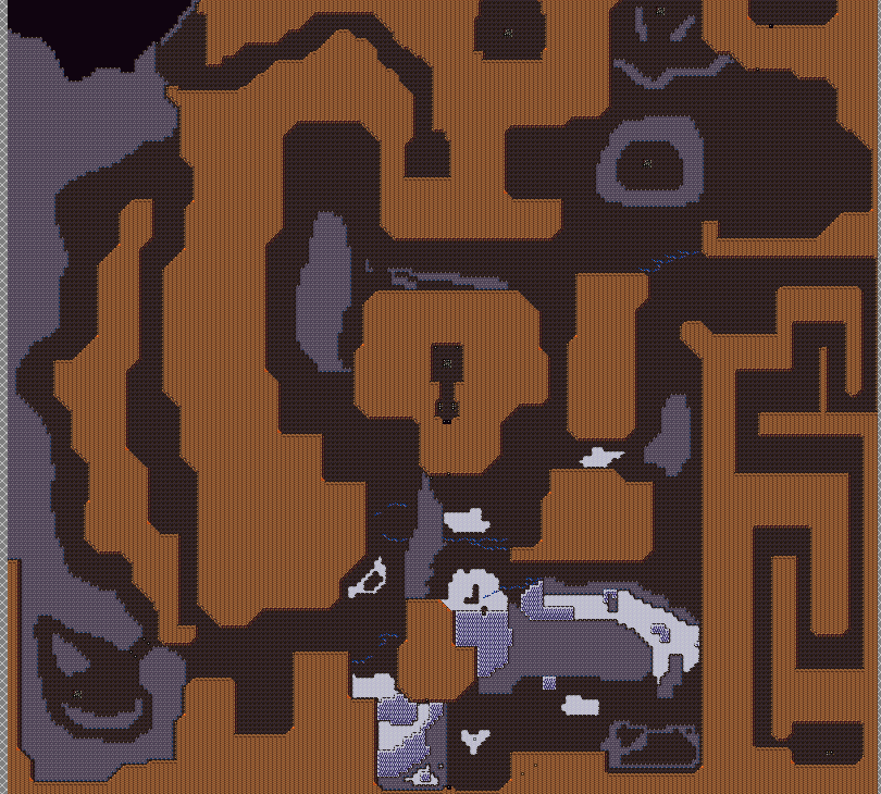
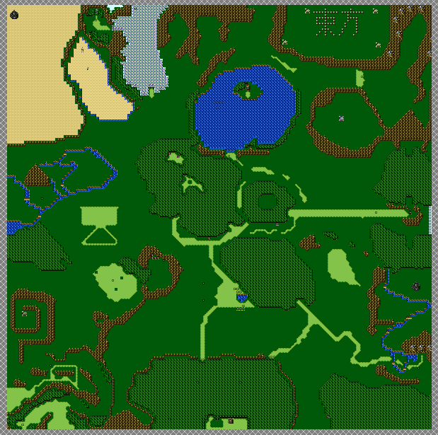
So! I decided to take a break from dungeon making, to go fix up an old map of mine. You see, Makai's map size is as big as Gensokyo's, 200x200. But you see, unlike Gensokyo, which has no random encounters, Makai does, and they're not easy ones at that. Here's what the OLD map looked like:
It's a pretty unsightly thing...it takes FAR too long to get from Point A to Point B, and it's just not that interesting. This is what it's looking like so far:
Gone from 200x200 to now 118x137. Much smaller and compact, but still large enough to be a world map. Of course, this poses the problem of having to fix all teleport events that lead to the world map. Luckily, I did this before too many events were done for Makai (unlike Gensokyo, which would be hell to fix up the map for...). I WOULD like to fix it up but...ugh. Maybe someone can help with that bit? I could post what the Gensokyo map looks like....eh, what the heck, you guys can see just how awful my mapping skills were back in the day (it's the same map for Gensokyo for the past 4 years now...I just never fixed it because so many teleport events...):
Yes, it's pretty bare and blah. And again, while I WOULD revamp it, just fixing all the teleport events would be hellish. Oh, and I now know that the Shift mapping is the way to fix up the snow forest/sand areas, so I can actually make those look NOT bad (figured this out when I was messing with Makai's snowfields).
Whew...that's a lot of talking there! @_@;
So! I decided to take a break from dungeon making, to go fix up an old map of mine. You see, Makai's map size is as big as Gensokyo's, 200x200. But you see, unlike Gensokyo, which has no random encounters, Makai does, and they're not easy ones at that. Here's what the OLD map looked like:
It's a pretty unsightly thing...it takes FAR too long to get from Point A to Point B, and it's just not that interesting. This is what it's looking like so far:
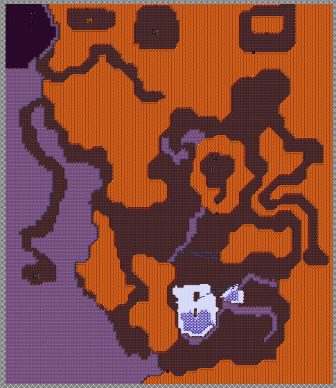
Gone from 200x200 to now 118x137. Much smaller and compact, but still large enough to be a world map. Of course, this poses the problem of having to fix all teleport events that lead to the world map. Luckily, I did this before too many events were done for Makai (unlike Gensokyo, which would be hell to fix up the map for...). I WOULD like to fix it up but...ugh. Maybe someone can help with that bit? I could post what the Gensokyo map looks like....eh, what the heck, you guys can see just how awful my mapping skills were back in the day (it's the same map for Gensokyo for the past 4 years now...I just never fixed it because so many teleport events...):
Yes, it's pretty bare and blah. And again, while I WOULD revamp it, just fixing all the teleport events would be hellish. Oh, and I now know that the Shift mapping is the way to fix up the snow forest/sand areas, so I can actually make those look NOT bad (figured this out when I was messing with Makai's snowfields).
Whew...that's a lot of talking there! @_@;

Hey Xenomic, you presented already some good maps. But those (2nd and 3rd picture) have still lots of work to do, you know. :)
More than likely they aren't going to change that much more. Not that they need THAT much changed, they're just world maps. *shrugs* Could be sized down a bit more maybe, but meh.
EDIT - Ugh...and for the Gensokyo map, there's well over 30-80 teleport events I'd have to fix strewn across the game. Gods that's going to be awful to do anything with if I even downsize the map at all...
EDIT - Ugh...and for the Gensokyo map, there's well over 30-80 teleport events I'd have to fix strewn across the game. Gods that's going to be awful to do anything with if I even downsize the map at all...
voxpopuli, that looks... Interesting to say the least. Combined the name you gave to that game, i'm looking forward to seeing more. Definitely at least stands out from masses!
sorceresskyrsty, that train looks whack! At first I thought it was some diagonal steel pillar, which I thought looked cool, but hearing it's a train... O_o i know it loses some of it's crasging effect, but honestly it would make more sense if it was aligned with the rails. Otherwise that screen looks really great, is that a FF8 fangame?
sorceresskyrsty, that train looks whack! At first I thought it was some diagonal steel pillar, which I thought looked cool, but hearing it's a train... O_o i know it loses some of it's crasging effect, but honestly it would make more sense if it was aligned with the rails. Otherwise that screen looks really great, is that a FF8 fangame?

author=XenomicI think they could definitely stand to be sized down. There's simply too much empty/negative space there and not enough visual interest on the maps. Especially if you have random encounters, I can see them getting tiresome quickly.
More than likely they aren't going to change that much more. Not that they need THAT much changed, they're just world maps. *shrugs* Could be sized down a bit more maybe, but meh.
Here are a few examples from classic RM games you could reference:


Or you could check out Nessiah's Article on World map design. ~^-^~
@Blindmind: Only the Makai map (2nd map) has random encounters. The Gensokyo map (3rd map) does not (bar an overworld optional boss you can run into). Heck, game is supposed to be emulating old SNES FF styled games, these maps don't do it well enough heh (outside of using the FFV world map for Gensokyo and FFIV Underworld map for Makai). And again, I'd be more than willing to size them down a bit more even, but fixing all those teleport events is really off-putting, savvy?
(That, and both of those tilesets don't really offer much in the way of visual stuff at all...>_<)
EDIT - I suppose I should mention that Gensokyo itself is a sealed-off region of Japan too, so it's not SUPPOSED to be super big. Hrm...what a conundrum this is...
(That, and both of those tilesets don't really offer much in the way of visual stuff at all...>_<)
EDIT - I suppose I should mention that Gensokyo itself is a sealed-off region of Japan too, so it's not SUPPOSED to be super big. Hrm...what a conundrum this is...

