


THE SCREENSHOT TOPIC RETURNS
Posts

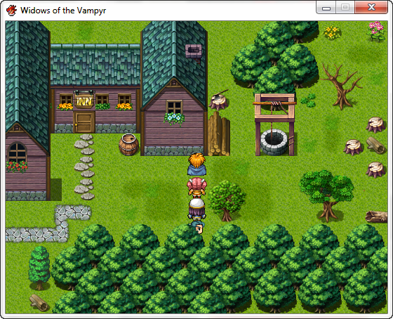
@yuna21: I really like the little house. I would personally change the bright blue of the curtains and the bed and turn it into a softer blue, but otherwise I really like it. Looks comfy. =)
I have been working on a few operation rooms and wanted to know if they look alright so far. There are still little details that I will have to add, of course.

I have been working on a few operation rooms and wanted to know if they look alright so far. There are still little details that I will have to add, of course.


author=Xenomic
@Blindmind:Only the Makai map (2nd map) has random encounters. The Gensokyo map (3rd map) does not (bar an overworld optional boss you can run into). Heck, game is supposed to be emulating old SNES FF styled games, these maps don't do it well enough heh (outside of using the FFV world map for Gensokyo and FFIV Underworld map for Makai). And again, I'd be more than willing to size them down a bit more even, but fixing all those teleport events is really off-putting, savvy?
(That, and both of those tilesets don't really offer much in the way of visual stuff at all...>_<)
EDIT - I suppose I should mention that Gensokyo itself is a sealed-off region of Japan too, so it's not SUPPOSED to be super big. Hrm...what a conundrum this is...
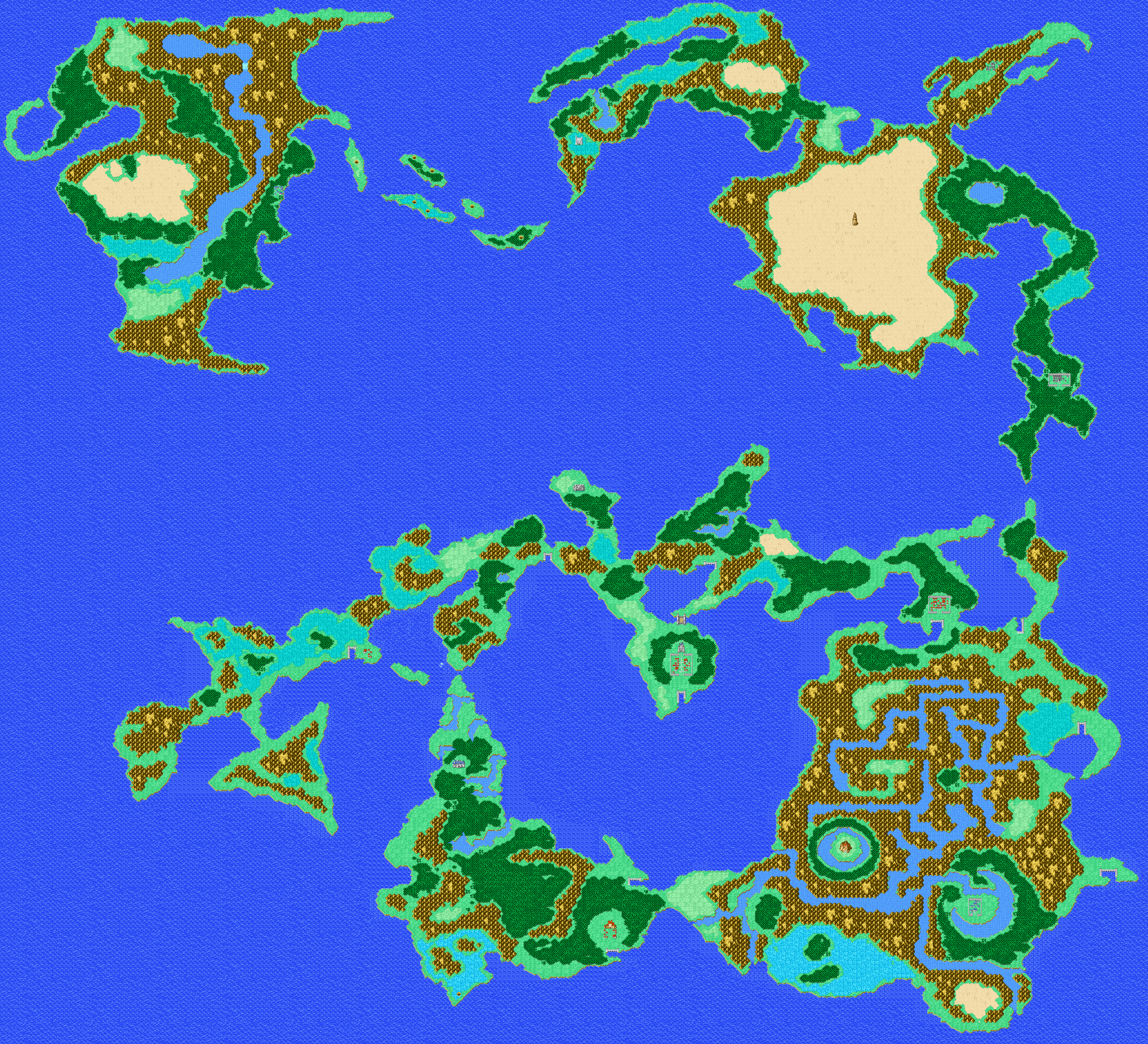
Take this!
It's FF. It's what you want. But except for the desert and the water (this is deliberate) you won't find any areas on the map that has the same texture ALL OVER THE SCREEN while you are exploring it.

...I guess I could just add more mountains or stuff...or impassable forests...*shrugs*. Just not going to resize and move locations around since that's too much of a pain in the arse for now. But that might be a decent reference material.
Evolution of a Map & additional screenshots:
One of the sequences I designed for Widows of the Vampyr was the Psychic Laboratory of Prof. Archibald Collinsworth.
Desiring a late 1800s turn-of-the-(20th)century feel, for the era the game is set in, I used an actual vintage projector product (graphic below) as the inspiration for the psychic projector design. I also used animated "character" light graphics for the projector and for the psychic receptor to screen. Finally I wanted actual movies to be shown on screen during game. Below is some of the evolutionary stages and components, plus a screenshot of the final result. To see the map in action here is a link to the YouTube video teaser trailer (for a sampling of the map) below.

1. Vintage illustration of antique projector used as inspiration for psychic projector
2. Photoshop line diagram to final b/w mock-up of projector
3. Shaded line diagram of psychic receptor (original design)
4. Final color version of psychic receptor
5. The sprite of the hero, Hieronymus Xylander, wearing the fashionable brass electrode cap and psychic conductor
6. Early version of map
7. Finished map
7.

Additional screenshots:
Chamber of Turning
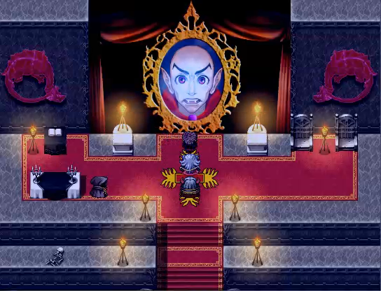
Ravenswode Forest
Crowsford Abbey
One of the sequences I designed for Widows of the Vampyr was the Psychic Laboratory of Prof. Archibald Collinsworth.
Desiring a late 1800s turn-of-the-(20th)century feel, for the era the game is set in, I used an actual vintage projector product (graphic below) as the inspiration for the psychic projector design. I also used animated "character" light graphics for the projector and for the psychic receptor to screen. Finally I wanted actual movies to be shown on screen during game. Below is some of the evolutionary stages and components, plus a screenshot of the final result. To see the map in action here is a link to the YouTube video teaser trailer (for a sampling of the map) below.
1. Vintage illustration of antique projector used as inspiration for psychic projector
2. Photoshop line diagram to final b/w mock-up of projector
3. Shaded line diagram of psychic receptor (original design)
4. Final color version of psychic receptor
5. The sprite of the hero, Hieronymus Xylander, wearing the fashionable brass electrode cap and psychic conductor
6. Early version of map
7. Finished map
7.
Additional screenshots:
Chamber of Turning
Ravenswode Forest
Crowsford Abbey
Hey guys!
Just showing some village maps I made! :)
Lariol Village (test map 1):

Lariol again:

Xai Village (test map 2):

I'm not to sure about the maps yet. I might use them, but tell me what you think of them!
EDIT:
Thanks for the advice! Also, I'll consider Lariol Village for one of my projects. Xai Village, I might set aside.
Just showing some village maps I made! :)
Lariol Village (test map 1):
Lariol again:
Xai Village (test map 2):
I'm not to sure about the maps yet. I might use them, but tell me what you think of them!
EDIT:
author=Pizza
@Zephire98: Lariol Village has way too much shit all over the ground. It'd be a nice map if there was some more consideration of where the decorations go. Try making beds of similar flowers- like real flowers would normally grow.
Thanks for the advice! Also, I'll consider Lariol Village for one of my projects. Xai Village, I might set aside.

Ace's autotiles are so frustrating when it comes to caves/interesting differences in elevation and what not

just this map + one more and this half of the dungeon is finished (the next half i will have to make ramps/use stairs for, because it's meant to be sort of spiralling downward for a long distance...might make some large crystal tiles to jut out of the walls.
just this map + one more and this half of the dungeon is finished (the next half i will have to make ramps/use stairs for, because it's meant to be sort of spiralling downward for a long distance...might make some large crystal tiles to jut out of the walls.
author=SnowOwl
Such as color?
I have never seen operation rooms full of colorful things, so no. The colors stay as they are. =)

author=SorceressKyrsty
Ace's autotiles are so frustrating when it comes to caves/interesting differences in elevation and what not
Yeah, I know what you mean. I've gone so far as putting former cave autotiles on to A5 tileset graphics just so I can do elevations easier. Works for cliffs and other elevated tiles too.

@Zephire98: Lariol Village has way too much shit all over the ground. It'd be a nice map if there was some more consideration of where the decorations go. Try making beds of similar flowers- like real flowers would normally grow.

Not so much a screenshot as I would like to be critiqued on editting Simulation RPG Tsukuru's facesets to have an SNES style similar to Final Fantasy IV/VI. The man on the bottom also had his eyepatch removed.

Here's a screen of a revised Lariol Village.

Note:
I changed the houses a bit and the surrounding landscape. Please tell me if it looks somewhat better than the original! :)
Note:
I changed the houses a bit and the surrounding landscape. Please tell me if it looks somewhat better than the original! :)
The problem I'm noticing is still there. Perhaps I should explain my viewpoint a little better.
Whenever I'm designing a map I always keep the routes I expect the player to traverse (say, between the buildings in your town) relatively opened up, for two reasons: That's likely where the moving NPCs are going to be situated, and that it makes finding your way around a lot easier. I situate the decorations at the sides of the main areas that you'll walk- that way you'll see the fluff in the town and all the pretty graphical shit but it'll never seem to be in your way.
My main point is that I don't and have never understood why the three tile rule (in its most basic and most often quoted sense) is apparently a good thing.
LockeZ

I'd really like to get rid of LockeZ. His play style is way too unpredictable. He's always like this too. If he ran a country, he'd just kill and imprison people at random until crime stopped.
5958
If the town is supposed to be abandoned and overgrown, it's perfect. Otherwise, there probably shouldn't be tall grass and plants directly in front of the doors like that.

author=Pizza
The problem I'm noticing is still there. Perhaps I should explain my viewpoint a little better.
Whenever I'm designing a map I always keep the routes I expect the player to traverse (say, between the buildings in your town) relatively opened up, for two reasons: That's likely where the moving NPCs are going to be situated, and that it makes finding your way around a lot easier. I situate the decorations at the sides of the main areas that you'll walk- that way you'll see the fluff in the town and all the pretty graphical shit but it'll never seem to be in your way.
My main point is that I don't and have never understood why the three tile rule (in its most basic and most often quoted sense) is apparently a good thing.
It was supposed to be used for nature areas, cliffs and water tiles (and sometimes paths) so that people would stop with the long-ass lines of straightness. People then decided to use it for other things and made crazy-cluttered maps. Of course, with some games it looked great (Ara Fell, even though a bit over-cluttered, is still an impressive to look at game and the Mack tiles made a lot of difference there, I believe).
Remember, it was created when mapping was still in the stages of "big ol empty maps everywhere" so it was a way to encourage people to think more about the placement of their tiles rather than just leaving things bland and empty, with long boring straight lines and little-to-no decorations.
Frankly, I stand by it for cliffage, water edging and thick nature areas. In less nature areas I recommend a more 5-6 tile rule instead.
@Zephire: You seem to be missing paths. Where people walk often there will be a wear-away of grass to reveal the dirt below and with enough people walking it will be more pronounced. Said paths are usually the shortest routes between areas that people need to go. Also, all towns (even 2-block towns - and I've lived in a 2-block town so...) have harder pathing outside houses and near stores and the like. They also have general layouts and not random placement of houses (except with the outskirts). So planning out your town with pathing and then adding houses is probably the best idea.
My checklist is as such:
- Nature (add water sources, trees, etc)
- Paths (and the main roads along which shops and important businesses will be)
- Houses
- Dirt Paths (the outskirt houses would have this, and paths to doors)
Here's a video that might help:

author=SpellcraftQuill
Not so much a screenshot as I would like to be critiqued on editting Simulation RPG Tsukuru's facesets to have an SNES style similar to Final Fantasy IV/VI. The man on the bottom also had his eyepatch removed.
These are really good! I've been doing a lot of face editing myself to be in this same style, so I know the love that goes into these.
@Liberty: Thanks for some of the tips. On a related note to mapping, I'm still a newbie and I like small buildings because my big houses seem kind of odd and, just to me, out of proportions. Maybe... I just suck... :(
@LockeZ: The town wasn't supposed to be abandoned, but it gives me an idea for when I want to design ruined villages. Besides, Lariol is supposed to have lush vegetation.
But still, thanks for the tips! :D
EDIT:
@Pizza: Yeah, my buildings are more like FF1-style, though I hope to get better with my mapping. (BTW, FF1 was awesome!)
Also, I have not been active for a while due to summer camp and driving school, so I need to really update with new screens soon!


The intro scene where you wake up in the ruins.

And this is the room where you will first see the ghoulish creatures that inhabits them.
Corfaisus

"It's frustrating because - as much as Corf is otherwise an irredeemable person - his 2k/3 mapping is on point." ~ psy_wombats
7874
Between raising the roof and banging heads on the wall, I don't see them as much of a threat. I love the gameboy color feel of the sprites and tileset, though. Reminds me a bit of playing the Zelda Oracle series.

