


THE SCREENSHOT TOPIC RETURNS
Posts

author=makoto12345678Debatable. I'll agree it's a good starting point, but only to that extent.
I see the RTP as a good starting point for new developers to mess around with.
It challenges us to be creative and try new things like editing to get just what you want.
I don't see how it challenges you to be creative, you can be creative with any tileset, if you meant setting an atmosphere with it outside of it's scope is creative, then yes, that would be a challenge-- though a waste of creativity to overcome when there are so many tilesets out there, for sale or for non-commercial use. If you're making a commercial game, it's quite liekly you're at a stage where you can either make your own tilesets or edit the RTP to blend with the atmosphere.
author=makoto12345678There's this for medieval/fuedal dramas of a heavy variety. Using chibi's for such a thing is contradictory in 85% of scenarios in which it is attempted.
I also disagree that the RTP can not be used for heavy drama medevel/feudal theme, from what I have so far it looks good.
author=makoto12345678Lol why is the house wall made out of waterfalls? Not necessarily bad just, not sure if thats what you're meaning to do.
By the way is this map ok?
There's a bit wrong with it, but it's off to a good start. I'll let the others tell you whats wrong with it, since if i do it'll take a lot of words to explain some minor issues.
Also here's a video of one of the best maps I've made:
Rensooi Tower - Planet Haven.
author=makoto12345678
IBy the way is this map ok?

The house is too large for its one tile height. And... waterfalls as walls? Also, that sand is meant for desert areas, not pathways amid green stuff. Plus, tone down with that grass, it makes the whole place look dirty. Instead, put in some cliffs to give the place variety in relief.
author=SnowOwl
Why not? It looks really blocky and the characters look like bigheaded retarded dwarfs.
Blocky - yes, at times, but I don't think it's too bad otherwise.
author=Ratty524
I neither like or hate the RTP, but it bothers me that people use it interchangeably with almost every different type of game genre. The RTP's style communicates a cute, happy-go-lucky fantasy adventure, not an adult-oriented horror or a hard-medieval drama.
Very much this, and mostly thanks to the color scheme and chibi-styled, Pokemonic sprites. And trees. Maybe in combination with (fitting) custom graphics the RTP could work well enough for serious games, but I've never seen that done properly.
One more screenshot.

Then a video, yes.
A silly celebratory video of releasing five games to the public.
Then a video, yes.
A silly celebratory video of releasing five games to the public.

Well the waterfall walls is because its the main castle in the land of water i wanted each castle in lands of water,fire,and air to incorporate their element. I am thinking of bringing it out a bit and putting a pool on the roof or something to make the water falls look more in place. the sand i will change i was looking for dirt path :). And if you don't challenge yourself creatively you end up staying where you are in skill level,but if you constantly challenge your self you will improve. That is why i think it is important to challenge your self creatively even if there is an easier way to do it especially if your new to creating rpg's.

Dayum it's been like 3 million years since I contributed here.
Makoto no offense but it doesn't look much like any type of castle to me and you ought to sort out the waterfall on the left and make it on the same level as everything else.
Gotta say I love the ambience of the music. I like the whole atmosphere.

A nightclub in one of my projects which is almost finished so I probably won't change much because asdfghjkl so lazy

Also thought I'd share this really pink house. Can you tell I like pink?
author=makoto12345678
Well the waterfall walls is because its the main castle in the land of water i wanted each castle in lands of water,fire,and air to incorporate their element. I am thinking of bringing it out a bit and putting a pool on the roof or something to make the water falls look more in place. the sand i will change i was looking for dirt path :). And if you don't challenge yourself creatively you end up staying where you are in skill level,but if you constantly challenge your self you will improve. That is why i think it is important to challenge your self creatively even if there is an easier way to do it especially if your new to creating rpg's.
Makoto no offense but it doesn't look much like any type of castle to me and you ought to sort out the waterfall on the left and make it on the same level as everything else.
author=BizarreMonkey
Also here's a video of one of the best maps I've made:
Rensooi Tower - Planet Haven.
Gotta say I love the ambience of the music. I like the whole atmosphere.
A nightclub in one of my projects which is almost finished so I probably won't change much because asdfghjkl so lazy
Also thought I'd share this really pink house. Can you tell I like pink?

I... wonder if this sort of setup can even carry an entire game.

author=LouisCyphre
snip
I... wonder if this sort of setup can even carry an entire game.
They're called visual novels. I hear some of them do quite well too. /hit for being a wiseass
But no seriously, plenty of games use that setup. And I think it looks good, what you've got now.
author=Skie Fortressauthor=LouisCyphreThey're called visual novels. I hear some of them do quite well too. /hit for being a wiseass
snip
I... wonder if this sort of setup can even carry an entire game.
But no seriously, plenty of games use that setup. And I think it looks good, what you've got now.
I agree.
Corfaisus

"It's frustrating because - as much as Corf is otherwise an irredeemable person - his 2k/3 mapping is on point." ~ psy_wombats
7874

In Feral Solidarity, you'll be able to pick out the transformed humans from the everyday animals by their speech patterns.
Hey all I just did a castle map and was wondering if it was to cluttered or anything.

I forgot the door :)
I forgot the door :)
Corfaisus
"It's frustrating because - as much as Corf is otherwise an irredeemable person - his 2k/3 mapping is on point." ~ psy_wombats
7874
author=Shadski
@Corfaisus
When or will you be releasing this game? It looks interesting.
Well, it's going to be commercial and I've set myself up a 3 month development period to get it done. So we'll see how that goes.

You need to learn a little about white space, my friend. If you add too much detail to a map it can come off looking very cluttered and too busy. You want to balance it out - have about 40-50% of the map blank space (that is, empty walls, empty ground tiles, empty water tiles, etc) and the rest have details. You want to scatter said details around so that it achieves a balance and draws the players' eyes to focal points of interest. In this case it'd be the doors, paths and other areas.
For example - the huge amounts of statues doesn't help in bringing you eyes to the door, however if the statues were flanking only the door, it shows that that is important. You want to make important parts of your maps stand out, so use tiles to point to them.
I'm going to ask you to try this method:
Take out all the details (that is, mainly the B-E tile stuff). Now, add only details around the main focal points. Okay. Now... use the 5-tile rule (hur) - that is, every 4-6 tiles that are the same, add a detail. Not the same detail - that's where you went a little crazy - but A detail. It could be a crack. It could be a piece of moss. It could be a tuft of grass or a spider web or something.
Just, try it until you get the hang of space allotment.

The main issue is that all those fine details - the vines, trees, etc - should be placed more randomly. Right now, the vines are placed in same pattern across the walls. That would never happen in nature.
Listen to Liberty's advice, as well.
Listen to Liberty's advice, as well.


author=Erave
A few new shots. Any feedback is appreciated.
One thing that I'm immensely impressed with is the fact that you're saying faithful to the grid of your pixels. Even with your font! The biggest pet peeve I have with other high-resolution "retro" graphics is when different items on-screen are different resolutions. It kills the aesthetic and just lowers the overall quality.
You avoid this pitfall, and your sprites have a powerful style and command of color to boot!
(I am quite fond of that retro fog graphic)
author=LouisCyphreauthor=EraveOne thing that I'm immensely impressed with is the fact that you're saying faithful to the grid of your pixels. Even with your font! The biggest pet peeve I have with other high-resolution "retro" graphics is when different items on-screen are different resolutions. It kills the aesthetic and just lowers the overall quality.
A few new shots. Any feedback is appreciated.
You avoid this pitfall, and your sprites have a powerful style and command of color to boot!
(I am quite fond of that retro fog graphic)
Thanks Louis. I have little to do with those things, I've just composed the sound track a few other misc things. I'll pass that on to our artist.
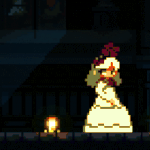
Been a busy week! Here's some sneak peeks of whats new.


One of the Optional Bosses, defeating her will open up Dimension π
One of the Optional Bosses, defeating her will open up Dimension π
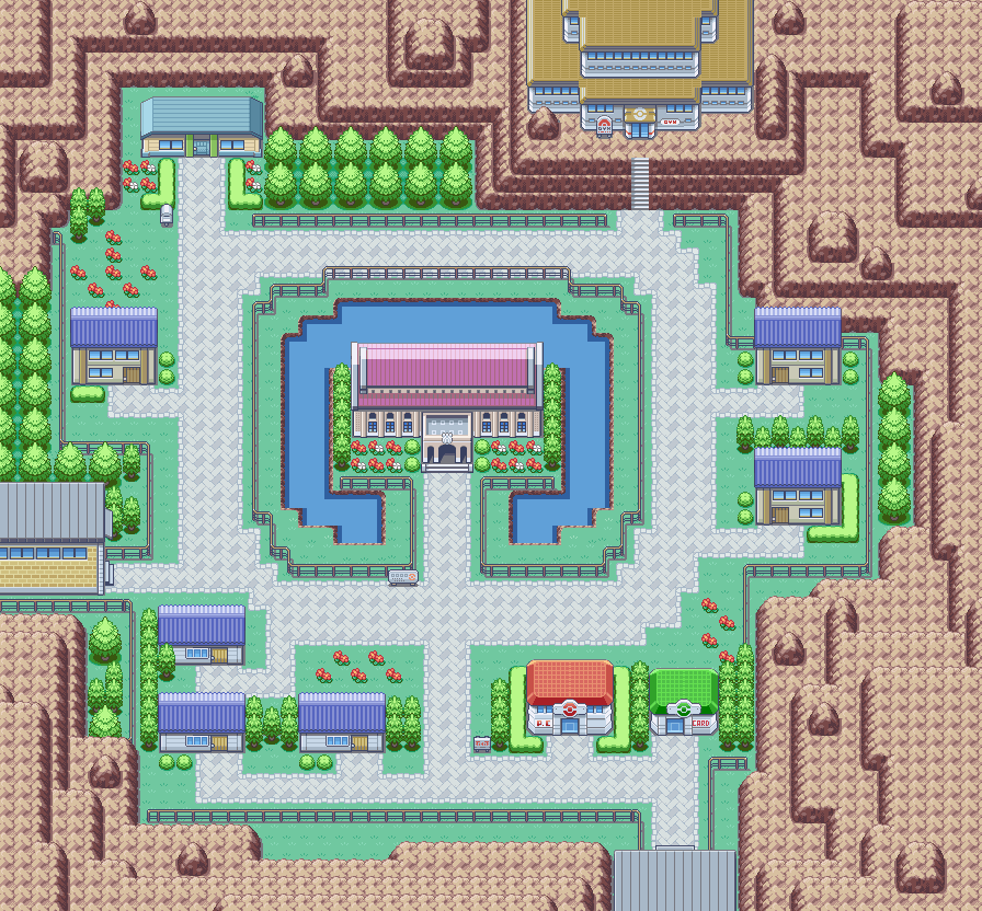
I made a map of Misao City, guys (for Pokemon RMN Version):
@Erave: Love this stuff overall. While I know it technically is "retro", I'm not a fan of dither-fog effects. Maybe you could get your artist to add some "cloud" shapes to it to make it look more interesting visually.
@Bizzare Monkey: Can't say much on the visuals myself, but I will say that "No" should end with a comma in your second screenshot.

