


CREATION CUSTOM CRAFTS: CRAVING CRITICISM
Posts

@NewBlack:
Thank you kindly, I'll do what is necessary to fix it.
@LockeZ:
What is written next to the door is: "The Seventh Door", it'll probably end up being the title of the game. It was drawn by what the player thinks is the murderer. Is that really the case however...?
Thank you kindly, I'll do what is necessary to fix it.
@LockeZ:
What is written next to the door is: "The Seventh Door", it'll probably end up being the title of the game. It was drawn by what the player thinks is the murderer. Is that really the case however...?
Alright, following your feedback here's the update:

Better, worse? Should I change anything else according to you guys. I always appreciate the input :).
Better, worse? Should I change anything else according to you guys. I always appreciate the input :).

I don't think the z,x,eye and hand should be on the picture, it sort of ruins it. What is that box with the red rectangle?
LockeZ

I'd really like to get rid of LockeZ. His play style is way too unpredictable. He's always like this too. If he ran a country, he'd just kill and imprison people at random until crime stopped.
5958
Looks like an air conditioner to me. I really like the screen, it's got a lot of life now.
I don't think you understood what we meant last time about the roof being illogical. Look at this version, where I fixed the roof on the left side (and changed back the stairs on the right side because there was nothing wrong with them):

That said I still don't really get what's going on with the area on the upper right, and still don't like the black areas at all. If it were my game I'd probably arrange the map something like this:

I don't think you understood what we meant last time about the roof being illogical. Look at this version, where I fixed the roof on the left side (and changed back the stairs on the right side because there was nothing wrong with them):
That said I still don't really get what's going on with the area on the upper right, and still don't like the black areas at all. If it were my game I'd probably arrange the map something like this:

author=chana
I don't think the z,x,eye and hand should be on the picture, it sort of ruins it.
I don't think they take anything away. The presumption is that those icons pop up in response to pressing a button. Like, as a reminder of what the buttons do? Just a thought.
What am I even doing on this thread, anyway? I feel like I'm way out of my league, here.
Wrong elevation is one of my pet peeves, so I try to not comment on it too much, but LockeZ is right. The elevation doesn't make sense unless it's a slanted plane. If it is the last floor, I prefer the way he edited the picture, but I don't have a problem with the black. Since the black is supposed to be where you "cut" the building (I think), being cut gives the impression that there are more floors above (Really minor issue).
Also, I think the eye/hand icons would look better if they had a little more contrast to the background: Something like different colors/style, or drawing them inside a square/circle, or even outlining them. Anyway, my two cents :)
Also, I think the eye/hand icons would look better if they had a little more contrast to the background: Something like different colors/style, or drawing them inside a square/circle, or even outlining them. Anyway, my two cents :)
You're right, I didn't understand what you meant :). I'll use your edit if you don't mind, it does look better (and make more sense).
As for the ''Z'', ''X'' key, they are meant to appear at the press of a button, they're not always there.
Also, I think the eye/hand icons would look better if they had a little more contrast to the background: Something like different colors/style, or drawing them inside a square/circle, or even outlining them
Not sure what you meant exactly, care to demonstrate with an edit? If not, I'll try to whip something up myself and you can then let me know if I'm going in the right direction.
Also, if you guys have any other idea as to how to integrate the icons, let me know. I don't really have any inspiration about this for the moment.
Cheers for all the input. I'm glad this screen is about done now with the elevation thing taken care of.
Sure. What I meant is this:

Sorry it sucks D: The square, in particular, looks awful, but the idea is separating the icons from the background.
Another one that might look interesting is removing the dark outline.
There's nothing strange in giving a more realistic look to the icons at all, but I would probably make them as cartoony and simple as the tiles, if it were me.
Waah, three months already since I've set foot at rmn.
Just so you know, yukiharu, your system was implemented to the game (the white outline if I remember correctly).
I'd like some criticism on this car please:

And on this portrait please:

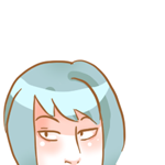
Can you guess who it is?
Just so you know, yukiharu, your system was implemented to the game (the white outline if I remember correctly).
I'd like some criticism on this car please:
And on this portrait please:
Can you guess who it is?
LockeZ
I'd really like to get rid of LockeZ. His play style is way too unpredictable. He's always like this too. If he ran a country, he'd just kill and imprison people at random until crime stopped.
5958
Those are all so good. The panda's arms and legs are tiny and weird looking, but maybe that's really what baby pandas look like, I don't know.
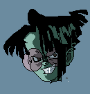
The amount of emotion in the face of the guy with the Xbox controller is great. He looks like he's about to kill someone for making disparaging remarks about his mother. I'm not so sure about the wire he's holding in his mouth. I didn't actually notice the wire until like the twentieth time I looked at the pic.
The amount of emotion in the face of the guy with the Xbox controller is great. He looks like he's about to kill someone for making disparaging remarks about his mother. I'm not so sure about the wire he's holding in his mouth. I didn't actually notice the wire until like the twentieth time I looked at the pic.

Hey, Creation, long time no see! Wow, it seems you've improved quite a bit since the last time you posted anything, and even your past sprites were already good. I don't have any real criticism to offer, though. I just wanted to say it's nice that you're not limiting yourself to one single style, and that you're doing more complex animations now... Keep up the good work!
@LockeZ: You're right about the Panda, I got lazy and didn't want to enlarge to redo the legs, hehe.
The picture of the guy is from a photography actually, he asked me to make him an avatar.
@alter: Yo! Yeah, I'm experimenting quite a bit, you're right. I think my past sprites were really n00bish but I guess that's a feeling I keep getting when I look back on the things I've done before. The reason why everything is so different is that I constantly strives to do things which are out of my comfort zone.
Explosion:

Jose from Cyber-6:
Not many people seem to know about Cyber-6. It's an animation from South America. It's really good actually.
The picture of the guy is from a photography actually, he asked me to make him an avatar.
@alter: Yo! Yeah, I'm experimenting quite a bit, you're right. I think my past sprites were really n00bish but I guess that's a feeling I keep getting when I look back on the things I've done before. The reason why everything is so different is that I constantly strives to do things which are out of my comfort zone.
Explosion:
Jose from Cyber-6:
Not many people seem to know about Cyber-6. It's an animation from South America. It's really good actually.
no nudity plz
It's not perfect but I'm glad how it turned out.
Backflip for Inexistence. It's kind of like in Castlevania, when you press a key you have this move to quickly get out of harm's way.
no nudity plz
Some people don't like the violet shadow. I like it to be honest.
It's not perfect but I'm glad how it turned out.
Backflip for Inexistence. It's kind of like in Castlevania, when you press a key you have this move to quickly get out of harm's way.
no nudity plz
Some people don't like the violet shadow. I like it to be honest.


