


 Add Review
 Subscribe
 Nominate
 Submit Media
 RSS
RSS
- Summary
- Blog
- Images
- Reviews
- Media
- Survival Tips
- Characters
- Videos
- You might also like...
- Downloads
- Play Lists
 NicoB
NicoB- Added: 10/24/2011 02:38 PM
- Last updated: 04/26/2024 12:17 PM
- 7236 views
Posts 

Pages:
1

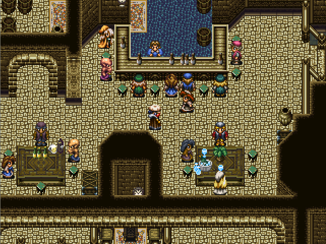
300 beers, eh? I think I could take that on in a couple weeks... did 50 in a week once. My liver swelled, but my wallet shrank.
The floor seems to mess with my eyes a bit becaue it is both bright and dark at the same time. I love everything else though, looking good!

weirder is the water the barman seems to be in, that map cut ib half up left and the white thingie at the entrance? great map.

UPRC's made a very valid... Umm... Statement (is that the correct word?) #dumbnonenglishspeaker
The floor is definately too clashy. Tone down the brighter colors in it. It's almost much brighter than the average sprite, it looks rather odd.
The floor is definately too clashy. Tone down the brighter colors in it. It's almost much brighter than the average sprite, it looks rather odd.

Hm...I always thought it looked fine, but I guess I've just gotten used to it. It is actually default colors from the original Rudra game, so I'm surprised it's so bothersome to people. I'll try darkening and see what happens.
I see, that map is a rug, as for the white bottom center it seems to be a person, whatever, as for the floor, it is dark and bright but I think that's part of the charm of this interior.
Lol the map looks fine imo, though I have to agree on the eye strain if you stare at it enough, but that's normal for some maps I think. :3
Alright, I tried darkening the lighter tones some. Tell me if this looks any better.
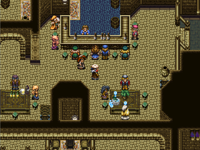
It feels like it's too dark to me now; but I suppose I've just gotten used to the old one.
It feels like it's too dark to me now; but I suppose I've just gotten used to the old one.

The brighter one stands out more.

The darker version is definitely easier on the eyes. I like it!
I don't like the darker one at all. If he is going for a stone look, rather than a carpet one, the brighter one looks more natural and still different enough to stand out and show off the room more.
But here is a suggestion. Adding an over-lay sort of thing over parts of the floor, one that shows, say, darker spots, with cracks, to darken that area up, and add age and it'd look more detailed.
But here is a suggestion. Adding an over-lay sort of thing over parts of the floor, one that shows, say, darker spots, with cracks, to darken that area up, and add age and it'd look more detailed.

The darker one is definitely better; tiles shouldn't stand out more than the sprites, and that floor was pretty blinding. xD I mean, it was blending in with Cyrus' hat! D:
I talked with some people in the screenshot topic, and they suggested I just brighten the dark spots rather than darken the light.
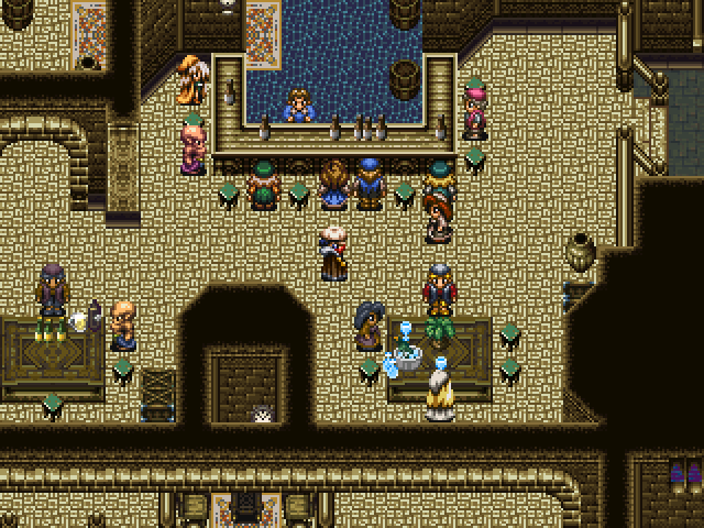
How's this?
How's this?

That works. What's important is the contrast (and it's still enough). I said something about brighter being "closer", but it's not a golden rule xD (say, for example, a white floor...).
So, thumbs up =),
Orochii Zouveleki
So, thumbs up =),
Orochii Zouveleki
Pages:
1

