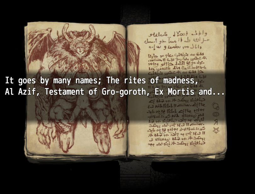
This looks really cool but I feel that the font kind of cheapens the look of it. The aesthetic is so beautiful and unique but then you have this really generic modern-looking font on top of it and it clashes with the entire art style. I know font has to be readable and the one you have here is VERY readable, but I think a clean serif font or something slightly more austere looking would make the whole thing look a lot more cohesive.

 Add Review
 Subscribe
 Nominate
 Submit Media
 RSS
RSS