


CREATION'S PROFILE

I translate games as I don't have enough time to make them.
Search
Filter
 Journeyman
I'll agree that there's even room to "greatly improve" the gameplay
There's always room for improvement, no matter the game.
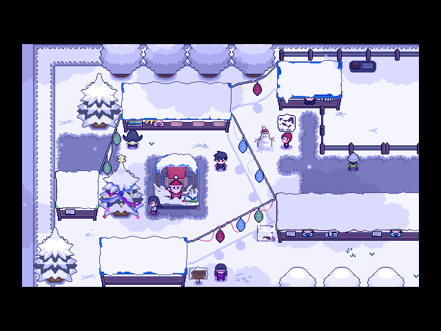
 The Screenshot Topic Returns
The Screenshot Topic Returns
Holy... smokes.
Look at this, another game by them Frenchies (it's in Katakana for the style apparently) by Moonwalk1803.
Everything is custom made apart from the grass. An English release is planned (which is quite likely since there's so little text to translate).
Enjoy the video!
Look at this, another game by them Frenchies (it's in Katakana for the style apparently) by Moonwalk1803.
Everything is custom made apart from the grass. An English release is planned (which is quite likely since there's so little text to translate).
Enjoy the video!
The Screenshot Topic Returns
The Screenshot Topic Returns
Wow, just saw your edit, lucid. You do draw everything, my bad. Well done, I can't wait to see the final product when everything is up par with the same quality.
@Adon: This is by far the most interesting project you've worked on IMHO. I like the idea of being in control of a dog.
I laughed.
@Adon: This is by far the most interesting project you've worked on IMHO. I like the idea of being in control of a dog.
Will there be a CBS(custom bark system)?
I laughed.
 Creation Custom Crafts: Craving Criticism
Thank for taking the time to give some feedback. I had noticed what you mentioned about the mouth and thought I had fixed it. I'll give it another try then :).
Some new stuff, mostly pixels.


As usual, comments are more than welcome. I can draw alright but I just started pixels two days ago and I'll admit I'm struggling with some things.
Some new stuff, mostly pixels.
As usual, comments are more than welcome. I can draw alright but I just started pixels two days ago and I'll admit I'm struggling with some things.
The Screenshot Topic Returns
lucidstillness
If you have any suggestions about how to minimize this problem I would be grateful.
Creation
I'd stop mapping for a bit and polish up what you've already done.
Some of the stuff in your game has been improved far too much compared to what you used to do before to the point where the graphics just don't sit well together. I mean if you keep creating stuff you'll become better at it as you go along. It happens to just about anyone who works on graphics for long enough. People constantly replace their old resources so that they match their new ones, there's no avoiding it really.
I mean, just look at the dragon and the anime faceset. The dragon looks like it was drawn by someone who is lightyears ahead of the person who did that faceset which looks like it was done by someone who has just started. I'm sure you see the HUGE difference as well, now you have to replace your outdated graphics with something more uniform.
I mean, even in your older screens, your battlers were still much better than your facesets:

To be honest with you, those battlers always screamed rotoscoping to me which is why I'll be honest that I was a bit suspicious about the whole ''drawing from scratch'' thing but I'll take your word for it. The reason I'm under this impression is that while the anime facesets could be criticized, the battlers itself is quite simply flawless. It looks like something you'd see in an AD&D rulebook or something, it's that perfect. I was doubtful that you went from average facesets to stellar battlers. I wouldn't be surprised if other people familiar with digital art were left with the same impression however. Just putting it out there. Your screens were actually featured in an international news available here and the writer was exactly under the same impression.
By drawing from scratch you do mean that you use references however, do you not? If you don't use references, then please replace that faceset with something of the quality of the dragon asap :-).
The Screenshot Topic Returns
Hi, Lucid, I've once again looked your screens over and wrote a detailed list of what I think could be improved. Take it or leave it.

+: the (yellow) dirt looks good.
-/+: Did you add noise to your grass texture? You did the right thing in lowering the saturation of that grass but I'm not a fan of the grainy texture, it looks odd.
-: You still a really serious problem with heterogeneity. To be honest I don't understand how you create your stuff. The flowers are obviously pixel art, the cliffs seem to have been ripped from another game. You can the see the huge difference in quality if you campare the flowers (very basic) and the cliff (pro looking).
Out of curiosity, are those rips? custom made? modified version of rips? I'm honestly at a loss. This is really the most serious issue at the moment. Either go for pixel art, or hand paint everything or use rips but right now the mix doesn't give a good result I think.
Just to give you an idea, look at this screen by Wanoklox:
Notice how everything blends in nicely and looks great? Everything is drawn in the same unique style and the screen itself is really neat because of that.
-: The trunk of the trees seem like they were done by hand but the leaves don't. It looks like the leaves were ripped from an actual picture and pasted on top of a hand drawn trunk and it doesn't fit nicely in my opinion.
-: the statues on the side of the stairs are flat, no shadow and they stick out. They just don't integrate well with the rest of the screen.
-: the texture for the cliff seem to have been stretched with photoshop and it doesn't look very good, especially at the very bottom of the cliff. Try to find a way to make it look less seemless.
-: You still have issues with your character sprite. You've been told about this before and I really think you should take some time to fix it considering it's pretty important. I'd stop mapping for a bit and polish up what you've already done. Get a reference for his anatomy, the shoulders are off.
-: the slime has a row of pixel at the bottom and it's very distracting. Maybe you could replace it with a darker color? The eyes of the slime could certainly use more contrast, it's difficult to actually see the details you've put in the eyes.

-: Same problem here. It seems like different people of very different artistic ability worked on this. For instance, the red eyes of the statue is a bit awkward in my opinion. The glow would probably be better if you played with transparency around the rim of the glow (if that makes any sense). I mean, the glow of the candle is not bad, why is it that the glow for eyes of the statues is so different? Maybe you were going for a different kind of light effect, I'm not sure really.
-: the arrows are oddly placed. Why are they so far away from the exits they indicate? I would put them closer, I think it'd look better. Also the arrow on top overlaps with the wall and it doesn't look great that way I think.

That's the best screen out of the three. The text is a bit dark, I think a lighter shade would make it easier to read. Did you draw the dragon? The faceset? I'm honestly trying to figure out where everything comes from in this game as the parts of its whole are just so different.
+: the (yellow) dirt looks good.
-/+: Did you add noise to your grass texture? You did the right thing in lowering the saturation of that grass but I'm not a fan of the grainy texture, it looks odd.
-: You still a really serious problem with heterogeneity. To be honest I don't understand how you create your stuff. The flowers are obviously pixel art, the cliffs seem to have been ripped from another game. You can the see the huge difference in quality if you campare the flowers (very basic) and the cliff (pro looking).
Out of curiosity, are those rips? custom made? modified version of rips? I'm honestly at a loss. This is really the most serious issue at the moment. Either go for pixel art, or hand paint everything or use rips but right now the mix doesn't give a good result I think.
Just to give you an idea, look at this screen by Wanoklox:
Notice how everything blends in nicely and looks great? Everything is drawn in the same unique style and the screen itself is really neat because of that.
-: The trunk of the trees seem like they were done by hand but the leaves don't. It looks like the leaves were ripped from an actual picture and pasted on top of a hand drawn trunk and it doesn't fit nicely in my opinion.
-: the statues on the side of the stairs are flat, no shadow and they stick out. They just don't integrate well with the rest of the screen.
-: the texture for the cliff seem to have been stretched with photoshop and it doesn't look very good, especially at the very bottom of the cliff. Try to find a way to make it look less seemless.
-: You still have issues with your character sprite. You've been told about this before and I really think you should take some time to fix it considering it's pretty important. I'd stop mapping for a bit and polish up what you've already done. Get a reference for his anatomy, the shoulders are off.
-: the slime has a row of pixel at the bottom and it's very distracting. Maybe you could replace it with a darker color? The eyes of the slime could certainly use more contrast, it's difficult to actually see the details you've put in the eyes.
-: Same problem here. It seems like different people of very different artistic ability worked on this. For instance, the red eyes of the statue is a bit awkward in my opinion. The glow would probably be better if you played with transparency around the rim of the glow (if that makes any sense). I mean, the glow of the candle is not bad, why is it that the glow for eyes of the statues is so different? Maybe you were going for a different kind of light effect, I'm not sure really.
-: the arrows are oddly placed. Why are they so far away from the exits they indicate? I would put them closer, I think it'd look better. Also the arrow on top overlaps with the wall and it doesn't look great that way I think.
That's the best screen out of the three. The text is a bit dark, I think a lighter shade would make it easier to read. Did you draw the dragon? The faceset? I'm honestly trying to figure out where everything comes from in this game as the parts of its whole are just so different.
Creation Custom Crafts: Craving Criticism
It's been almost 8 months since I've posted something here, holy!
As usual, what I'm really looking for is criticism to improve my ''craft''.
Some icons:


The first three are the weapons I have in mind for the first demo while the last one is the first of three armors.
Would you have any funny ideas for some unusual armor? I want to stay away from the usual leather armor, chain mail, etc...
I realize the weapons are pretty cliché but I don't really have any good ideas for original weapons at the moment. Any ideas anyone?
Some character for Slimongo (it moves slower in game):

The faceset for the same character:

If you don't like something, I would appreciate if you could point out what you dislike so that I can fix it.
Thanks!
As usual, what I'm really looking for is criticism to improve my ''craft''.
Some icons:
The first three are the weapons I have in mind for the first demo while the last one is the first of three armors.
Would you have any funny ideas for some unusual armor? I want to stay away from the usual leather armor, chain mail, etc...
I realize the weapons are pretty cliché but I don't really have any good ideas for original weapons at the moment. Any ideas anyone?
Some character for Slimongo (it moves slower in game):
The faceset for the same character:
If you don't like something, I would appreciate if you could point out what you dislike so that I can fix it.
Thanks!

