


CREATION'S PROFILE

I translate games as I don't have enough time to make them.
Search
Filter
 Giving Feedback: Pass or Fail
Could someone embed the videos for backstage II, Forever's End, Crystalis and Omnium project please? I'm having a hard time with my phone.
my name in lights
Hard work pays off, well done!
Damn, knowing you'd become rich and famous, I would have harvested sweet penny out of you for that tablet XD!
Damn, knowing you'd become rich and famous, I would have harvested sweet penny out of you for that tablet XD!
 The Screenshot Topic Returns
I'm still building up these sprites and maps, so any suggestions are valid and welcome!
Well, time to give some feedback of my own :). I hope the following comments help you out:
1. The grass doesn't tile well. I would also consider desaturating the color a bit, it's quite flashy at the moment. Ocean did a pretty good tutorial on his blog about grass tiles if my memory serves me well.
2. the trees are in the wrong perspective. They're seen from in front as opposed to being seen from up above.
3. The crates are ok although they look more like small furniture than actual crates.
4. The closet is fine as well.
5. the floor in the green room doesn't do it for me. It not seamless. You can clearly see the pattern.
6. I'd use some midtones on the walls, the transition right now is really rough and it's messing up the wall's perspective.
7. The perspective of the table seems wrong. It should be seen from above a bit more.
8. In the second screen, the tent top (the red and white thingy) really stands out. It's a lot more polished than the rest of the elements (it looks amazing). It has a painted look. The crates on the other hand are clearly pixel art. Mixing both doesn't look right to me. What's inside the crates also seem like it's been painted and it clashes with the pixel art.
9. It seems like you use that filter from photoshop for the walls (white walls). I think it looks odd. I'd paint them just like you did for the walls inside.
10. the transition with the road/grass looks wrong. It'd be great if you could see some grass strands on top of the road so to speak.
11. the really long building on the left side on the first screen looks weird and unpleasant I think.
12. The sprites are nice but the shoulders are too square. Also, the hair looks flat so I'd add some more pixel in there to make it look better.
Alright, that's my contribution, I hope it helps :). Looking forward to your next version.
The Screenshot Topic Returns
@Khos:
I'm getting complains about the bricks, yes.
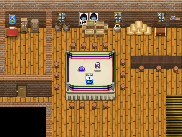
Anywho, Here's another version, probably final unless I change the bricks. I've changed the ring with a brand new one and added some minor things which most of you probably won't notice :).
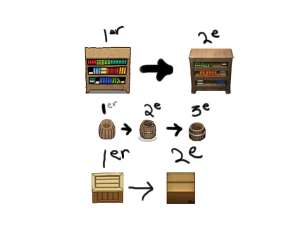
Just for fun, here's a before/after comparison:
Before:
After:
I'm getting complains about the bricks, yes.
Anywho, Here's another version, probably final unless I change the bricks. I've changed the ring with a brand new one and added some minor things which most of you probably won't notice :).
Just for fun, here's a before/after comparison:
Before:

After:

The Screenshot Topic Returns
Thanks for the comments as usual.
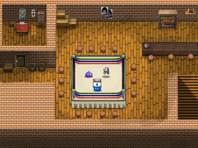
The ropes will be fixed, yes. I've been procrastinating about this because I'm doubtful as to how to improve it.
As for the stoots, good call. Problem is that is I reduce their size it'll become blurry and unwatchable which means I would need to sprite them in pixel art which I'm not good at.
The ropes will be fixed, yes. I've been procrastinating about this because I'm doubtful as to how to improve it.
As for the stoots, good call. Problem is that is I reduce their size it'll become blurry and unwatchable which means I would need to sprite them in pixel art which I'm not good at.
 Americana Dawn
Nah, NicoB called it like it is, let's not hide our head in the sand here. No big deal anyway, everybody ragequits and eventually return.
The Screenshot Topic Returns
Updooken!
I like to keep a record of my stuff as I got along to see how much I've progressed:
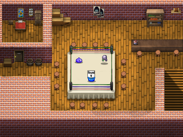
A new version of the ring, with most of the flaws fixed:
Once again, I'm looking forward to your criticism as to what to improve next :).
I like to keep a record of my stuff as I got along to see how much I've progressed:

A new version of the ring, with most of the flaws fixed:

Once again, I'm looking forward to your criticism as to what to improve next :).
 pano3.png
The Screenshot Topic Returns
Thanks for the feedback. I'll actually try what Chana suggested about centering things a bit more but will keep the same layout for the characters.
I just tried a new title screen today. I'd like to know if there are things you don't like about it so that I can change it. If you have ideas or suggestions of your own, I'm all ears.
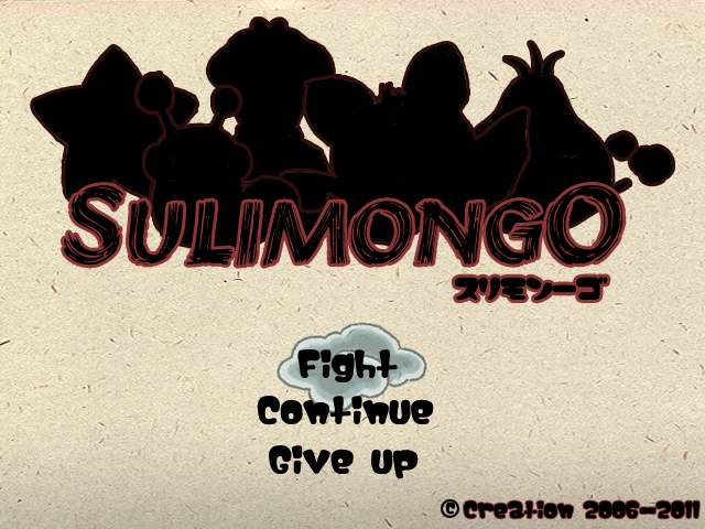
I tried going for the same kind of background as Okami. There are some white pixels that I've just noticed but those will be easy to fix.
I'm not looking for an out of this world title screen, just something good enough which gives a good impression.
The cloud flies in from the left and highlights your current selection. It's also going to be animated.

