


CREATION'S PROFILE

I translate games as I don't have enough time to make them.
Search
Filter
 Weird Dreams
As long as it's not past the deadline, what's the harm in updating the version of your game? I don't personally see any problems with that.
I watched the LT and I was kind of shocked as to how hard it was 0_o'. I mean, it's even harder than two-lips island! I think you would do the right thing in rebalancing the battles. Also, if the game is short, are you sure it's a good idea to have to grind so much? Just some things to consider.
Also: have you thought about putting arrows to guide the poor guy around? He had no idea where he could leave a map and that must have been a bit frustrating.
 NovellaRoses.png
I'm curious.
Do you sprite the characters one pixel at a time with the pen or do you use like a really small brush? I like the result and I'd like if you could tell me how you proceeed.
Do you sprite the characters one pixel at a time with the pen or do you use like a really small brush? I like the result and I'd like if you could tell me how you proceeed.
 Novella
I just watched the little video and I quite simply loved it. I applaud your creativity, it's nice to integrate gaming elements in such a different way.
This is the first game I am subscribing to.
This is the first game I am subscribing to.
 Giving Feedback: Pass or Fail
Whaling Revolution by Proto
You might notice there isn't any ''Pass'' or ''Fail'' logo at the end of the video. This was done on purpose. I'll still keep the concept for now but will integrate it in the first message of the thread (along with the rest of the rankings). I figured it really wasn't that important as the objective is mainly to give feedback, suggestions for things to work on. I might eventually get rid of the concept of ''pass'' or ''fail'' completely and just give a score/commments of the beginning of the game as the objective is to help, not to discourage people.
You might notice there isn't any ''Pass'' or ''Fail'' logo at the end of the video. This was done on purpose. I'll still keep the concept for now but will integrate it in the first message of the thread (along with the rest of the rankings). I figured it really wasn't that important as the objective is mainly to give feedback, suggestions for things to work on. I might eventually get rid of the concept of ''pass'' or ''fail'' completely and just give a score/commments of the beginning of the game as the objective is to help, not to discourage people.
 Well, here goes!
 The Screenshot Topic Returns
It's a mystery... which can be revealed if you donate loads of cash to the project.
But, seriously, is it ok like this or does it suck so much that you don't even know where to begin?
But, seriously, is it ok like this or does it suck so much that you don't even know where to begin?
The Screenshot Topic Returns
Wow, thanks for all the replies.
Yes, I see what you mean. The thing is, the tileset elements were all drawn at different times. I eventually became better at it which explains the discrepancy between the various elements. I didn't want to bother redrawing the older elements (like say the barrels) out of laziness but I guess I'll have no choice to do so.
If you have some time, I'd be great what if you could point out what in your opinion should be changed (poorly drawn elements) so that I can have a better consistency in quality.
Any suggestions for the door? I've actualy messed with it quite a bit but can't seem to reach a satisfying result.
The brick is blurry because I had to resize it in order to make it fit in a ''tile'' so to speak. It didn't strike me as being very blurry though.
I'll fix the top of the bookcase, good call.
You're talking about the ring, right? Alright, I'll what I can do.
The door is going into the wall, I was told it was sticking out too much so I tried to integrate it into the wall so to speak.
Could you be more precise about the ring. I don't really know how I could improve it based on your comment. It'd be great if you could provide some ideas/suggestions so that I can make the change because I don't really know what to do. I don't personally see a problem with the ropes being slightly curved like this. Are you saying that you think it would look better if they were straight?
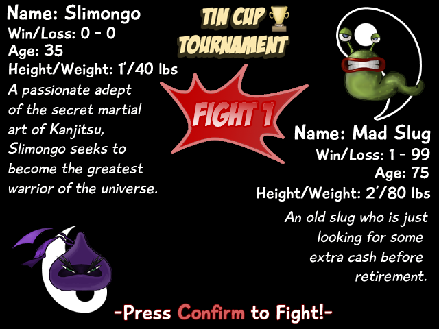
There's something else I'd appreciate input about.
I want to use a screen before each duel just like in ''Punchout'' for the nes:

I came up with this but I'm not happy with it. I think it could certainly be improved. I'd be interested in your ideas/suggestions for things to change, thank you:
I also changed the look of Slimongo, it looked bad before:

@Creation: Everything looks superb! Great art style there. Do you use some sort of textures?Thanks for the praise, I appreciate it. I use semi transparent texture on top of the armoire in the little room and on top of the book case.
Creation, that entire chipset is custom made by you? Really? That's pretty excellent, considering :oWell, I use the basic RPG Maker VX RTP as a model and try to redraw it in my own way so to speak.
Someone's little brick house does seem like an odd place for a boxing ring, but otherwise I have nothing negative to say about that screenie.It's supposed to be the bedroom of Slimongo, the protagonist of the game, so it's not really a house but more like a shabby room. I want the room to improve as the player earns more money from fights, as a representation of his ''status'' so to speak.
Except that maybe the posters are a little out of perspective, like they're flat while the wall is sloped Zelda-style.
Except that maybe the posters are a little out of perspective, like they're flat while the wall is sloped Zelda-style.Yes, good point, I'll need to fix that.
I like the look overall, but the tiles are just too different in quality and presentation. Layout is very good though, and the tile choice too, just that the quality doesn't match up.
Yes, I see what you mean. The thing is, the tileset elements were all drawn at different times. I eventually became better at it which explains the discrepancy between the various elements. I didn't want to bother redrawing the older elements (like say the barrels) out of laziness but I guess I'll have no choice to do so.
If you have some time, I'd be great what if you could point out what in your opinion should be changed (poorly drawn elements) so that I can have a better consistency in quality.
A lot of the tiles look fuzzy (in a bad way) especially the brick. Some of the object like the bookshelf are fuzzy and pixelated on the top. The door on the left room looks clean and stands out way too much.
Any suggestions for the door? I've actualy messed with it quite a bit but can't seem to reach a satisfying result.
The brick is blurry because I had to resize it in order to make it fit in a ''tile'' so to speak. It didn't strike me as being very blurry though.
I'll fix the top of the bookcase, good call.
the color and shading of the ropes stick out like a sore thumb compared to the rest of the tiles.
You're talking about the ring, right? Alright, I'll what I can do.
Dizzy... aren't the flour bags and the boxes (the bar?) slightly falling forwards (actually the 2 barrels on the right of the door are the only elements that seem to be standing straight up)? Also the door of the room looks like its going into the wall at the top. That ring definitely isn't too great (color, lining and how did those curves get there with the strings ?).I don't get this impression from the floor, the bags or the crates. But come to think about it, maybe you're right. I didn't strike me as being obvious when I first did the whole thing, but I do kind of get this impression when I look at it in greater detail.
Edit : for the "falling forward, maybe it's the floor tiles, would be better horizontal ?
Re-edit : That's a pretty thick wall on the right, but, why not?
The door is going into the wall, I was told it was sticking out too much so I tried to integrate it into the wall so to speak.
Could you be more precise about the ring. I don't really know how I could improve it based on your comment. It'd be great if you could provide some ideas/suggestions so that I can make the change because I don't really know what to do. I don't personally see a problem with the ropes being slightly curved like this. Are you saying that you think it would look better if they were straight?
the rope on the far side of the ring looks odd. It looks like it should go straight across instead of bow in a u shape or be placed beyond the edge of the ring instead of where it is ie. moving the horizontal lines 1 square "north" so that you see wood floor between the ropes, not ring.Ah yeah, ok, I see. You mean move up the poles higher in the corners so that the ropes show the floor in between them as opposed to showing the ring, correct?
There's something else I'd appreciate input about.
I want to use a screen before each duel just like in ''Punchout'' for the nes:
I came up with this but I'm not happy with it. I think it could certainly be improved. I'd be interested in your ideas/suggestions for things to change, thank you:

I also changed the look of Slimongo, it looked bad before:


