


DARIA'S PROFILE
Daria

71
I make games for fun, sometimes.
I also review RPGs on YouTube, sometimes.
I also review RPGs on YouTube, sometimes.
Search
Filter
 The Screenshot Topic Returns
@Lotus
Heh. I'm actually using XP with the default RTP. Although I've made some edits where needed.
To address a few points (although I appreciate the feedback!)
The lighting in this room is a. overhead or b. on the walls you can't see. Not to mention the windows that are visible from the exterior of the building. I'm not asking for a leap of imagination; I add lighting effects as overlay after the fact, so you will see light (if not the light source) in the final product. To be totally honest, after hand painting so many light maps... I was kind of trying to get away with a map that didn't have a ton of lamps plastered all over the place. XD The fireplace will also be lit, but I'm having issue with the fire event. Anyway I totally want to give the forge a red glow.
Also in the real world not all doors face north/south. The storage room is accessible from the east/west. Again, not a leap of imagination in other areas of my game you can pass under certain autotile ceiling trims. Players will be totally accustomed to this mapping technique long before they ever reach the blacksmith.
Carpet's not a bad detail, but I'm going to have to make one as nothing I currently have set up in my tileset looks right. I think I want something red.
The Screenshot Topic Returns
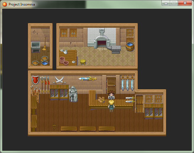
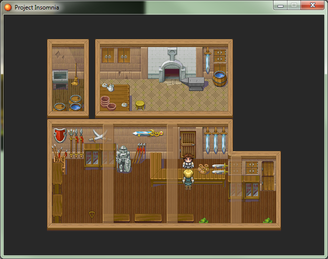
Okay, okay. I fixed the shadows ya broken record. :P
And tried out the smaller beams, I dunno. Still can't decide if this technique is cool or stupid.
For easier comparison, here are all the screens again.
Small beams
Large beams
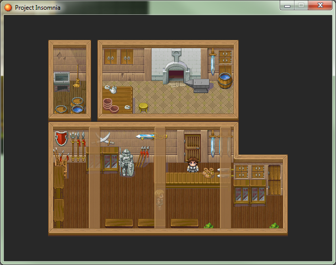
No beams
And tried out the smaller beams, I dunno. Still can't decide if this technique is cool or stupid.
For easier comparison, here are all the screens again.
Small beams
Large beams
No beams
The Screenshot Topic Returns
JosephSeraph: I thought of making the beams darker, but the ceiling trim autotile is lit from above. Thought they ought to match color.
And OOooh... 8bit-ish graphics. I love the style, although I have no idea what's going on in the first map.
And OOooh... 8bit-ish graphics. I love the style, although I have no idea what's going on in the first map.
 Tutorials, learning and hand-holding
author=LockeZ
It can be hard to figure out exactly how long I should wait before assuming the player is a dumbass, though.
"Mmm.. boss battle. That means sammich time!"
*later*
"Tutorial? WTF?!"
Seriously though. I like this solution too. Although you may want to have a prompt that asks the player if they would like to see the solution first.
The Screenshot Topic Returns
The Screenshot Topic Returns
Lockez: Actually they are transparent, but I need to lower the transparency (And make them less bright!). It's currently set to like 75% but since all my town interiors use one giant tileset I wasn't going to bother fixing it until I was done mapping. As it is I keep going back and adding items here and there. Thanks though. (:
Lotus: Oh there will be lighting. But this is one map in a queue of 39 others.
Note taken about the anvil shadows. Guess I forgot to draw it. Not sure what you mean by double ceiling, but it gives me an idea. Maybe some transparent ceiling beams? *runs off to experiment!*
Lotus: Oh there will be lighting. But this is one map in a queue of 39 others.
Note taken about the anvil shadows. Guess I forgot to draw it. Not sure what you mean by double ceiling, but it gives me an idea. Maybe some transparent ceiling beams? *runs off to experiment!*
What's in a Name?
author=8bitbeardauthor=SauceIndeed. This is the best way I think. This way you don't end up with names like Krn'umfalallak.author=Dyhaltoauthor=kentona^ Great minds think alike.
I usually look up baby names for a given gender and geography/culture that corresponds roughly with the culture that that character comes from in my game. And then I might take some creative liberties with the spelling.
Ditto. I'm happy if my names sound good and are believable. I'm not looking to express any sense of hidden literary allusions in my NPC names.
Bad puns are also totally acceptable for a chuckle.
Tutorials, learning and hand-holding
author=doomed2die
The problem with the aforementioned method being that an individual who passes through the boss fight without using the desired mechanic has learned nothing of the mechanic, and therefore, has gained no direction.
Each and every method has issues
-Box Popups: Can be boring, and even a little patronizing but can give the most information without too much of a hassle
-Video Tutorials: Can take too long but manages to add a more aesthetically appealing element to your tutorial.
-Grayoutalltheoptions Tutorial: Forces you to manually utilize the mechanic and discover its properties but can fail to convey the full of the information and takes away any sense of player control
-Forceyoutousetheoption Tutorial: It's merely hiding the fact thatyou're robbing the player of control...
It doesn't matter how you do anything; there are pros and cons. I personally think that the Text Popups are the best for games I play; I'm a fast reader and going through pointless battles and videos to learn mechanics seems unnecessarily long to me. But that may not apply to everyone.
I think the worst possible thing you can do is bore your players. Personally I like the idea of not-so-subtly encouraging the player to use the mechanic in a tailored battle. Like Crystalgate pointed out even if they don't pick up the intended lesson they still find a way to overcome the challenge, and if that's an issue then throw in a NPC later that reminds the player via a brief message. Eg. "When I was an adventurer I was nearly done in by a whelk. Let me tell you, I wouldn't be here bothering you today if I didn't learn how to counter attack!"
And if they die during the battle... well if you set up the battle to be easily conquered using the intended mechanic, and you made it obvious that the option was available to the player, then you did all you could do as a designer. Stupid players can't be helped and maybe dying was a lesson they needed to learn too.
Just don't preach to the lowest common denominator, it's patronizing for everyone else.
The Screenshot Topic Returns
Craze: Personally I'd edit the tile set so that the paintings hang lower on the walls. Seems like they're cutting into the ceiling trim and the comparison to the window height is even stranger. Also seems like shelf units should be scooted up a half tile. But again it's a tileset thing and not your mapping. Otherwise looks good to me.
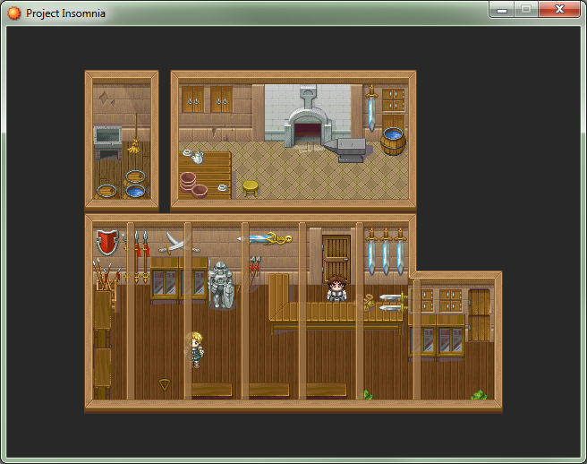
So finally mapped out my blacksmith/weapon shop. Didn't have an anvil so I had to draw it from scratch. I'm not a pixel artist, but I think it came out alright. I may try making a hammer to sit on top next. Also edited the barrel to contain water. I like my shops to be more cluttered than this, but all the weapon graphics are meant to face towards the player-- which makes it difficult to fill up the foreground with anything except the tops of display cabinets.
So finally mapped out my blacksmith/weapon shop. Didn't have an anvil so I had to draw it from scratch. I'm not a pixel artist, but I think it came out alright. I may try making a hammer to sit on top next. Also edited the barrel to contain water. I like my shops to be more cluttered than this, but all the weapon graphics are meant to face towards the player-- which makes it difficult to fill up the foreground with anything except the tops of display cabinets.

