


GREATREDSPIRIT'S PROFILE

sherman
o
o

Search
Filter
 Rubicante.PNG
You probably did what the developers expected you to do: Hit him until his HP hits zero. His AI script changes as he loses HP and he whips out more dangerous and party hitting moves. If you never do a lick of HP damage though, well you're free to raise his level until he hits 255 which is vulnerable to L5 Doom!
FF5 has a hilarious amount of crazy exploits.
FF5 has a hilarious amount of crazy exploits.
Rubicante.PNG
author=Camupinsauthor=SanaRubicante is one of the easiest bosses I have ever face in a Final Fantasy game... This is the hardest one I ever fought. :p
Agh! Not Rubicante~ This guy just loves to screw me over.. :P
http://finalfantasy.wikia.com/wiki/Enuo_(Final_Fantasy_V)#Battle
There's no such thing as a hard boss in FF5
optional.png
I certainly hope Bomb did more damage to Zeromus than it did to an imp in that demo video.
ps Bahamut is trash too. Use Nuke instead for instant case and reflect-glitches to ignore half of Big Z's HP and all the counters.
ps Bahamut is trash too. Use Nuke instead for instant case and reflect-glitches to ignore half of Big Z's HP and all the counters.
optional.png
optional.png
iirc there's four enemy drops summons in FF4. Imp, Bomb, Cockatrice (dummied out in FF2, not sure about FF4ET), and the Mage/MindFlayer.
spoilers they're all trash
spoilers they're all trash
Altima_by_Despite.png
choose3.jpg
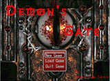
Upload the standalone portrait-picture and font and I'll try to make a mockup of what looks better and how to do it. (Paint can't do alpha channels which PNGs use so that is probably the cause of the white border)
This is bad typography. Labels and block text follow different rules when you select a font for easy readability. Using one font and turning on cruise control is not the proper way to do it.
Craze
Also, even if you like the font, be consistent. Use your text font for ALL the text.
This is bad typography. Labels and block text follow different rules when you select a font for easy readability. Using one font and turning on cruise control is not the proper way to do it.
choose3.jpg
The portrait of the guy looks awful like he was ripped from a JPG. It even has a white border around it. Also that font is simply awful. It looks like it was poorly resized never mind that the typography is just crappy for a label and text font.

