


JUDE'S PROFILE

Search
Filter
 What are you working on now?
post=213473
Now working on 64 scientists NPCs (32 x 2 genders. They'll make some of the labs alive, and also working on a little colony for FRANTIX.
Good god. Just make one of each gender and copy/paste. If it's an important NPC make them unique.
I'm scripting cut-scenes, which is pretty much the least fun thing ever.
 Craze Hates Dungeon Crawling
I'm a pretty big fan of dungeon crawlers and thought Etrian Odyssey 2 was awesome. I'm not real huge on Japanese-style "mysterious dungeon" games, though, except for a few of them (like Torneko). I think a lot of it stems from growing up playing games like Eye of the Beholder, so I kind of have a soft spot for it.
 MANOS: The Hands of Fate
 Prologue stuff...
post=213009
First one reminds me of Ninja Gaiden 2.
I looked to a lot of examples for intro scenes and the Ninja Gaiden games were definitely in mind.
 vh_title_04.png
post=212954
Just to be picky... the word 'NecropoliS' is placed too high on the screen. =P
Not really nit picky if you're right.
vh_07.png

Prologue stuff...
post=212882
Everything you've done so far looks damn amazing man. However, I think that castle could benefit from a little more texture. It looks sort of plain and blocky right now.
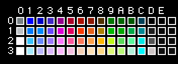
I have a limited palette to add too much texture. I actually violated the NES ruleset when I moved the title over the moon, which I have to go back and adjust (one of the reasons I nixed the first version as well, in addition to the gaudiness). I can only use four colors per object or tile, which includes the transparent color. The blockiness is okay with me. Here's the palette if anybody wants it, by the way:
 Necropolis
post=212496
this looks pretty sweet.
when will this be released?
Not soon. I'm maybe a week from finishing chapter 1. I'll decide around then whether or not it's substantial enough to make a demo.

