


LUIISHU535'S PROFILE

I'll be back.
Youtube: https://www.youtube.com/user/luiishu535
DeviantArt: http://luiishu535.deviantart.com/
Soundcloud: https://soundcloud.com/luiishu535
Tumblr: http://luiishu.tumblr.com/
Youtube: https://www.youtube.com/user/luiishu535
DeviantArt: http://luiishu535.deviantart.com/
Soundcloud: https://soundcloud.com/luiishu535
Tumblr: http://luiishu.tumblr.com/
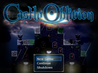
Castle Oblivion: Remake
Have you ever made a mistake you regretted so much that you wish it possible to turn back time?
Have you ever made a mistake you regretted so much that you wish it possible to turn back time?
Search
Filter
 RETROMANIA!
Congraturation! You've mak gam!
Just kidding; 'tis just an illusion devised by Nemera.
Go ahead dauntlessly!
Mak gam again, you must!
Just kidding; 'tis just an illusion devised by Nemera.
Go ahead dauntlessly!
Mak gam again, you must!
 Screenshot Survival 20XX
The screenshot in the spoiler tag is actually from Romancing Saga 3. xD I just included it to show where my latest inspirations come from.
I'm pretty sure that I'm able to create stuff in RS3's style, but it's not something that I'm going for entirely for my current project.
I'm pretty sure that I'm able to create stuff in RS3's style, but it's not something that I'm going for entirely for my current project.
Screenshot Survival 20XX
@suzy: Thank you! I love to add highlights here and there to give the visuals that extra oomph!
@SevensAce: Looks pretty dank, mate!
@SevensAce: Looks pretty dank, mate!
 sc1.png
Screenshot Survival 20XX
@Momeka: Yeah, readability is one of the things that's been on my mind a lot lately. I'm not sure how I should tackle this ATM, but I've been thinking about using a tweaked palette for the sprites so that they stand out more against the tiles. Another potential solution might be to just lower the saturation of the palette that's used for the tiles.
Your menu has a nice and simple design. I like it.
Your menu has a nice and simple design. I like it.
Screenshot Survival 20XX
@Kaempfer: I know what you mean! Thank you for the detailed explanation! I'll keep experimenting with the tiles and lightning to see what I can come up with.
@MarkusT: That's definitely a valid point and I hear you on that. It's definitely not THAT distracting to me. The main reason why I'm bringing it up is because this is a critique/feedback thread. Your game looks far from bad!
Here's a little thing I improvised last night.

I'm mostly just messing around with some different ideas, seeing what kind of patterns and textures I'm able to come up with. Lately, I've been getting more and more inspired by the pixel art of Romancing Saga 3.

The way this game handles colors is truly inspiring.
It's a bit hard for me to settle on a style since I'm so new to the whole pixel art (art in general) thing. I'm not entirely sure, but I believe that the style I want to go for is a bit similar to Professor Layton: London Life and Mother 3, with color choices similar to Romancing Saga 3.
@MarkusT: That's definitely a valid point and I hear you on that. It's definitely not THAT distracting to me. The main reason why I'm bringing it up is because this is a critique/feedback thread. Your game looks far from bad!
Here's a little thing I improvised last night.
I'm mostly just messing around with some different ideas, seeing what kind of patterns and textures I'm able to come up with. Lately, I've been getting more and more inspired by the pixel art of Romancing Saga 3.
The way this game handles colors is truly inspiring.
It's a bit hard for me to settle on a style since I'm so new to the whole pixel art (art in general) thing. I'm not entirely sure, but I believe that the style I want to go for is a bit similar to Professor Layton: London Life and Mother 3, with color choices similar to Romancing Saga 3.
Screenshot Survival 20XX
@Suzy: Thank you! I guess it's the resolution of the screenshot that makes it look like meh IMO.
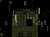
@Kaempfer: Thank you! My main inspiration for the wall tile and its lightning comes from Clock Tower (the SNES game). Here's a pic for reference:

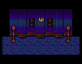
I haven't decided on a light source yet, but I'm thinking about adding candles/chandeliers to the wall.
@Rukiri: That sounds really cool! Best of luck with the project, mang!
@Momeka: Thank you! I literally know nothing about animation. xD Although, after looking at it again, I think it makes for a good "Hey, over here!" type of animation. xD Would it work better if I gave the arms an inward movement (moving closer to the body)? I can't move the arms more to the sides because I'm sadly out of grid space. Dx
I admire your attention to detail! If your project's going to have a more medium/biggish scope (30-75+ hours of gameplay), then I suggest you to just stick with general pictures of a level/area instead of having a picture for every map.
@Frogge: Thanks, buddy!
@Kaempfer: Thank you! My main inspiration for the wall tile and its lightning comes from Clock Tower (the SNES game). Here's a pic for reference:
I haven't decided on a light source yet, but I'm thinking about adding candles/chandeliers to the wall.
@Rukiri: That sounds really cool! Best of luck with the project, mang!
@Momeka: Thank you! I literally know nothing about animation. xD Although, after looking at it again, I think it makes for a good "Hey, over here!" type of animation. xD Would it work better if I gave the arms an inward movement (moving closer to the body)? I can't move the arms more to the sides because I'm sadly out of grid space. Dx
I admire your attention to detail! If your project's going to have a more medium/biggish scope (30-75+ hours of gameplay), then I suggest you to just stick with general pictures of a level/area instead of having a picture for every map.
@Frogge: Thanks, buddy!
HRDX_battle_samplers.png
 My mom found 40$ in my laundry. "Next time, I'm keeping it" fair enough mom.
$40!? Please fund my Kickstarter of me (maybe) attempting to make a game in Unity! If I won't make the game, I'll use the money for pizza.
Screenshot Survival 20XX
@Frogge: Some of those tiles don't loop that well. Otherwise, it looks pretty nifty, buddy!
@MarkusT: Looks pretty good, but I'm not a fan of how some things seem to be a mix of digital and pixel art. I'd personally pick one style and stick with it for consistency.
@Rukiri: Making a LoZ fan game? It looks promising!
Here's my first animation!

Also, here are some dumb tiles I just made (not done yet).
I'm trying to go for a more painterly look.
@MarkusT: Looks pretty good, but I'm not a fan of how some things seem to be a mix of digital and pixel art. I'd personally pick one style and stick with it for consistency.
@Rukiri: Making a LoZ fan game? It looks promising!
Here's my first animation!
Also, here are some dumb tiles I just made (not done yet).
I'm trying to go for a more painterly look.

