


S. F. LAVALLE'S PROFILE
S. F. LaValle

1069
Search
Filter
 Aftermath__Warning_for_lower_level_parties.png
Relax. You're being totally unreasonable. If VX rtp is all you can find, fine. People are going to be critical of it, but big deal. Don't take every comment as a personal attack.
VS_Teaser_Banner_September_2011.png
Yes, it's a double standard. Why does this bother people?
Look, none of us would be using ripped sprites if we could have them made to suit our own purpose. We all know this, and we all look the other way using sprites from commercial games.
The issue I have is that we feel the need to take sprites made by a member of the amateur community (I'm presuming based on the responses) for their own game. Not because I enjoy being a hypocrite, but because there are plenty of other resources out there you could be stealing, made by companies whose artists have already been paid for, and subsequently forgotten about these works for years or decades. Who cares if it's a double standard. That which makes a particular amateur game unique from others should not be free game for all simply due to "ethical consistency." It's common sense.
Hanzo, I don't know enough about the source material to make judgments beyond the concerns others have been stating, so I'm not explicitly accusing you of any wrongdoing. Do note, however, that RMN will typically take corrective action when a plagiarism complaint is made relating to materials created by another community member. Nocturne is not a member of RMN specifically, but I personally believe all RM communities in any part of the world are entitled to that mutual respect. Use this information as you will, but I don't think the request to remove or alter your banner or other posted content displaying ripped amateur resources is unreasonable.
FinalTitle.png

Arc1.jpg
Everybodys_Happy.png
Haha. People like Craze complain too much about this "tile vomit." The path you need to go is clear, and the map is pretty.
SS2.png
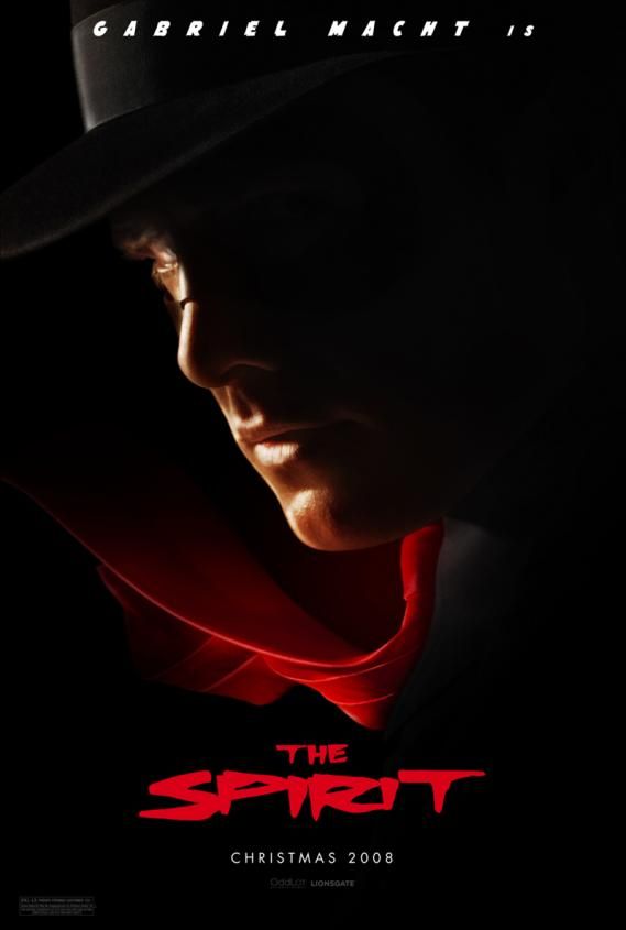
I looked at the word "Spirit" and the first thought that came to my mind was, "Isn't that the same font used for the movie 'The Spirit'?"
http://screenrant.com/wp-content/uploads/the-spirit-full-size.jpg
I'm not too far off =)
There's some things I like going on, and some things that I think could use work. Overall, functionally, it's just fine. Just needs some pizazz (the HP/TP/Spirit font, WIP is right about, it's kinda misplaced pizazz).
Everybodys_Happy.png
They fit much better now =) It definitely wouldn't bother me at all at this point. You may have liked the fact that they stood out a bit and added some flavor to the scene. In that case, you might be able to get some of that variation back by playing around with the hue of the leaves some now that the saturation/contrast matches better. Note, that's not a suggestion, I think it looks fine as is =) Just giving you some ideas if you're not as happy with it as you were before.
Final_Battle_Setup.png
But trust me I'm not very photoshop savvy
Lies! Else, who did your CSS backdrop, your battle UI, and your logo? =) I'd still like to know how the logo (not the text itself but the backdrop for it) was done.
Final_Battle_Setup.png
Looks pretty nice and solid for a 3-man party interface. Here are not so much criticisms, but what I would be thinking about if I had this design:
- All due props to your artist, but Sienna has a real Cousin It thing going on ^^ It's pretty wild!
- Fonts, which may or may not be temporary. The serif font (Times New Roman) isn't so bad, but I'm sure you could find something classier. The bitmap font used by Tankentai is pretty bad. I can help you with this if you need it, but it's just a matter of creating a new bitmap set to use (you seem Photoshop-adept enough).
- The ring menu looks cool, but it would be nice to offer a better way of determining which icon is the currently "selected" one. Sure, it has the command name when it's highlighted, but instantly knowing which icon is "highlighted" helps navigation so that people can find the command they want.
- I know you get a lot of flak for using XP resources. It doesn't really bother me, and in fact I like how you use them. A few simple photoshop edits would make them look considerably better though. First and foremost, the shadows. XP used a terrible gray for its shadows than plain black at 50 (or whatever) percent. This is an insanely easy fix, as using a non-contiguous selection will select all of the shadows on the chipset, which you can then simply fill black (it should retain its 50% opacity). Secondly, I know a few people offered to adjust the hue and contrast of the trees. I'd take them up on it =) It's a simple fix which can vastly improved results.
Keep up the good work!

