


ARCAN'S PROFILE

Search
Filter
 The Screenshot Topic Returns
The background (walls floor etc.) is drawn with a more detailed and realistic style while the sprite is cartoony with super visible outlines, exaggerated proportions and limited use of color which naturally makes them contrast. I was also thinking the setting looks very modern while the character appears to be wearing something you would see in dbz. What do you mean the shadows are programmed into the software?
The Screenshot Topic Returns
The color scheme ain't bad but that sprite doesn't fit on many levels and though I like the use of shadows some of them don't make sense.
The Screenshot Topic Returns
The Screenshot Topic Returns
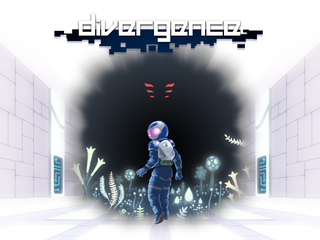
One set of flowers is clearly much darker than other and the carpet sticks out because it's brighter, more saturated, and more complex than it's surroundings which draws more attention than anything else and makes it look like it should be part of the wall. I'd be curious to see how these tiles are used in the actual game.
The Screenshot Topic Returns
Cool map but the flowers in the top room don't match in style and though the carpet is really cool it feels out of place.
 Badass Mapping Contest
Seems like nobody is planning anything for the next contest and I've got a lot of free time. If Tau or Blindmind have something in the works you guys can go ahead otherwise I will take over and start something up soon.
The Screenshot Topic Returns
Version 1 has better sprites but version 2 fits better with the background. The problem is that the background is just not good so trying to match the sprites to it is a waste of time imo. If you still insist on that background then I suppose you should go with version 2 but fix some things.

1. blur on the shield
2. shoes became much less detailed
3. spear is too pixelated
4. sword seems too high compared to where the hand is at
5. hair has become pointy which is starting to grow on me
6. weird shape of arm and super thick outline
1. blur on the shield
2. shoes became much less detailed
3. spear is too pixelated
4. sword seems too high compared to where the hand is at
5. hair has become pointy which is starting to grow on me
6. weird shape of arm and super thick outline
 How to Beat the Map Tree Break (the Easy Way)!
How to Beat the Map Tree Break (the Easy Way)!
Much easier way is to copy the whole corrupt project folder into a different location such as your desktop and open it from there. No work needed.

