


Description

Some of you might not know what a Release Something! Day (RS!D) is. Basically, it's a day where you release something - anything! - in order to get feedback from the community.
Release Something! Days used to be a regularly occurring events back when the community had a problem with releasing stuff. It was created as a way to encourage sharing, collaboration, feedback, and content in the community. The aim is to truly try to capture the spirit of releasing something.
It is not about prepping a major release, or making something in a fury to have something new to show for the event. It is about showing your works-in-progress, getting feedback, and checking out what other people are working on. Like a snapshot of RMN's development community.
WHATTA RELEASING?
Music, tiles, sprites, graphics of any type, gameplay (videos of gameplay tests are good), tech demos, demos - even completed games (but don't strive for a finished product; that's not the point of RS!D).
GOTTA HAVE RULES
- To 'Release Something' just upload it straight to this event page. Sign in/up, then hit 'Submit' in the top right corner of the page and browse until you find the file you want to 'Release'. Voila~
- You can release more than one thing, but try to make sure it's something you've been working on at least recently (say, in the last month or so). Keep it relevant!
- Release all through the weekend.
- DO NOT steal the things you see here, if someone wants feedback on a resource or script. I doubt we have to say it, but it's worth saying just in case someone uses the 'but you never said...' shit to justify being a fuckwit.
- To give feedback, use @username and then hide tags (depending on length and amount of feedbacks in post. So, for example:
@Liberty
[hide]this page is pretty awesome but hey, I think you need to work on your logo making abilities because holy shit giiiiirl[/hide]
GOTTA GET GOODIES
There will be a badge worth 10 MS for releasing something. One per person.
Best feedback givers will also get a badge worth 20 MS. Because the feedback is what counts most!
Just to re-iterate: You are releasing something :ANYTHING: that you have done on your project over the last month or two. It can be a screenshot, a face image, planned dialogue, a script snippit, a resource, a demo (if you have one on hand) or a video of a system or anything like that. It does not have to be something that you whip up over this weekend - in fact, it's HIGHLY ENCOURAGED that you NOT do that! Just dump something in! Or a few somethings!
GO GO GO GO GO GO GOTTA GO FASTER!!!!
Details
- 01/15/2016 11:59 PM
- 01/18/2016 11:59 PM
Achievements


Registration
You must be logged in to sign up for Release Something: Gotta Go Fast!!!.
 AraFellGreenlight_0000_TitleAraFellcopy2.png
 AraFellGreenlight_0001_TitleAraFellcopy.png
 AraFellGreenlight_0002_TitleAraFellcopy5.png
 AraFellGreenlight_0003_TitleAraFellcopy4.png
 AraFellGreenlight_0004_TitleAraFell.png
 AraFellGreenlight_0006_TitleAraFellcopy6.png
 utVZj4G.png
 OverworldIconsRawr.png
 20160118_05050.png
 Eliciaattack3.gif
 01_Fairy_Spirit.jpg
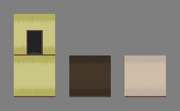 walls_and_door.png
 milla3.png
 milla_test.png
 milla_test_2.png
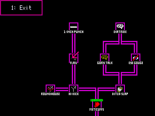 Skill_System.PNG
 High_Kick_Skill_Card.PNG
 One_Inch_Punch_Skill_Card.PNG
 minty.gif
 Battlers_1.png
 Ship_Bridge_WIP.png
 Ship_1.png
 Port_Town.png
 INTRO_03.PNG
 INTRO_04.PNG
 INTRO_05.PNG
 Screenshot_20160113_130013.png
 Screenshot_20160113_125854.png
 releasesomething1.png
 WeDroveThemOverTheCliffs.png
 FirstScene.png
 Menu.png
 Untitled.png
 KILL_THE_CLOWN_Title_Screen_Concept_Art.png
 FaceSets.png
 Screenshot_1.png
 Screenshot_2.png
 map01a.png
 map06e.png
 map08a.png
 t2.png
 t4.png
 t5.png
 tactics1.png
 tactics2.png
 tactics3.png
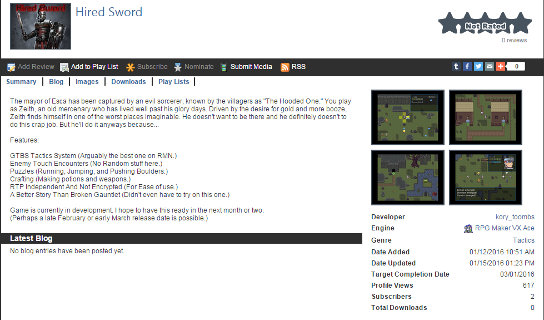 GamePage.png
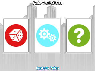 Rule_Variations.png
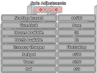 Rule_Adjustments.png
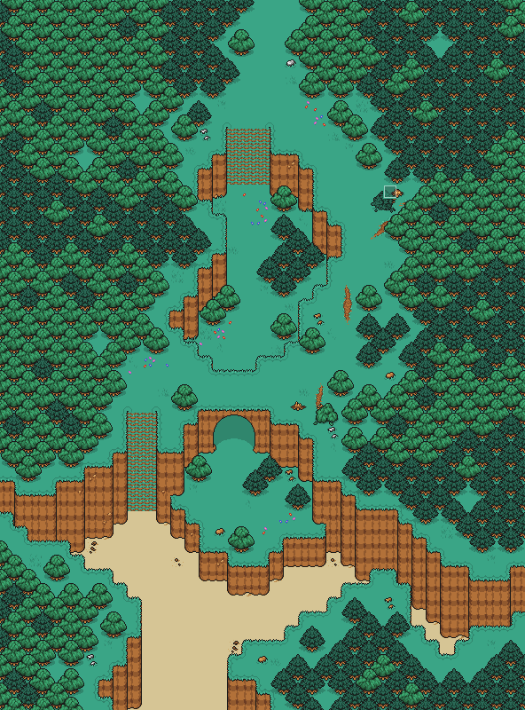 BeachWoods_2_Map.png
 CW_DevShot_8.png
 OWF_Sketch.png
 HolographicStnad.png
 Map010.png
 Chaos.png
 Kezia.png
 TheSerpent.png
 TheWeepingAngelEffectIsReal.png
 MMC_MultiMedia_Center.png
 Tech_Room.png
 TRACE_System_1.png
 WhenTutorialsGoCanon.png
 WhyDidIComeBackHereAgain.png
 X__Xenarthra.png
 New_Shop_Menu_1.png
 Shop_Menu_tweaked.png
 endhouse.PNG
 grave.PNG
 Blob2.gif
 Weird_And_Unfortunate_Battle_Animation1.png
 Weird_And_Unfortunate_Battle_Animation2.png
 Weird_And_Unfortunate_Monsters.png
 1760.jpg
 1947.jpg
 backgrounds.jpg
 SuperHomicideDetectiveTitle.png
 SHDApartment.png
 SHDBattleTest.png
 SHDCafery.png
 SHDCrimeScene.png
 SHDGunnery.png
 SHDMap.png
 SHDMorgue.png
 SHDOutfittery.png
 SHDStatusScreen.png
 Issac_Swordsman.png
 SKETCHES_DREAMSCAPE_PHANTASM_COLLECTION.png
 Sketch_Collection_2.png
 Sketch_Collection_4b.png
 Buttheart2.png
 Critter_Sketch_Collection.png
 sketch_collection_3b_1.png
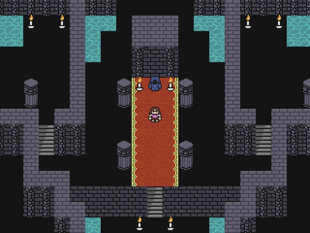 The_Keep.png
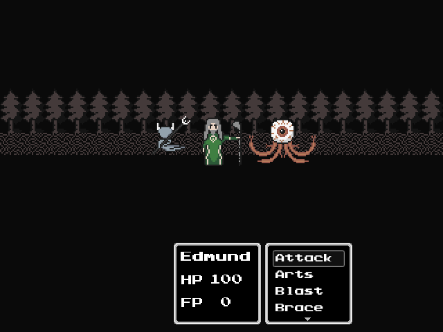 Battle_Layout_WIP.png
 IMG_48771.JPG
 PowerUps.gif
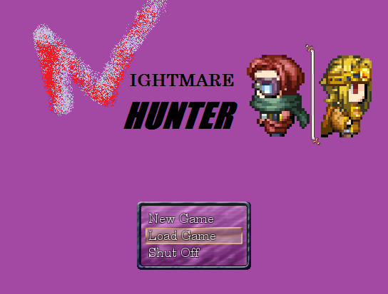 NightmareHunter_3.png
 NightmareHunter_4.png
 NightmareHunter_1.png
 NightmareHunter_2.png
 NightmareHunter_5.png
 Test2.gif
 DrAxton_Normal.png
 Sona_Normal.png
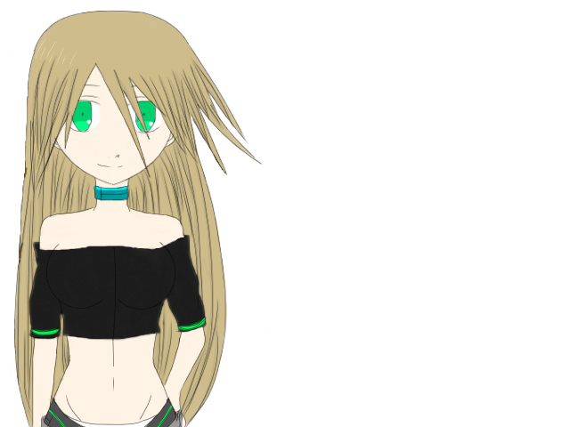 Echo_Normal.png
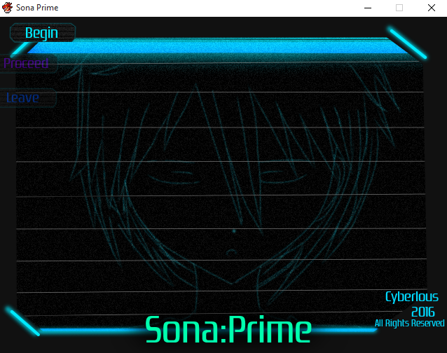 Title_Art.png
 Sona_Battler_1.png
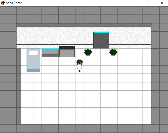 Screenshot01.png
 __38.png
 __39.png
 __40.png
 StealthSystem.png
 Rival.png
 CeltiaInGame.png
 Cooking.PNG
 Cookingv14.PNG
 Cooking_v20.PNG
 maison_dvasion.jpg
 attic.png
 la_cuisine.png
 weird_geometry.png
 better_gemetry.png
 waterfields.png
 better_weird_geometry.png
 monument.png
 unfinished_map_layout.png
 title.png
 wordbubbl.gif
 starworld.gif
 1.png
1.png 2.png
2.png 3.png
3.png 4.png
4.png 5.png
5.png J0e.png
 Coach_Imani.png
 Art_Teachers_Kama_Ananta.png
 Music_Teacher_Amna.png
 clip0010.gif
 clip0003.gif


