


HOW CAN I IMPROVE MY MAPS ?
Posts

http://rpgmaker.net/games/4454/
Hi guys,
I need some tips on improving my maps. Apparently, many people who tried my game said that the mappings need some fix. But they didn't really elaborate what exactly was wrong, so I don't know where and how to fix the maps.
I hope you guys can check out the game and tell me what I should change.
Thanks. ;)

Your classroom interiors seem really wide and vast. If you go into a class room it usually takes a couple of paces to go across the width. Classrooms are usually built to narrow the students so they're not looking to their right/left to look at the teacher. Basically make them less wide.
Your exteriors make no sense to me I cannot tell if it's a world map or even an area I can recognize. If it's a world map, make the roads way smaller so they take up 1 or 2 tiles in width. If it's a suburb or some kind of city make actual buildings that take up the blocks. Also there's a lot of inconsistent props (cacti, palm trees, regular trees all in the same area?). Consistency would be nice to establish the climate.
I think overall you need to be efficient with your space, and think about how long it takes to get from point a to point b.
Your classroom interiors seem really wide and vast. If you go into a class room it usually takes a couple of paces to go across the width. Classrooms are usually built to narrow the students so they're not looking to their right/left to look at the teacher. Basically make them less wide.
Decrease the width ? So that means I should increase the height as well, right ?
I suppose I should move the desks up 1 tile, too ?
Your exteriors make no sense to me I cannot tell if it's a world map or even an area I can recognize. If it's a world map, make the roads way smaller so they take up 1 or 2 tiles in width. If it's a suburb or some kind of city make actual buildings that take up the blocks. Also there's a lot of inconsistent props (cacti, palm trees, regular trees all in the same area?). Consistency would be nice to establish the climate.
You 're talking about the town, correct ? No, it 's not a world map, that 's a normal area. I would have used bigger buildings, but I just can't find any satisfied modern tilesets. About the trees, they represent the difference in height and size, but I would make some changes as well if necessary.
LockeZ

I'd really like to get rid of LockeZ. His play style is way too unpredictable. He's always like this too. If he ran a country, he'd just kill and imprison people at random until crime stopped.
5958
You need to establish at least a semi-consistent sense of scale. As a general rule, a tile is about two to three feet (about two thirds of a meter to a meter).
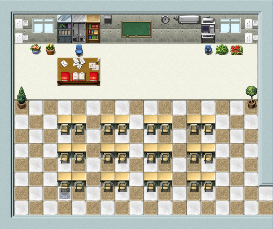
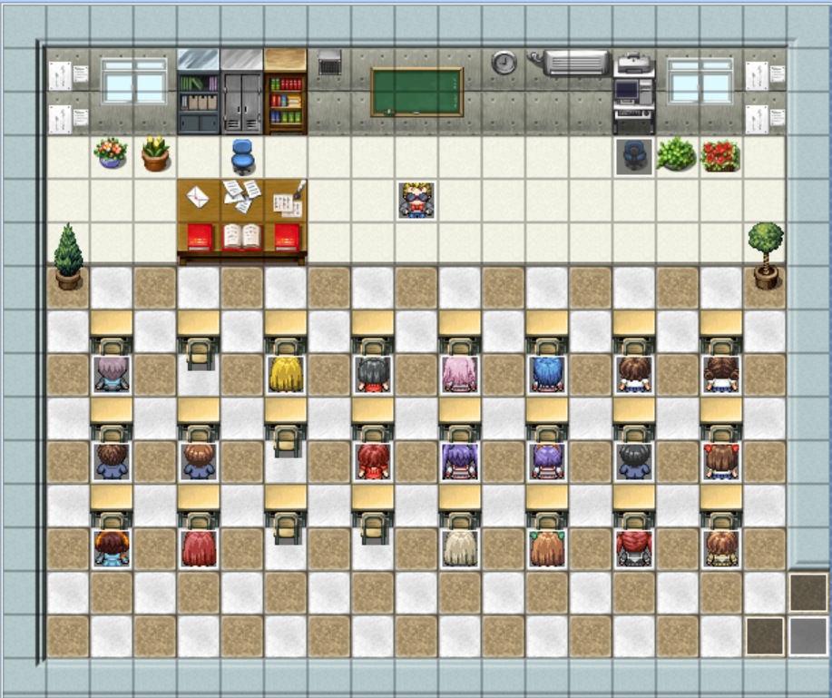
How big is a classroom in real life? It's not as big as yours. There's not enough space between the desks to fit one and a half more desks. There's barely enough to walk between. Make it so only every other column of desks has an empty row in between it - the students will still be able to get out that way. The area for the professor is also ridiculously huge, it's the size of an auditorium stage. He only needs about a single row of 3-5 tiles up there, tops. Plus, for coherency reasons, the player should be able to see the chalkboard and the back row of desks at the same time. Try to fit a single room on a single screen when you can.
Don't increase the vertical space - decrease that too. Get rid of empty tiles. If tiles are redundant and samey then start putting different things on them. For example, give the students' desks different notebooks, binders, books, etc. sitting on top of them.
Your outdoor maps are horrible, sorry, I think you will just need to delete them and start over. Pick either overworld map scale or normal scale and stick with it. I know you have... seen cities in video games before, right? Find a modern video game that you like the outdoor segments of, and try to mimic how it lays the areas out. It doesn't have to be an RPG. You don't need RPG style five-building towns if you don't want them. Maybe you want to do it like old adventure games, having a list of buildings you can travel between, and when you choose one from the list you show up outside the building. Maybe you want to do it like Persona, showing what looks almost like a satellite view of the entire city at once, giving the player a tiny cursor they can walk through the streets with. All I know is that you definitely don't want to do it the way you're doing it now.
I can try to help. (•D•)/ ... (>3<)/
My sister is a lot like this, lol...
- keep attentive of what you see around u and try to copy it into ur maps.
- try to make the environment like a dream come true for anyone (lol). Something that u look at and say "wow, i really wish i could be there..!!"
- try to add lots of little details, like variations in the terrain, borders on walls, lights, windows, rugs, flowers, desks, etc. think of it like art class.
- try to roughly think of what you want the map to look like before u do anything... Like a school assignment. Or think of a theme and build around it (like i want an elegant garden, i want a run-down library, etc)
- try to practise mapping random maps, or practise trying out different concepts on the same map. If that doesn't work, u might want to practise a craft that involves perception and art for a bit. It will prolly help u a lot in developing your sense of space and colour.
I hope i could help u. I tried to keep it short.
I want to ask though, do u like mapping?.. (•o•) (•A•) if u dont like it, that would b giving u some trouble, too...
- keep attentive of what you see around u and try to copy it into ur maps.
- try to make the environment like a dream come true for anyone (lol). Something that u look at and say "wow, i really wish i could be there..!!"
- try to add lots of little details, like variations in the terrain, borders on walls, lights, windows, rugs, flowers, desks, etc. think of it like art class.
- try to roughly think of what you want the map to look like before u do anything... Like a school assignment. Or think of a theme and build around it (like i want an elegant garden, i want a run-down library, etc)
These are exactly what I was doing. I tried putting a lot of details and decorations as possible. All the maps were created based on real life or existing maps from Mega Man Battle Network.


The area for the professor is also ridiculously huge, it's the size of an auditorium stage. He only needs about a single row of 3-5 tiles up there, tops. Plus, for coherency reasons, the player should be able to see the chalkboard and the back row of desks at the same time. Try to fit a single room on a single screen when you can.
An auditorium stage !? That was about the size of my typical classes. The area was sized for decorations, like desks, computer, windows, board, bookshelves. Also, the teacher 's area was a little big because of the desk and chair tiles. No, I can't fit a the whole into a single screen.

This is my attempt at creating a smaller classroom.
Your outdoor maps are horrible, sorry, I think you will just need to delete them and start over. Pick either overworld map scale or normal scale and stick with it. I know you have... seen cities in video games before, right? Find a modern video game that you like the outdoor segments of, and try to mimic how it lays the areas out. It doesn't have to be an RPG.
I 'll see what needs to be fixed and fix them. Also, the town was based on ACDC Town from MMBN with some differences.
LockeZ
I'd really like to get rid of LockeZ. His play style is way too unpredictable. He's always like this too. If he ran a country, he'd just kill and imprison people at random until crime stopped.
5958
No, your typical class was not the size of a basketball gym, with one third of its area being open space for the teacher to walk around. The classroom photo you linked is like a fourth the floor space of your original screenshot classroom.
A picture's worth a thousand words, so here's my own first attempt at editing this for you:

- Removed all the empty floor space.
- The computer and shelves were floating in midair above the wall. The bases of them weren't on the ground, they were in the air in front of the walls! Your soda machines in the fountain screenshot have a similar problem. I moved them down half a tile, so they're now sitting on the ground up against the wall.
- Removed the windows. Classrooms don't have windows on the same wall as the chalkboard, because you would be blinded while trying to look that direction. They have windows on the sides instead.
- No plants, mostly because no room for them. You could probably fit one if you wanted. Five is ridiculous.
- Teacher's desk sort of jutting into the desk space instead of having empty area beside it. Your photo does this too. This helps fit more desks in the same space. It's done in real classrooms for the same reason. It could also be in the corner, that's another common arrangement. I'm not super happy with the way it looks right now in my edit, being corner-to-corner with two of the student desks. I would probably move left two tiles to the corner of the room, and change which desks get deleted accordingly.
- There was no wall on the exit leading out of the room, in the lower right corner. Didn't make sense. I put a wall there.
- Smaller desk. An executive might have a five by eight foot desk, but a high school teacher doesn't. You should consider finding an actual desk graphic instead of a table, and recoloring the wood to be as close as you can manage to the same color as the student desks.
- Also, removed the quill from the desk, because seriously, there's a computer right there. If you like those papers, edit the tileset to just delete the quill and leave the papers on that tile. I feel pretty sure you're not gonna ever need a quill in your game. Maybe replace it with a pen.
- The left part of that back wall is still pretty empty. You should add some dorky motivational poster there if you end up with empty wall space. High school teachers always have those hanging up. A cat hanging from a tree branch with the text HANG IN THERE or something.
- If it were possible I'd even move the desks closer together. Classrooms are seriously cramped, your chair is always touching the desk behind you. I don't think it's possible to do in a tile-based map and have characters sitting in the desks, though. You'd have to put the desks halfway between two tiles, which is a perfectly good way to place non-interactive furniture like those cabinets, but doesn't work so great when you want people sitting in the chairs. You can't put events halfway between two tiles, after all (not without more work than you're probably willing to do, anyway). Maybe someone else has a solution for that.
A picture's worth a thousand words, so here's my own first attempt at editing this for you:
- Removed all the empty floor space.
- The computer and shelves were floating in midair above the wall. The bases of them weren't on the ground, they were in the air in front of the walls! Your soda machines in the fountain screenshot have a similar problem. I moved them down half a tile, so they're now sitting on the ground up against the wall.
- Removed the windows. Classrooms don't have windows on the same wall as the chalkboard, because you would be blinded while trying to look that direction. They have windows on the sides instead.
- No plants, mostly because no room for them. You could probably fit one if you wanted. Five is ridiculous.
- Teacher's desk sort of jutting into the desk space instead of having empty area beside it. Your photo does this too. This helps fit more desks in the same space. It's done in real classrooms for the same reason. It could also be in the corner, that's another common arrangement. I'm not super happy with the way it looks right now in my edit, being corner-to-corner with two of the student desks. I would probably move left two tiles to the corner of the room, and change which desks get deleted accordingly.
- There was no wall on the exit leading out of the room, in the lower right corner. Didn't make sense. I put a wall there.
- Smaller desk. An executive might have a five by eight foot desk, but a high school teacher doesn't. You should consider finding an actual desk graphic instead of a table, and recoloring the wood to be as close as you can manage to the same color as the student desks.
- Also, removed the quill from the desk, because seriously, there's a computer right there. If you like those papers, edit the tileset to just delete the quill and leave the papers on that tile. I feel pretty sure you're not gonna ever need a quill in your game. Maybe replace it with a pen.
- The left part of that back wall is still pretty empty. You should add some dorky motivational poster there if you end up with empty wall space. High school teachers always have those hanging up. A cat hanging from a tree branch with the text HANG IN THERE or something.
- If it were possible I'd even move the desks closer together. Classrooms are seriously cramped, your chair is always touching the desk behind you. I don't think it's possible to do in a tile-based map and have characters sitting in the desks, though. You'd have to put the desks halfway between two tiles, which is a perfectly good way to place non-interactive furniture like those cabinets, but doesn't work so great when you want people sitting in the chairs. You can't put events halfway between two tiles, after all (not without more work than you're probably willing to do, anyway). Maybe someone else has a solution for that.
I really appreciate your effort on going to such length to elaborate. :D
I agree with the way the maps should be fixed, but I can't agree with the way to made it look in the above picture. So, I am going to re-locate things around.
What I am really curious about is how did you move a tile down by half ?? I would separate the desks by half a tile as well since students aren't suppose to sit that close to avoid copying.
I tried. But the view is from the top, so if I put something on the sidewall or back-wall, it would look like they are on the "top" of the wall.
Forget real classrooms then... I 'll try something different like spacing them out a bit, but not too ridiculous. This is suppose to be a rich school in the modern, after all.
I agree with the way the maps should be fixed, but I can't agree with the way to made it look in the above picture. So, I am going to re-locate things around.
What I am really curious about is how did you move a tile down by half ?? I would separate the desks by half a tile as well since students aren't suppose to sit that close to avoid copying.
The left part of that back wall is still pretty empty. You should add some dorky motivational poster there if you end up with empty wall space. High school teachers always have those hanging up.
I tried. But the view is from the top, so if I put something on the sidewall or back-wall, it would look like they are on the "top" of the wall.
If it were possible I'd even move the desks closer together. Classrooms are seriously cramped, your chair is always touching the desk behind you. I don't think it's possible to do in a tile-based map and have characters sitting in the desks, though. You'd have to put the desks halfway between two tiles, which is a perfectly good way to place non-interactive furniture like those cabinets, but doesn't work so great when you want people sitting in the chairs. You can't put events halfway between two tiles, after all (not without more work than you're probably willing to do, anyway). Maybe someone else has a solution for that.
Forget real classrooms then... I 'll try something different like spacing them out a bit, but not too ridiculous. This is suppose to be a rich school in the modern, after all.
LockeZ
I'd really like to get rid of LockeZ. His play style is way too unpredictable. He's always like this too. If he ran a country, he'd just kill and imprison people at random until crime stopped.
5958
Moving stuff by half a tile is mostly just a matter of opening the tileset in your image editor, copying the tile to a blank spot, and moving it down 16 pixels so it takes up the bottom half of one tile and the top half of another. You'll probably end up with a tileset that looks something like this:

If the bottom half of the tile is empty, the tile should be walkable. Since the hero's feet are at the bottom edge of whatever tile he's standing on, it looks perfectly fine to have him standing on a tile in which the top half of the tile is the bottom part of a cabinet or something. For example, in my edited screenshot, the player would be able to walk in front of the shelves and the computer, as though they weren't there. Because they don't jut out into the tile enough for it to make sense to block movement.
Though for my example, I just edited your screenshot itself in Photoshop. I don't even have VX Ace. :)
But like I said, you're not gonna be able to do it that easily for the students themselves. The only way to really put the students halfway between two tiles would be to turn the students into tiles instead of charsets, which would be a massive pain in the ass, or to add pixel movement to your game, which is probably not something you want to do (though it might be?). And if you don't do it for the students, you can't do it for the desks (the students need to be lined up with the desks, after all).
No no no, I meant the north wall, the wall visible to the player. That area of wall behind the teacher's desk looks bare. There are already the papers hanging on it, but adding a poster hanging on it next to the papers would look nice. I updated my edit of the map to show what I mean; reload the page and you can see it.
...poster should probably be in Japanese if you really do that, though
If the bottom half of the tile is empty, the tile should be walkable. Since the hero's feet are at the bottom edge of whatever tile he's standing on, it looks perfectly fine to have him standing on a tile in which the top half of the tile is the bottom part of a cabinet or something. For example, in my edited screenshot, the player would be able to walk in front of the shelves and the computer, as though they weren't there. Because they don't jut out into the tile enough for it to make sense to block movement.
Though for my example, I just edited your screenshot itself in Photoshop. I don't even have VX Ace. :)
But like I said, you're not gonna be able to do it that easily for the students themselves. The only way to really put the students halfway between two tiles would be to turn the students into tiles instead of charsets, which would be a massive pain in the ass, or to add pixel movement to your game, which is probably not something you want to do (though it might be?). And if you don't do it for the students, you can't do it for the desks (the students need to be lined up with the desks, after all).
author=Mr_DetectiveThe left part of that back wall is still pretty empty. You should add some dorky motivational poster there if you end up with empty wall space. High school teachers always have those hanging up.I tried. But the view is from the top, so if I put something on the sidewall or back-wall, it would look like they are on the "top" of the wall.
No no no, I meant the north wall, the wall visible to the player. That area of wall behind the teacher's desk looks bare. There are already the papers hanging on it, but adding a poster hanging on it next to the papers would look nice. I updated my edit of the map to show what I mean; reload the page and you can see it.
...poster should probably be in Japanese if you really do that, though
Understood.
Now that 's the class, what about the School Entrance, Tiwn and the House ?
Someone said the School doesn't make any sense at all. For the Town, I still can't find any modern tileset for the houses. I could delete the little trees, but the for the houses or buildings, I am stuck.
By the way, I noticed something else : When a dialogue occurs, it sometimes appears on top of the characters, or overlap. Should I fix this ?
LockeZ
I'd really like to get rid of LockeZ. His play style is way too unpredictable. He's always like this too. If he ran a country, he'd just kill and imprison people at random until crime stopped.
5958
There's a simple event command that changes where the message box is shown. If you have a cut scene where the characters are standing on the bottom four rows of tiles on the map, it's good to flip the text boxes up to the top for that scene. If you just have wandering NPCs with one or two boxes of dialogue who sometimes end up down there, it's not worth caring about them.
I never felt like there was any problem with using the RTP for modern buildings. Some of the walls are granite or log cabins, but others are just solid colors and look perfectly fine. There's one wall that looks like strips of wooden siding - if you recolored it in photoshop you could probably turn it into white painted siding, like many modern houses have.
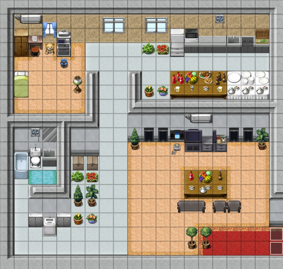
Inside of the house is way too big, far moreso than the classroom. Remember, each tile is about two or three feet. How big is your bedroom? How wide is your hallway? Look at some houses in commercial RPGs to compare the sizes and layouts. I try to make my houses about this size, which is a little small for a typical two-story house in the US, but appropriate for most other countries or for a lower-class house in the US:

You did mention the characters are upper-class, so if you want the character to live in a mansion, then the size you have it is okay, but the layout is not. There still wouldn't be all that empty space. I don't know what to tell you to fill it with, though. Columns, maybe? Artistic paintings, family portraits, little tables with sculptures on them? Nice looking carpets I guess? Wandering butlers? Floor pillows for a ridiculous-looking tiny dog to sleep on? 500 inch televisions? I know high ceilings help give off a feeling of size and are popular even in middle-upper class houses - you can get the same effect in RPG Maker by making the walls three or four tiles tall instead of two.
I never felt like there was any problem with using the RTP for modern buildings. Some of the walls are granite or log cabins, but others are just solid colors and look perfectly fine. There's one wall that looks like strips of wooden siding - if you recolored it in photoshop you could probably turn it into white painted siding, like many modern houses have.
Inside of the house is way too big, far moreso than the classroom. Remember, each tile is about two or three feet. How big is your bedroom? How wide is your hallway? Look at some houses in commercial RPGs to compare the sizes and layouts. I try to make my houses about this size, which is a little small for a typical two-story house in the US, but appropriate for most other countries or for a lower-class house in the US:

You did mention the characters are upper-class, so if you want the character to live in a mansion, then the size you have it is okay, but the layout is not. There still wouldn't be all that empty space. I don't know what to tell you to fill it with, though. Columns, maybe? Artistic paintings, family portraits, little tables with sculptures on them? Nice looking carpets I guess? Wandering butlers? Floor pillows for a ridiculous-looking tiny dog to sleep on? 500 inch televisions? I know high ceilings help give off a feeling of size and are popular even in middle-upper class houses - you can get the same effect in RPG Maker by making the walls three or four tiles tall instead of two.

OK... This is what I have at the moment... And I don't mean to be a jerk, but... It feels so weird, like... less fancier and darker ?
There's a simple event command that changes where the message box is shown. If you have a cut scene where the characters are standing on the bottom four rows of tiles on the map, it's good to flip the text boxes up to the top for that scene.
But sometimes you will have text boxes on the bottom, middle, or top. Wouldn't that be inconsistent ?
I never felt like there was any problem with using the RTP for modern buildings. Some of the walls are granite or log cabins, but others are just solid colors and look perfectly fine. There's one wall that looks like strips of wooden siding - if you recolored it in photoshop you could probably turn it into white painted siding, like many modern houses have.
The default feels really outdated so I didn't use them. I 'll try to recolor them like you said.
Inside of the house is way too big, far moreso than the classroom. Remember, each tile is about two or three feet. How big is your bedroom? How wide is your hallway
Well a house must be bigger than a classroom. My current house in real life is very similar to that in the game. Those empty spaces are for you to walk. And again, I did look at maps from professional games as examples. All the maps were created based on real life or existing maps from Mega Man Battle Network.
Is this better ?

I'd like to think I've been making some marginal progress with making classrooms using default graphics. Yeah, I know these are not the default graphics, but that's what I work with.

When making maps, smaller is always better. If you can make something smaller without affecting the core of the map's design, make it smaller. If you have open space, remove it unless your map is supposed to be spacious. If you think your map is small enough, make it smaller still because chances are you're still drawing your maps too big.
LockeZ's maps came out good because they're trying to be as small as realistically possible. You may think large maps are overall better, but they really aren't. Large maps lack detail, lack substance, and are bland.
LockeZ's maps came out good because they're trying to be as small as realistically possible. You may think large maps are overall better, but they really aren't. Large maps lack detail, lack substance, and are bland.
OK, I got it. I 'll cut the map down a little more.
By the way, do I have to include those black spaces outside the map ?
By the way, do I have to include those black spaces outside the map ?
LockeZ
I'd really like to get rid of LockeZ. His play style is way too unpredictable. He's always like this too. If he ran a country, he'd just kill and imprison people at random until crime stopped.
5958
When your room doesn't take up your entire screen - which, I'll point out, should really be the case in every single indoor map in your game - the black area is used to fill in the rest.
If the map goes up to the edge of the screen, and you don't have black area around it, that is a cue to players that walking to the edge of the map will take you to another map. If that's not the case in your maps (and even moreso if it's the case in some of your maps but not others), you are confusing the players.
If the map goes up to the edge of the screen, and you don't have black area around it, that is a cue to players that walking to the edge of the map will take you to another map. If that's not the case in your maps (and even moreso if it's the case in some of your maps but not others), you are confusing the players.

Speaking of black area in maps, I have this weird peeve where every map I make has to have a ten tile buffer so that the player sprite is always centered, rather than the camera getting stuck on edges.
author=Jude
Speaking of black area in maps, I have this weird peeve where every map I make has to have a ten tile buffer so that the player sprite is always centered, rather than the camera getting stuck on edges.
That is something to keep in mind.
Phew... I don't think I can cut down anything else... :)
Speaking of black area in maps, I have this weird peeve where every map I make has to have a ten tile buffer so that the player sprite is always centered, rather than the camera getting stuck on edges.
That is something to keep in mind.
So I should add about 10 black tiles to all sides on every map ?

Alright, so here are a few tips.
1 - Never underestimate the wall overlap technique. This makes your map look more realistic. You're looking at the map at a 3/4-ish view, so you won't be able to see what is directly behind the walls. Most walls are 2 tiles high, so there are 2 tiles worth of space behind them, hiding things from you.
2 - Shift Mapping. Holding Shift while placing auto tiles allows you to place the middle tile instead of the outer ones. This helps with edging issues, like with your carpets, how the design on the edges makes the carpet look like it's oddly cut. (Most carpets being square or rectangular.) Holding Shift while placing the carpet tile will make it look more like the red carpet has been thrown over the peach one.
The second part of Shift Mapping is this: When holding Shift you can copy an exact tile and if you hold Shift while placing it, it will remain the same. Shift+Right mouse click to copy, Shift+Left mouse click to place. This helps out a lot with autotile placement too.
3 - Learn how to conserve space. Give a rough estimate to your tiles and stick by them. I tend to think of tiles as equal to two steps. Others have different measurements. The deal is to make it consistent. Also, outsides vs inners. Make a concentrated effort to make them at least consistently the same size each time. (I like to make insides about 2x the sizes of the houses outer shell. It gives me room and helps when scaling all areas.)
4 - Don't decorate for decorations' sake. It's okay to break this rule sometimes, but putting pots and flowers and shit all over just to take up room means that you have too much room. You'll see in my rendition of your maps what I mean.
5 - Keep in mind what the map is supposed to be and what is needed in it. Also, for inners, the people who live there and their personalities. If a Carpenter runs a shop inside his house he'll have carpentry tools around. If you have a sailor or fisherman they'll have fishing and sailing equipment indoors. If a bachelor, not likely to be flowers and cute stuff around.
6 - A bed for everyone! Or at least allude to it. If you have a house with a three person family, unless they are very, very close they won't just have one bed between them. You could have doors on walls that are locked or just won't open to show that there are other rooms to a house if you don't want to expand the inners too much, but remember the people who live in the house need to have places to sleep too.
7 - The outside =/= the inside. If you're trying to make an outside that is the same size as your inside it will come off looking very dull and bad most of the time. (There are cases of this working, but not often and not likely with the RTP tiles.)
8 - Nature vs nurture. Nature is hectic, wild and untamed. The farther you go into lands that are unexplored, the less likely bushes, trees and flowers will line up in rows. Cliffs should not be unbroken lines, water should not be a long straight one-tile river, paths will not be just straight lines and grass does not grow in 3x3 clumps. Make things more random.
Whereas in towns you will usually find more structure. Gardens, while in some cases still a bit random, will usually be more carefully planned. Trees are found in rows, grass either mowed or cared for and streets run usually in straight lines.
A way to get better: Study/look at other maps in 2D commercial games. Not 3D games - they have more graphical shit to work with. Also, try to practice by recreating maps that you like in the maker. Experiment with things and find out what looks good and what doesn't.
Also, asking for input is a great idea. Good job~
Now, map edits:
I did a bit of cut and paste (it's pretty choppy) but you can see that the size is quite reduced. Mainly I added some overlapping aspects in the bedroom and kitchen, got rid of a line of plants and a box (dunno why they were there anyway) and make things cosier.

As for the school, two versions:

First one I got rid of the plants because unless this is a class about plants they weren't needed. This freed up some room to enclose a bit and added and extra window.

The second one I made it 3x4 instead and made the bookshelves at the back of the room as though overlapped by the wall. The setup looks a lot better in my opinion. Also, what's with the yellow poster?
1 - Never underestimate the wall overlap technique. This makes your map look more realistic. You're looking at the map at a 3/4-ish view, so you won't be able to see what is directly behind the walls. Most walls are 2 tiles high, so there are 2 tiles worth of space behind them, hiding things from you.
2 - Shift Mapping. Holding Shift while placing auto tiles allows you to place the middle tile instead of the outer ones. This helps with edging issues, like with your carpets, how the design on the edges makes the carpet look like it's oddly cut. (Most carpets being square or rectangular.) Holding Shift while placing the carpet tile will make it look more like the red carpet has been thrown over the peach one.
The second part of Shift Mapping is this: When holding Shift you can copy an exact tile and if you hold Shift while placing it, it will remain the same. Shift+Right mouse click to copy, Shift+Left mouse click to place. This helps out a lot with autotile placement too.
3 - Learn how to conserve space. Give a rough estimate to your tiles and stick by them. I tend to think of tiles as equal to two steps. Others have different measurements. The deal is to make it consistent. Also, outsides vs inners. Make a concentrated effort to make them at least consistently the same size each time. (I like to make insides about 2x the sizes of the houses outer shell. It gives me room and helps when scaling all areas.)
4 - Don't decorate for decorations' sake. It's okay to break this rule sometimes, but putting pots and flowers and shit all over just to take up room means that you have too much room. You'll see in my rendition of your maps what I mean.
5 - Keep in mind what the map is supposed to be and what is needed in it. Also, for inners, the people who live there and their personalities. If a Carpenter runs a shop inside his house he'll have carpentry tools around. If you have a sailor or fisherman they'll have fishing and sailing equipment indoors. If a bachelor, not likely to be flowers and cute stuff around.
6 - A bed for everyone! Or at least allude to it. If you have a house with a three person family, unless they are very, very close they won't just have one bed between them. You could have doors on walls that are locked or just won't open to show that there are other rooms to a house if you don't want to expand the inners too much, but remember the people who live in the house need to have places to sleep too.
7 - The outside =/= the inside. If you're trying to make an outside that is the same size as your inside it will come off looking very dull and bad most of the time. (There are cases of this working, but not often and not likely with the RTP tiles.)
8 - Nature vs nurture. Nature is hectic, wild and untamed. The farther you go into lands that are unexplored, the less likely bushes, trees and flowers will line up in rows. Cliffs should not be unbroken lines, water should not be a long straight one-tile river, paths will not be just straight lines and grass does not grow in 3x3 clumps. Make things more random.
Whereas in towns you will usually find more structure. Gardens, while in some cases still a bit random, will usually be more carefully planned. Trees are found in rows, grass either mowed or cared for and streets run usually in straight lines.
A way to get better: Study/look at other maps in 2D commercial games. Not 3D games - they have more graphical shit to work with. Also, try to practice by recreating maps that you like in the maker. Experiment with things and find out what looks good and what doesn't.
Also, asking for input is a great idea. Good job~
Now, map edits:
I did a bit of cut and paste (it's pretty choppy) but you can see that the size is quite reduced. Mainly I added some overlapping aspects in the bedroom and kitchen, got rid of a line of plants and a box (dunno why they were there anyway) and make things cosier.
As for the school, two versions:
First one I got rid of the plants because unless this is a class about plants they weren't needed. This freed up some room to enclose a bit and added and extra window.
The second one I made it 3x4 instead and made the bookshelves at the back of the room as though overlapped by the wall. The setup looks a lot better in my opinion. Also, what's with the yellow poster?

