


HOW CAN I IMPROVE MY MAPS ?
Posts

OK, this is what I have at the moment. The lower left will be a construction site, as if a new house is being built. The bottom middle will be an underground train station, though I am not sure how to make it yet... :D
And chana, I tried your suggestion, it 's quite good. :)

Do you guys think the town looks modern enough ?
Oh, one more thing, you guys notice how there is no shadow around the houses ? I don't like the way they look, so I deleted them. Should I put the shadow back ?
And chana, I tried your suggestion, it 's quite good. :)
Do you guys think the town looks modern enough ?
Oh, one more thing, you guys notice how there is no shadow around the houses ? I don't like the way they look, so I deleted them. Should I put the shadow back ?

If by modern you mean contemporary, then, yes, it definitely looks modern enough. One thing, though, that yellow sidewalk looks a bit weird, it should be concrete, so grey, also, detail, on the right of the middle house in the middle row there's a tiny bit of shadow that makes the house look 1 cm wide!
I know, but I was asking should I put the shadows back or it 's okay if I delete them ? :P
I am not sure which of these 2 tiles is better... :D

UPDATE : I believe this is good enough. ;)

I am not sure which of these 2 tiles is better... :D
UPDATE : I believe this is good enough. ;)
Right, I like those whitish tiles too, it's definitely looking much more sidewalk-like; now I would, maybe, "earthen" (like the ones leading to the doors) the horizontal paths between the houses that are not sidewalks, see if it works?

No, I meant the horizontal pathways only between 2 houses and only up to the vertical sidewalk (you can't have the earth cut the pavement like in the bottom houses left and right), there is 1 on the left, 1 in the middle and 2 on the right, at least it's an idea as these pathways are not sidewalks since they don't follow a street, see what I mean?
Oh... I get what you mean now ! :D
Those paths are actually sidewalks. Notice those white lines for pedestrians ?
They are supposed to be connected to a straight sidewalk and continue toward the right and left side.
Those paths are actually sidewalks. Notice those white lines for pedestrians ?
They are supposed to be connected to a straight sidewalk and continue toward the right and left side.
oh, ok, then don't forget to undo that extra bit of earth path where they cut the sidewalks. Basically it's looking great at this point, the construction site is a bit "woody", do you have anything more industrial?
do you have anything more industrial?
No... Nothing beside some light pole :P
And for the brown house in the middle, should I change it or leave it ?

All that 's left is the train station, which is going to be tough. :D
*Whoops : There is a lava tile on the right that accidentally got in, I 'll fix that.*
I would leave it, it makes for variety and looks fine. Otherwise, maybe just take out the dead trees and also the tree stumps, and add much more cut wood as if for the construction of a wooden house or something?
Edit : As for the shadows I wouldn't bother, and yes, definitely this
V
V (i.e. post below)
Edit : As for the shadows I wouldn't bother, and yes, definitely this
V
V (i.e. post below)

Thanks guys ! :D Well, the thing I am kinda concerned about is that, it seems kinda outdated and stand out compared to the others. :P
And I really had a hard time with the train station, so this is the best I could came up with. :(

That 's only the entrance, I haven't done the interior yet...
And I really had a hard time with the train station, so this is the best I could came up with. :(
That 's only the entrance, I haven't done the interior yet...
Looking at the shadow of the train station, I'm thinking you could do as much for the houses (now!). The construction site is looking better, and the train station is fine I guess, is the greenery behind necessary?
LOL I removed all the shadows because I don't like them. But if it 's necessary, I can easily put them back again. :P
And yeah, the trees were there to make the train station less boring.
Now I am going to work on the school interior.
And yeah, the trees were there to make the train station less boring.
Now I am going to work on the school interior.
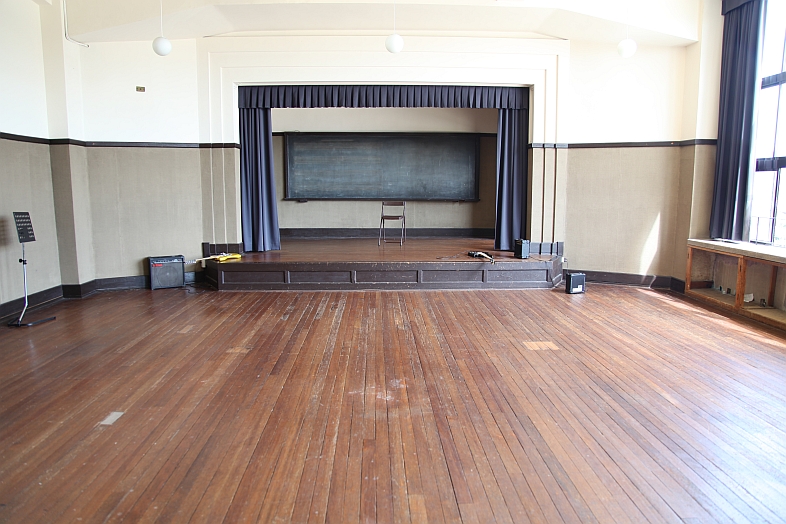
This is the Light Music Clubroom from K-On :D I 'm not really sure how to make that stage at the top yet :P

http://www.cuso4.org/photos/20100922-kix/20100922-kix-ko.htm
http://www.cuso4.org/photos/20100922-kix/20100922-kix-ko.htm

For one, make the back wall one tile less since you've got the curtains hanging on it and it's too large. You want to keep it the right size and consistent.

Here's an example of something I did with a stage. Notice that the back walls for the stage are one tile less than the rest of the walls because the stage naturally puts the level higher by one tile.
Here's an example of something I did with a stage. Notice that the back walls for the stage are one tile less than the rest of the walls because the stage naturally puts the level higher by one tile.
For one, you shouldn't put a window next to the stage : if it's going to go inside the wall, it's hard to beleive there would be a window there; then, the wall doesn't look right, I would hold down shift when doing the top part of the curtains, but it's hard to see much as long as the stage is not done.
Oh, and congrats for all you've done already, looking really nice and phewww! quite a job, no?
(huh.. you don't intend to make a map for every picture you've linked..?)
Oh, and congrats for all you've done already, looking really nice and phewww! quite a job, no?
(huh.. you don't intend to make a map for every picture you've linked..?)
OK... How is this ? :D

Hm... The room feels really dark without windows, and the tiles aren't helping it, either... Oh and I tried holding down shift like you said, it looked awful. XD
Yeah, it could really be a pain to do all these maps. :P I have yet to do the school interior, which will be the next difficult challenge. Without you guys, I am hopeless. :D
For one, you shouldn't put a window next to the stage : if it's going to go inside the wall, it's hard to beleive there would be a window there; then, the wall doesn't look right, I would hold down shift when doing the top part of the curtains,
Hm... The room feels really dark without windows, and the tiles aren't helping it, either... Oh and I tried holding down shift like you said, it looked awful. XD
Oh, and congrats for all you've done already, looking really nice and phewww! quite a job, no? (huh.. you don't intend to make a map for every picture you've linked..?)
Yeah, it could really be a pain to do all these maps. :P I have yet to do the school interior, which will be the next difficult challenge. Without you guys, I am hopeless. :D
Firstly, the 'floor' is a ceiling tile.
Secondly, I'd make the stage a bit wider. This is a room where you can get away with a bit more 'room' since it's supposed to be an area where a large group can congregate. Also either make the height of the back wall and curtains one tile less or make the side walls one tile higher since the stage is a 'step up' from the base floor.
What kind of room is this supposed to be? Is it a drama room or an assembly hall? If it's a drama room (where drama and acting is taught) then the lockers, table and board is fine (even if, in my experience, most drama classes are taught in normal classrooms and any acting is moved to the assembly/auditorium, so this doesn't really make sense.)
If it is an auditorium/assembly hall, get rid of the table, lockers and board. Make the room double the length and you could probably add a small door at the back of the stage (it can just be a locked on if you don't want to make a backstage area) to give at least the illusion of a backstage area.
Have you ever been in a hall?

