


SCREENSHOT SURVIVAL 20XX
Posts
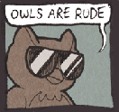


LockeZ

I'd really like to get rid of LockeZ. His play style is way too unpredictable. He's always like this too. If he ran a country, he'd just kill and imprison people at random until crime stopped.
5958
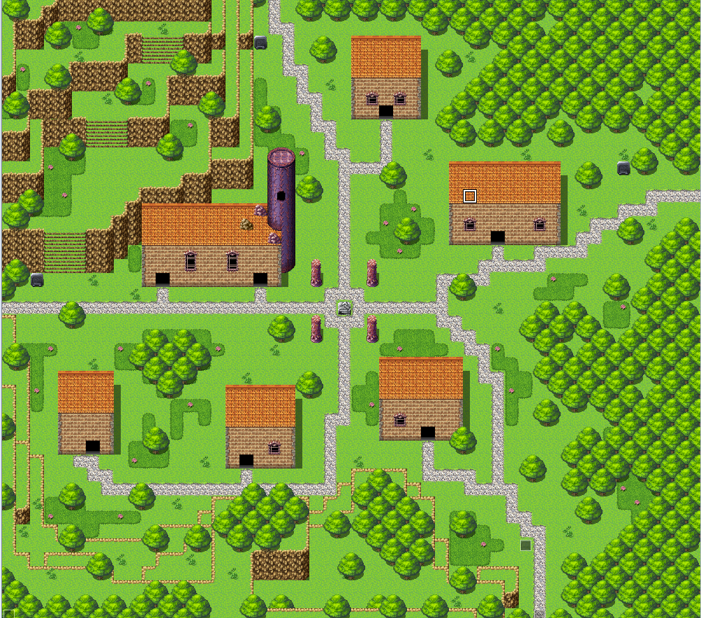
In the town, I would scoot those two houses in the lower left part upward so that their doors can be clearly seen from the east-west road through the middle of the town - that way the player can tell whether there's a sign over the door or not just by walking past. And also move the building in the upper right part to the left, so that it can be seen from the north-south road through the middle of the town. Generally you can probably scooch everything together unless there's an entire layer of outdoor shopping stalls or crowded military events that you're not showing.
Forest is okay. I usually create more of a semi-defined path, either with actual barriers or just with different ground tiles, so the player has some kind of sense of whether they're making progress in the dungeon or not.
Forest is okay. I usually create more of a semi-defined path, either with actual barriers or just with different ground tiles, so the player has some kind of sense of whether they're making progress in the dungeon or not.
I made two slightly different animated start screens. Which one do you all like, and do you have any other suggestions?
Option 1
Option 2
What you can't notice in the screenshots is that the busts kinda float up and down and there are red sparky particle effects that float up. Also, the circle rune thing rotates.
I definitely have an opinion, but I'm too close to everything to know if what I'm thinking is right. Thanks!
Option 1

Option 2

What you can't notice in the screenshots is that the busts kinda float up and down and there are red sparky particle effects that float up. Also, the circle rune thing rotates.
I definitely have an opinion, but I'm too close to everything to know if what I'm thinking is right. Thanks!

I like the one with just the girl better. Although, I'm not sure about the choice to have the busts bounce up and down. I'd have to see it to be sure how I feel about it.
My, my... so many excellent screens, I'm even getting jealous :o It's a true joy to lurk around this place, seeing so many cool screenies it sure motivates you!
@Erilex/Kefka: man, I only hope that game doesn't take five years to be completed, because just by seeing the aesthetics of it, it instantly reminds me of DS and I want to play it badly. Judging by the creepy men in the background, will it have religious overtones like DS did?
@Chilly: I'm really digging that style man. At first it gave me an Earthbound vibe, then the differences became evident, but I still like the style a lot. Isometric is not something you see everyday.
@Punkitt: cute battle layout, the most interesting of all is the battle background. Cool stuff. Wouldn't it better if the HUD numbers were white tho?
@JosephSeraph: cool platform system and nice graphics, I like the aesthetics of it, and the movement seems to be smooth. I've seen the progress from where you started up until now :3
@Koopa: not much to say about your screen, those tiles I've always loved 'em. Also, that guy seems to be in trouble!
__________________________________
I wanted to say that I've read the feedback you guys gave me (I don't remember the nicks but I think it was Caladium and other people, sorry I'm a goldfish) even if I didn't respond anymore to this thread, or to them. Anyways, I've been lurking all this time and changing lots of stuff from my game, specially because I do not want it to be all RTP, even if I can't have custom assets I still want to make it a little different from the rest. Just a little.
So that said, I gotta add that what I've changed is: tilesets, sprites, windowskin and the font. I'm looking for feedback on how this message style looks
External link
@Erilex/Kefka: man, I only hope that game doesn't take five years to be completed, because just by seeing the aesthetics of it, it instantly reminds me of DS and I want to play it badly. Judging by the creepy men in the background, will it have religious overtones like DS did?
@Chilly: I'm really digging that style man. At first it gave me an Earthbound vibe, then the differences became evident, but I still like the style a lot. Isometric is not something you see everyday.
@Punkitt: cute battle layout, the most interesting of all is the battle background. Cool stuff. Wouldn't it better if the HUD numbers were white tho?
@JosephSeraph: cool platform system and nice graphics, I like the aesthetics of it, and the movement seems to be smooth. I've seen the progress from where you started up until now :3
@Koopa: not much to say about your screen, those tiles I've always loved 'em. Also, that guy seems to be in trouble!
__________________________________
I wanted to say that I've read the feedback you guys gave me (I don't remember the nicks but I think it was Caladium and other people, sorry I'm a goldfish) even if I didn't respond anymore to this thread, or to them. Anyways, I've been lurking all this time and changing lots of stuff from my game, specially because I do not want it to be all RTP, even if I can't have custom assets I still want to make it a little different from the rest. Just a little.
So that said, I gotta add that what I've changed is: tilesets, sprites, windowskin and the font. I'm looking for feedback on how this message style looks

External link

I was thinking of updating my game's skill descriptions with coloured text and skill icons. Does it look OK, or is it too... busy?


I kind of like it better without them.
On the other hand they make it easier to focus on essentials of the text.
On the other hand they make it easier to focus on essentials of the text.

I'd suggest the description to be "The user's Attack power is doubled...", buuuut, that might be a bit of a nitpick!
Maybe instead of coloring percentile, perhaps coloring the status effect name? If you feel the need to shorten it later, you can change it to something like:
Doubles user's attack power, gain Poison (50%) and Bleed (50%).
Doubles user's attack power, gain Poison (50%) and Bleed (50%).
I thought about that, but the reason I added the icons is because some skills interact with those states, so it's easier to recognise for players that way. Though I have reworded the skill description to "The power of the user's Attack doubles, and gains a 50% chance to inflict or , or both."
This is what I used to have, but I think it would be easier to misread that it would also benefit physical skills, which is not the case with this effect. It only boosts the power of the Attack command.
Thanks all for the feedback. :)
author=Marrend
I'd suggest the description to be "The user's Attack power is doubled...", buuuut, that might be a bit of a nitpick!
This is what I used to have, but I think it would be easier to misread that it would also benefit physical skills, which is not the case with this effect. It only boosts the power of the Attack command.
Thanks all for the feedback. :)

How does the color look for the blue text? Is it too light? Does it work well with the aesthetic? Should "INFO" be some other color?

author=Merlandese
How does the color look for the blue text? Is it too light? Does it work well with the aesthetic? Should "INFO" be some other color?
I think the blue is perfectly readable, though a little drop shadow might help things too.
One thing I would consider purely for readability's sake: unless you have a consistent scheme in the entire game where names are pink and nouns are blue, I would group the colors by phrase. So make "Ion a root or wood gift" one color, and so on. That would help me associate it in my head much more easily (though I am a visual learner so that could just be me).
The blue looks fine, but I would keep the 'or' in between 'root' and 'wood' black, unless they're meant to be grouped together like that.
Thanks, guys! Good to know. I might try out some drop shadows and see if it works. :)
Yeah, it's consistent. The names themselves are drawn from a set text variable that have BBCode written into them so they always pop into color.
It does looks bad like that. The "or" is part of the term, though. It's procedurally pulled out from set terms, and right now I just haven't figured out a single term for "root or wood" things. That's also why the whole passage reads a bit stiff. What people like or don't like are semi-randomly altered before every game, and characters sometimes mention it, so the terms and structure have to accommodate unpredicted setups.
Thanks again for the feedback, guys. :)
author=Deltreeauthor=MerlandeseOne thing I would consider purely for readability's sake: unless you have a consistent scheme in the entire game where names are pink and nouns are blue, I would group the colors by phrase.
How does the color look for the blue text? Is it too light? Does it work well with the aesthetic? Should "INFO" be some other color?
Yeah, it's consistent. The names themselves are drawn from a set text variable that have BBCode written into them so they always pop into color.
author=Milennin
The blue looks fine, but I would keep the 'or' in between 'root' and 'wood' black, unless they're meant to be grouped together like that.
It does looks bad like that. The "or" is part of the term, though. It's procedurally pulled out from set terms, and right now I just haven't figured out a single term for "root or wood" things. That's also why the whole passage reads a bit stiff. What people like or don't like are semi-randomly altered before every game, and characters sometimes mention it, so the terms and structure have to accommodate unpredicted setups.
Thanks again for the feedback, guys. :)
Red_Nova

Sir Redd of Novus: He who made Prayer of the Faithless that one time, and that was pretty dang rad! :D
9192
I was showing Prayer of the Faithless to some dev buddies at school, and almost all of them hated how the message windows look with the busts.
The original layout:
They all said the window + bust combination covered up most of the screen and detracted from the map and sprites, and suggested that I condense it so that the writing and art don't step on each other's toes.
Here's my attempt:
Is the new one better or worse? I'm not a fan of having less space to write in, but if I have to condense dialogue, this may be a good opportunity to punch it up a bit more to bring out more charactertization.
The original layout:

They all said the window + bust combination covered up most of the screen and detracted from the map and sprites, and suggested that I condense it so that the writing and art don't step on each other's toes.
Here's my attempt:

Is the new one better or worse? I'm not a fan of having less space to write in, but if I have to condense dialogue, this may be a good opportunity to punch it up a bit more to bring out more charactertization.
author=Red_Nova
I was showing Prayer of the Faithless to some dev buddies at school, and almost all of them hated how the message windows look with the busts.
author=Red_Nova
Is the new one better or worse?
I'd say the new layout looks much worse in theory, but mostly because the character bust overlaps the left part of the message box, and I assume that that's just a mockup image. To be fair, I also always thought that the busts occupy too much space on the screen, so I see the point. But I think it would look better if you just moved the bust as far towards the left edge of the screen as possible, to start off. If that doesn't help enough, maybe you can find some way to make the bust feel integrated with the message box without simply making it the background for the bust's lower part. Because that looks really strange to me, at least.

Why not move the bust over a bunch more so that the arm on the left is overlapping the side of the window? It'd allow a lot more room in the middle at least. Honestly, I prefer the bust in the first, because it allows the name box to be on the side, but yeah, move the portrait over a lot more to the left because your friend is right that it takes up a lot of space.
Hell, if you really want you could swap the direction of the bust and pop it over the right-hand side. Put it closer to the edge and it'll still be visible, but there'll be room for both the name box and the portrait.

Hell, if you really want you could swap the direction of the bust and pop it over the right-hand side. Put it closer to the edge and it'll still be visible, but there'll be room for both the name box and the portrait.

Red_Nova
Sir Redd of Novus: He who made Prayer of the Faithless that one time, and that was pretty dang rad! :D
9192
The busts are positioned the way they are to account for larger character designs and possible alternate poses that would take a larger space. I can nudge the dimensions of the bust a little bit and move them more to the left, but I don't think the change would be substantial enough to solve the issue here.
That being said, I've made a couple of mockups after listening to what you had to say. I'm not sure if I'm ready to settle on anything right now since I'll need to take every other character bust into account, but just so I understand what you're saying:
Just moving the bust to the left:
Putting the bust down low and moving the message window to the right:
Anything strike your fancy?
That being said, I've made a couple of mockups after listening to what you had to say. I'm not sure if I'm ready to settle on anything right now since I'll need to take every other character bust into account, but just so I understand what you're saying:
Just moving the bust to the left:

Putting the bust down low and moving the message window to the right:

Anything strike your fancy?

