


SCREENSHOT SURVIVAL 20XX
Posts

@Gretgor- I imagine full screen in game you can read the text
It is a new page, isn't it?

I know it's a very small thing, but I've been using a single placeholder gun for all guns in DYSTOPIAN ZOMBIES! and I just got done editing and making new unique guns to each character/class. So a handgun looks like a handgun an uzi like an uzi, etc etc.
So I'm pretty excited about that :D
It is a new page, isn't it?
I know it's a very small thing, but I've been using a single placeholder gun for all guns in DYSTOPIAN ZOMBIES! and I just got done editing and making new unique guns to each character/class. So a handgun looks like a handgun an uzi like an uzi, etc etc.
So I'm pretty excited about that :D
author=Gretgor
@Punkitt: I really like the cute style you're going for. It looks good, but the text is extremely hard to read, even though you took care to use different font colors. Maybe some font shadows?
Oh, yeah, that's an issue I'm having! I'm aware of it. I'm using a placeholder System at the moment since I'm having trouble with making them on my own. It'll be fixed, don't worry!
oh hey, new page! Here's some screens of a funny little room I'm working on with a slow scrolling parallax background.
And here's the background itself, with a hidden doofy dog!

@Sated-Those stairs look so bad. I know it's not your fault, but I can't help but hate them X3 Those houses have pretty weird layouts, and the bottom could use a little more detailing, but it's a good map overall!
@Punkitt-So KAWAIIIIIIIIIIIIIIIIII! Spriting looks average(mainly the npcs), but I LOVE those color palettes.
I got imgur to work again, so I'm probably gonna share a whole bunch of screenshots. Here's one from a project I wanna go commercial with.

@Punkitt-So KAWAIIIIIIIIIIIIIIIIII! Spriting looks average(mainly the npcs), but I LOVE those color palettes.
I got imgur to work again, so I'm probably gonna share a whole bunch of screenshots. Here's one from a project I wanna go commercial with.
Red_Nova

Sir Redd of Novus: He who made Prayer of the Faithless that one time, and that was pretty dang rad! :D
9192
author=CashmereCat
@Red Nova. Love the new tiles <3 That's the opening scene setting of Prayer of the Faithless, am I right?
Dammit, my super secret, super cool addition has been found out.
Infection: Woah that's looking really cool! Though that area name gets in the way of zombie's HP. Try moving the display window to the right so that no information is concealed.
@Frogge Thank you! The one of the reasons I wanted to make the game was because I wanted to do some intuitive color design.
Not a screenshot, but soon to be! I'm working on doing a title and this is some of the potential art for it. I'm debating on whether or not to do a digital painting for the title screen or more pixel art.
Not a screenshot, but soon to be! I'm working on doing a title and this is some of the potential art for it. I'm debating on whether or not to do a digital painting for the title screen or more pixel art.
@Red_Nova - Thank you! And yeah, I thought I had changed the location pop up settings, maybe it was in the version I lost. I'll fix that right now!

author=InfectionFiles
This looks so awesome. I love the style of the zombies, and the overall tone set by the tileset and the fog works very well. Also, the action looks cool as well.
By the way, I subbed to DZ!.
@Gretgor- Thanks man! I appreciate the support! :D
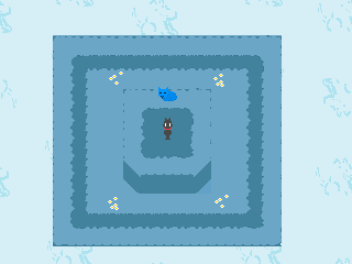
Speaking of style and fog, I was taking a series of screenshots of a map so I could make a composite picture to show here in RMN to get some feedback, but in the process, I made some crazy mistakes:
- I forgot to turn off the dynamic fog I set up.
- I forgot to make the character sprite invisible.
When I realized those two things, I was almost done taking the pictures, so I decided to finish what I started and compose the picture. The result is a... rather interesting and bizarre piece, so if anyone would like to see, there you go. Be warned that this looks hilarous due to the aforementioned problems.
Challenge: try to find all the Maries in the picture.
PS: some feedback regarding mapping would be much appreciated.
- I forgot to turn off the dynamic fog I set up.
- I forgot to make the character sprite invisible.
When I realized those two things, I was almost done taking the pictures, so I decided to finish what I started and compose the picture. The result is a... rather interesting and bizarre piece, so if anyone would like to see, there you go. Be warned that this looks hilarous due to the aforementioned problems.
Challenge: try to find all the Maries in the picture.

PS: some feedback regarding mapping would be much appreciated.

@Gretgor: The only glaring problem I see are the cliffs. The map itself isn't bad, but it would look a lot better if there was a partially submerged cliff tile so it doesn't look as though it's just 'floating' on top of the water. I'm quite sure it could be solved with an event tile, though.

Kind of like what I did there. It's not perfect, but you get the idea. The event tile itself is animated as well.
Some random trees would do the map some good as well. There's a little too much empty space for my liking, but at least the map itself isn't cluttered.
More Tristian stuff:


Kind of like what I did there. It's not perfect, but you get the idea. The event tile itself is animated as well.
Some random trees would do the map some good as well. There's a little too much empty space for my liking, but at least the map itself isn't cluttered.
More Tristian stuff:

Beautiful, Gretgor! Really adds to the scene :)
author=InfectionFiles
Beautiful, Gretgor! Really adds to the scene :)
Yay :D

Looking good, Luchino. The maps and the tilesets themselves look amazing. My only gripe is in the first screen. I think there should be edges on the brown "stone" tile where it meets the water and grass. Right now it's just a sudden transition and it looks a little sloppy.
Here's a swamp I made, complete with bio-luminescent plants and subtle lighting effects:
What do you guys think? Most swamps in games are pretty boring and drab, so I tried to spice things up a bit and make it more fantastic. I think swamps have so much unused potential when it comes to aesthetics.
This is an optional area.
Here's a swamp I made, complete with bio-luminescent plants and subtle lighting effects:

What do you guys think? Most swamps in games are pretty boring and drab, so I tried to spice things up a bit and make it more fantastic. I think swamps have so much unused potential when it comes to aesthetics.
This is an optional area.
Ooooo! dethmetal, I love the ambiance and feel of that screenshot.
It's been a while since I started something new. Usually I start a new project whenever I have dev's block, so quite often.
Here's some screenshots.

Got a flashlight system using common events. Quite proud of it actually, although it does go over walls. Blue arrows show unlocked doors and red arrows show locked ones.


What I will do is have a monster roaming around the house and the whole house is in one map so I will have it so that when the monster reaches the arrows it can also switch rooms. I'm also going to try to add a sneaking system to make it more realistic but don't know how that's gonna work out. Something else I wanna have is when your flashlight is on it will be easier for the monster to notice you, so you need to turn it off to hide.
Here's some screenshots.
Got a flashlight system using common events. Quite proud of it actually, although it does go over walls. Blue arrows show unlocked doors and red arrows show locked ones.
What I will do is have a monster roaming around the house and the whole house is in one map so I will have it so that when the monster reaches the arrows it can also switch rooms. I'm also going to try to add a sneaking system to make it more realistic but don't know how that's gonna work out. Something else I wanna have is when your flashlight is on it will be easier for the monster to notice you, so you need to turn it off to hide.

@dethmetal: I like the idea for the swamp! It is definitely something new. I saw that your maps are huge and maybe you could use that to your advantage: Create a path of light plants that starts with small, tiny things and becomes bigger until the player finds a secret spot where a lot of those plants grow, with maybe a special, glowing tree that stands in the middle of them. You could place treasure there, or a hidden bossfight, or something like that!
@Frogge: That looks pretty cool, I especially like the idea of the arrows. To create the illusion of having a real door there, however, you could make tiles of small rectangles roughly the size of a door. You don't have to animate them, either, you just need a left one and a right one. Then you place them where you would find a door, and have the outline of a door actually being there. =)
@Frogge: That looks pretty cool, I especially like the idea of the arrows. To create the illusion of having a real door there, however, you could make tiles of small rectangles roughly the size of a door. You don't have to animate them, either, you just need a left one and a right one. Then you place them where you would find a door, and have the outline of a door actually being there. =)
@Frogge: Will the player be able to see where they're going wqith the lamp switched off? (one thing that bothers me about modern survival horror is as soon as the torch is off it's pitch black like the player character suddenly went blind)

Does the text clash too much with the window background... I'm thinking it might benefit from a colour change... but I don't know what to.
(The Persona 4 graphics are a placeholder. I intend to... attempt to draw my own.)
Does the text clash too much with the window background... I'm thinking it might benefit from a colour change... but I don't know what to.
(The Persona 4 graphics are a placeholder. I intend to... attempt to draw my own.)
@Pyramid head: I think there are a little too many colours in the window skin. First, you have the gradient from purple to blue-ish, which looks really nice! Then you have the outline which is yellow, but could fit the window skin as a whole. Then you have red flowers with a little bit of white highlights and green leafs. And THEN you have white text and a white arrow.
My advice would be to:
- either change the frame to white or change the arrow and text to yellow
- remove the flowers
- or use a gradient from yellow to red
My advice would be to:
- either change the frame to white or change the arrow and text to yellow
- remove the flowers
- or use a gradient from yellow to red

