SCREENSHOT SURVIVAL 20XX
Posts
Red_Nova

Sir Redd of Novus: He who made Prayer of the Faithless that one time, and that was pretty dang rad! :D
9192
Oh crap. Looks like I missed a pixel when making the tree's shadow. That's an easy fix, though. I'll adjust the dark shading, too. Thanks!

Here's a concept title screen to my new potential project. It reminds me of Stephen King's IT a little.

I know that the objects and text aren't lined up (I am using windows paint for this, and couldn't find any way to do line things up.). I'm not sure what happened to the clown's foot, but that will be fixed of course.
I originally wanted something like this: a complete black background, with the same clown in the middle, only in one red color (same as the text). The logo should be written in blood, above the clown picture. I'm not sure how to make a multicolored object single colored. I thought I knew how to make backgrounds transparent, but unfortunately I do not (or paint changes/removes the transparency for some reason).
Overall, I'd like to keep things simple. Any feedback or tips are greatly appreciated! I'm using GIMP as well, but I'm not that good with the program yet. Perhaps it would be wiser to skip paint altogether and do everything in GIMP instead.
Damn, Luchi, that was some improvement! Nice work!
@Red_Nova You're progressing nicely, but those trunks are kind of offputting. They kind of have a Pac-Man ghost thing going with how they stick out of the ground all jagged. Maybe flatten your roots out some?
Shoot, it's hard to get across what I mean! I'll add some examples when I get home.
@Red_Nova You're progressing nicely, but those trunks are kind of offputting. They kind of have a Pac-Man ghost thing going with how they stick out of the ground all jagged. Maybe flatten your roots out some?
Shoot, it's hard to get across what I mean! I'll add some examples when I get home.
Whoops, I made it sound like the clown art was mine. :3 The clown is made by Thalzon. I'm not sure what title screen you're comparing it with, but I'm glad you like it so far. Thanks!
Oh, shoot! Sorry, I was talking about Luchino's trees! But your title screen is coming along nicely! I'd remove the lines under the text, though. Try using paint.net instead of regular paint! It's like a cheaper, simpler photoshop. And by cheap I mean entirely free. Try it! It'll help improve your title screen tons.

I got some stuff of my own done, as well. Trying out battle sprites and all that jazz. Gonna improve and customize the Battle UI a little more!
I got some stuff of my own done, as well. Trying out battle sprites and all that jazz. Gonna improve and customize the Battle UI a little more!

Undertaleeeeeeeeeeeeeeeeeeeeeeee <3
That aside, that looks pretty adorbs! Love the battle bg!
That aside, that looks pretty adorbs! Love the battle bg!


Luchina - much, much better. >.<)b
Red, try this tutorial: https://www.pinterest.com/pin/301459768776837861/
Red, try this tutorial: https://www.pinterest.com/pin/301459768776837861/


Old trees. Tbh, I made these a while before I came across that tutorial.

New ones, with shadows added. Took me 1.5 hours for the leaves alone using that hide-tagged method I posted on the previous page.
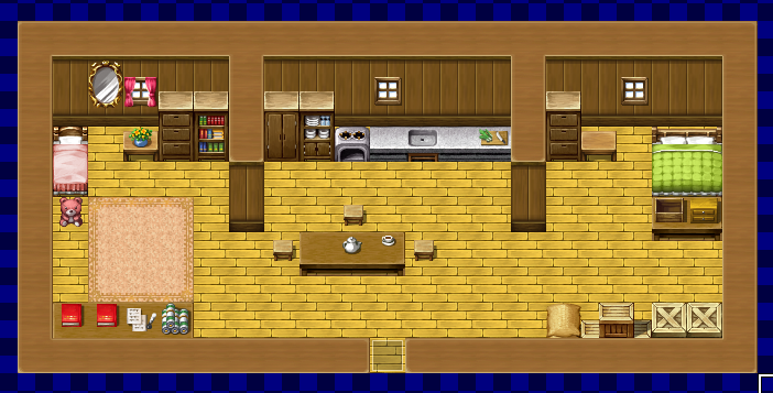
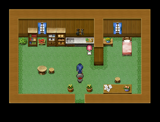
Is there a Resource WIP section on this site? I know there's the Whatchu working on thread and the WIP thread, but a pinned topic specifically for making game resources would be nice too. Seeing as so many of us are making our own visuals for our projects now, we can all share advice and tutorials and the works. =)
Nice work!! The side-by-side (or, down-and-up..?) really shows the improvement!
On another note, I'm working on some battle UI graphics that'll hopefully mix well with the rest of the game.

Don't mind all the tiny mushrooms, this is a test battle!
On another note, I'm working on some battle UI graphics that'll hopefully mix well with the rest of the game.
Don't mind all the tiny mushrooms, this is a test battle!

I'm definitely seeing an improvement there, Luchino.
Punkitt, I'm not sure what to say about that other than it looks fine and the I like the mushroom sprites. I'm not a fan of the brown theme, but that's just me.
I decided to rework one of the earlier sections in my game because, frankly, I realized no one would enjoy it as it was. I compiled a brand new tileset and began working on an expansive 130 x 150 map.

I'm not sure if I'll keep the sandstorm effects. Here's how it looks without them:

If anyone's interested, I'll post an image of the entire map zoomed out.
Punkitt, I'm not sure what to say about that other than it looks fine and the I like the mushroom sprites. I'm not a fan of the brown theme, but that's just me.
I decided to rework one of the earlier sections in my game because, frankly, I realized no one would enjoy it as it was. I compiled a brand new tileset and began working on an expansive 130 x 150 map.
I'm not sure if I'll keep the sandstorm effects. Here's how it looks without them:
If anyone's interested, I'll post an image of the entire map zoomed out.
I prefer the map without the sandstorm overlay, tbh. The overlay is kind of washing out the colour of the pallete. I do see some very obvious 'blocky' segments in that map as well.
Gonna be frank in saying that the sandstorm overlay looks more like a sheet of piss covering over the entire screen. The non-overlay version looks much more crisp and the colors have better contrast. It's superior in every way.
Well, if the sandstorm was moving my opinion might be different! But stationary-screen-wise, the clear image looks better.
Also, I don't think it looks blocky. Whereso?
Also, I don't think it looks blocky. Whereso?

Definitely without the sandstorm effect. Though I love the idea of the sandstorm and always wanted to find a way to work it in for one of my games but god, is it ugly visually
@Punkitt: I highlighted some of the more obvious areas for you. =)

You seem to be missing some cliff pieces as well.
You seem to be missing some cliff pieces as well.
You can tell on the second screenshot on the cliffs too
@dethmetal- And yes, you should post a full view screenshot!
@dethmetal- And yes, you should post a full view screenshot!