


SCREENSHOT SURVIVAL 20XX
Posts


That looks awesome punkitt! And here I am only 10% done with my sky level and already wanting to remake it. Since you shared a screenshot though, I might as well too.

Edit: Replaced the image because I remade the level.
Edit: Replaced the image because I remade the level.

@Punkitt:
Wow! That tileset looks great so far. It looks like it could have easily been in SMW but it's got a whole new vibe.
@Frogge:
I'm not sure if there's a darker/alternate tile available for the back wall/roof, but right now it's a bit tricky to tell what's part of the background and what's part of the ceiling of the level. Otherwise it's lookin' cool!
author=Kaempfer
@Punkitt:
Wow! That tileset looks great so far. It looks like it could have easily been in SMW but it's got a whole new vibe.
Thank you!

Just another shot of me showing off stuff. There were Goombas here, but I moidad 'em.
wait i should move that window down one woops
I actually completely remade mine to be a waterfall level instead of a sky level. I'm gonna replace that screenshot to show what the new one looks like :3
punkitt, a new project for every page of this topic huh? :D Your GameBoy stuff looked real charming. nice coincidence, I just found my old GB Pocket and few games for it yesterday. GB palette gives me a nice fuzzy feeling. The super mario game looks cool too. Sorta like the haunted house levels, except outdoors? I also second that it looks like straight outta SMW.
frogge, I'm getting heavy SMB2 vibes from your screenie. Might be because of the desert/sand theme and waterfalls. there are some minor problems with the diagonal walls, but other than that it looks great. I'm liking the turtledude.
frogge, I'm getting heavy SMB2 vibes from your screenie. Might be because of the desert/sand theme and waterfalls. there are some minor problems with the diagonal walls, but other than that it looks great. I'm liking the turtledude.
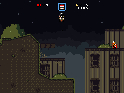
@Punkitt:
Are those two shorter houses in the foreground or background? Because in the first screen there's an obvious demarcation between the top of the building (obviously a platform) and sides (obviously background). But in the new shot, the whole building has the same edge, so I can't tell (at a glance, anyway).
Are those two shorter houses in the foreground or background? Because in the first screen there's an obvious demarcation between the top of the building (obviously a platform) and sides (obviously background). But in the new shot, the whole building has the same edge, so I can't tell (at a glance, anyway).


Those look lovely, Luchino. Can't give anything specific at the moment, it looks warm and cozy with those lighting effects. I could almost feel the breeze and smell the first screenshot.

I like the maps, Luchino, but my nitpick is about the sprites in the screen, not the map.
I may have said this before, but those poses are so rigid and unnatural they throw my eye off every time. Every is standing like a stiff cardboard cutout. Smaller sprites can get away with this without it looking too weird, but since you are using more realistic proportions and a taller sprite size you should consider adjusting their standing poses. Like okay, maybe a soldier could or would stand like that, but regular townspeople/other characters would definitely not. You are already making all these custom assets (right?) Why not go a little further and adjust the character stances so they are more realistic / pleasing and could even offer some individuality amongst characters so they don't all seem like they came off a factory line that produces cardboard NPCs. Just my two cents. : )
I may have said this before, but those poses are so rigid and unnatural they throw my eye off every time. Every is standing like a stiff cardboard cutout. Smaller sprites can get away with this without it looking too weird, but since you are using more realistic proportions and a taller sprite size you should consider adjusting their standing poses. Like okay, maybe a soldier could or would stand like that, but regular townspeople/other characters would definitely not. You are already making all these custom assets (right?) Why not go a little further and adjust the character stances so they are more realistic / pleasing and could even offer some individuality amongst characters so they don't all seem like they came off a factory line that produces cardboard NPCs. Just my two cents. : )
author=Kaempfer
@Punkitt:
Are those two shorter houses in the foreground or background? Because in the first screen there's an obvious demarcation between the top of the building (obviously a platform) and sides (obviously background). But in the new shot, the whole building has the same edge, so I can't tell (at a glance, anyway).
Oh shoot, you're right! I'll fix that right away. Nice catch.
@Luchi
I agree with Dookie. The rigid poses have always seemed a little off. I think the best and most minimal thing you can do is just relax the shoulders a bit. Everyone looks so tense!
@Dookie and Punkitt: I do admit, making custom sprite sheets can be a bit daunting at times, but I'll see what I can do. I could really use the help of an additional spriter for my project... Just to handle the sprites other fix-ups. ><
@Luchino: Sweet maps, as always. I did notice that, on the second one, that the marble railing on the upper library/sitting area doesn't meet the north wall correctly. It seems that it should meet a tile up from where it is now.
The sconce glow is sooo nice... Did you make those yourself?
The sconce glow is sooo nice... Did you make those yourself?

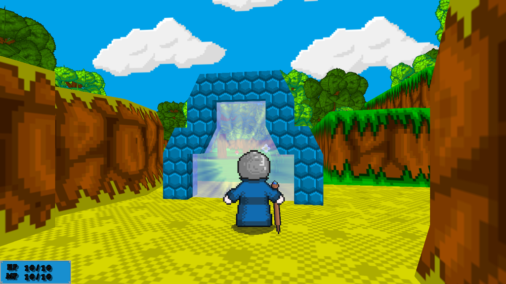
I now have working portals in my game. You can use them to travel to new randomly generated worlds(or back to old ones)

@Luchino: Your maps look very colorful and vibrant; good job! In the first one however, there's a tree at the top left corner that goes into the building to its right. Is that intentional?
@grindalf: Lookin' good! The map reminds me of the forest from Skyward Sword.
@grindalf: Lookin' good! The map reminds me of the forest from Skyward Sword.

@Luchino: The lightning effect is flattening out the map. It needs to interact with the objects in the environment (and not trail off behind the wall) or just not be there at all.


^^ Is the evil wizard doing naruto ninja hand seals? Your sprites look way awesome man! Karate knight especially! Such captivating blank stare
grindalf, your game reminds me of old net yaroze PS1 games. Dunno if you're aware of what those are, but there used to be these amateur games in old Playstation magazine demo discs that often looked something like that. I personally love retro PS1 era 3D graphics, so thumbs up from me!
Luchino, your graphics look so beautiful! Really vibrant colors, but I agree with the stiffness of characters. It's really tricky to make tall charsets from zero. I recommend that you just look up how they made those in some commercial games and copy a little bit where necessary. arms and shoulderarea look off.

