SCREENSHOT SURVIVAL 20XX
Posts
I tried doing a simple colour change, along with adding a curb on the stairs at the top. Is it any better? I wasn't really getting anywhere with the autotiles, but they definitely gotta change, the tint made it even more obvious how tiled it is.
author=DragolHahaha, I know right. :)
I can't believe that you are still making games about yourself :P
It started out that way and I stuck with it for a lot of games in the past; I prefer going by my real name nowadays when making/releasing a game. In order to avoid confusion. Or should I chance it to something really pretentious like: "The Artist Formerly Known as Colt". :P
In the RPGmaker community I am know as Colt and that is why I stuck with the username when posting here. Better yet, when I started to post here again it appeared my 8 year old account (and games) where still functional, so why bother with a new account.
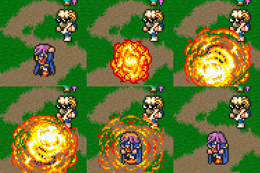
Since this is a screenshot page here are some gifs from a couple of action scenes in the game. Be warned, they are fairly large and could take a little while to load

I call this one: "Our ninjas are better"

And this one is called: "Bringing a gun to a knife fight"
I am trying to bring back the sprite based action scenes as they appeared in PTEI2 and I recon it is going pretty well. Do you agree?
Psst... don't forget: World In Danger Become-A-Playable-Character-Contest ;)
author=Colt
"The Artist Formerly Known as Colt"
Lol
But anyway, you have one the best action games in this comminuty, and your shooting tutorial for 2003 was almost gold.
And sprited scenes are great.
Corfaisus

"It's frustrating because - as much as Corf is otherwise an irredeemable person - his 2k/3 mapping is on point." ~ psy_wombats
7874
@Konradix I think the same, the second one with the consistent slope would also make more sense if it was a street.
@Konradix:
Why are your screenshots so huge, man? They don't need to be 4x zoom or whatever they are.
The second one, with the consistent slope, looks way better.
Why are your screenshots so huge, man? They don't need to be 4x zoom or whatever they are.
The second one, with the consistent slope, looks way better.
@Colt: Woah, thats quite the coreography you have going there.
Very impressive. Is it all done with Events in maker or is it a "real" cinematic done withs external software thats played ingame?
@Topic:
I am finally getting to the point where I am somewhat confident i my indoor maps. Still had to overhaul the libary like 3 times because I still thought that there was too much empty space. Maps are Paralax and most of the furniture and items has been edited in one way or another.


Picture #1: Carpet's shape is nonsense, everything seems too big. i would recommend to shorten libraries and break them up with tables instead of putting the study aside.
Picture #2: Too big. Bar should be about the same size as the stage. Stage has an unnecessary curtain. Remove it or add space behind it. And again, break it, move some table a tile or two out of the row.
And windows could help to lighten both of them.
Picture #2: Too big. Bar should be about the same size as the stage. Stage has an unnecessary curtain. Remove it or add space behind it. And again, break it, move some table a tile or two out of the row.
And windows could help to lighten both of them.
When you do parallax maps, how do you do things that are supposed to cover the view of the player? (Like the tops of those library shelves.) Is this in one of the later Makers, where it's handled with scripts (that could handle multiple big pictures that could act as BG layers)?
author=Zachary_Braun
When you do parallax maps, how do you do things that are supposed to cover the view of the player? (Like the tops of those library shelves.) Is this in one of the later Makers, where it's handled with scripts (that could handle multiple big pictures that could act as BG layers)?
Use pictures for everything you want to have above the player. Make sure you use a script to have pictures fixed to the map otherwise they will scroll and mess up!
Figured I'd transfer some of my screenshot pictures of my maps over here from RMW.
The Exterior of Bargon Castle
First Map of Ceratapin Castle
The Interior Entrance to Bargon Castle
This one ended up being to big... and this was the WIP. Afterwards I realized I lost several "edited/combined" structures while merging the image that I have to go back and add. However since I will likely scale down the map a bit I haven't done that yet.
Meluvet/Garalas
Incase these look familiar to anyone they are for my Legion Saga MV remake. Yes, I have permission from Matt/Kamau. I have a thread over on RMW about it. I haven't added one here yet.
EDIT: Woah. Those map images were to large so I just added the links to the imgur maps instead.
^ Those are looking pretty close to what I'd imagine original LS looking like on MV. I'm really excited about your project there, Legion Sagas were among my favourites back in the day! Altho LS2 is my favourite ;)
I'm also transitioning to RMV as of lately. I'm really liking the higher resolution, so I started redoing all my graphics from my VX project.
the original:

new gfx:

I'm really liking thse new graphics a lot more ^^
I'm also transitioning to RMV as of lately. I'm really liking the higher resolution, so I started redoing all my graphics from my VX project.
the original:

new gfx:

I'm really liking thse new graphics a lot more ^^
Agreed!
This is the first time I see MV graphics, which I like better than Ace ones. It really is nice, how they are somewhere between hand-drawn and pixelated. The atmosphere is great too. For some reason it reminds me of The Darkest Dungeon.
Arcmagic, they look good. They lack finishing but the base is solid in all three cases. I find the castle (the first picture) little too robust. I'm can't wait to see finished maps (It's easier to nitpick on them).
That's beautiful, orange~
Actually this whole page is looking pretty good!
Actually this whole page is looking pretty good!
LockeZ

I'd really like to get rid of LockeZ. His play style is way too unpredictable. He's always like this too. If he ran a country, he'd just kill and imprison people at random until crime stopped.
5958
The support pillars on your walls are a little bit, uh, wobbly. I'm not sure why they look like that but it took me a few minutes to realize it was just the pillars and you weren't doing a trippy screen-distortion effect.
I definitely approve of zooming in as opposed to having 70% of the screen be black. You get the same limit on visible distance, but it looks a hell of a lot nicer.
I definitely approve of zooming in as opposed to having 70% of the screen be black. You get the same limit on visible distance, but it looks a hell of a lot nicer.
@LockeZ, yea true. the pillars are a bit funny.. I wanted an illusion of tunnels having a sort of curved feel, but it doesn't really look right atm. I'll see what I'm gonna do about those, then again I'm not against distorted feel. I'd just need to have more weirdly distorted stuff there.
@Cap_H, This game is probably gonna have more things in common with Darkest Dungeon as well. At least from what I've heard. Never played the actual game ^^
@Colt, holy shit! You're the guy who used to make those Pokemon shoot-em-ups, no? I just realized you got yourself in those games as well. I really liked em' so definitely interested in your game! This game is looking really great.
@Cap_H The Castle is meant to look robust and a bit over extravagant. It is a show of wealthy and power (thus the "gold statues" as opposed to stone ones). So that is actually what I was going for... unless there was something more specific that you meant?
@orange- Thanks. I now have access to a bunch of the original maps so I've been trying to emulate them somewhat... but they are much simpler in design compared to mapping techniques nowadays.
As an aside: Heck even going back playing FF6 on the mobile I am like "Damn these are pretty bad!" Design Philosophy for mapping has just changed so much. Simpler isn't better anymore... plus I've been following into the amateur trap of making the maps to big and they become difficult to fill up properly.
Ok, then.
FF games are damn good in mapping. There were other 16-bit games, which were fantastic and probably better. Still FFs have superbly solid mapping and their minimalism is something I'm learning from a lot.
Making better maps for example is not about having more details. You can overfill a terrible map with them and not make it any better. It's about shapes and custom pieces.
Lunar games had some seriously awesome mapping.


