


SCREENSHOT SURVIVAL 20XX
Posts

author=Momeka
Hammering away on a title screen

This looks fucking awesome man. Is this the same game you're making with the dungeons?
@Sated - The Time Fantasy pack, I liked the sprites, that's why I bought it. Plus I just can't stand the VX/MV RTP.
@Blindmind - Fuck knows man, maybe, maybe not haha.
@Kaempfer - The resolution problem could be from when I cut the screenshot I took? What exactly did you do with it, doesn't look too bad. Kinda want to know now.

I never liked those tiles either. The grass looks like treetops and is too strong. Overall the colors are just not done that well.

@theloathableone:
I really like the mini-RTP aesthetic you're going with!
@Altered:
It's a good idea, but right now it's a bit unclear that they're doorways. I wouldn't have guessed that first. You might want to have a very transparent doorway (like... 20% transparency) to show that there is an exit there. If that clashes too much with your aesthetic, a square shape might work a bit better than a round one, since the doors we CAN see are both larger and rectangular.
@Momeka:
the skull is 2spoopy and it did me a frighten
(I like it a lot)
@Tau:
I lowered the brightness and raised the contrast in paint.net (GIMP/PS would have also worked I imagine), then I played with the hue until I liked it better (I think it was +7?). I uploaded a 32 bit .png, so the palette is true colour if you want to assemble a colour ramp from it.
I think the tiles are a decent base and the sprites look really cool, but if it's not in proper 2x resolution (upscaled from 16x16 to 32x32) then that's going to cause lots of weird issues. I don't know what the original pack looks like, but if you resized your screenshot that could have caused it. If you're going to use the pack, definitely fool around with some of the details before committing. My edits took approximately 12 seconds and, while it's not great pixel art to just use sliders, it does the job.
edit: I really dislike the last couple sets of RTP (VX/MV), so I think you did a pretty good job with these tiles. They just need some work, lest they'll bog your mapping skills down.


author=Tau
This looks fucking awesome man. Is this the same game you're making with the dungeons?
Thanks and yeah it is. Going to do my own tilesets for it so it fits better in with the cartoony style of the title screen.

remind me to never ever even think about making 48x48 tiles ever ever ;v; (s-still looking good though.)

author=JosephSeraph
remind me to never ever even think about making 48x48 tiles ever ever ;v; (s-still looking good though.)
If I remind you it'll make you think about them so we're stuck in a time loop from which there is no escape.

@Momeka: That animation is really cool, it has a total retro feeling to it.
@Archeia_Nessiah: looks good overall, but could benefit from some more backdrop items/plants and same more different ground tiles/shades to mix things up.
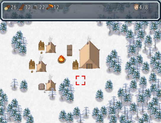
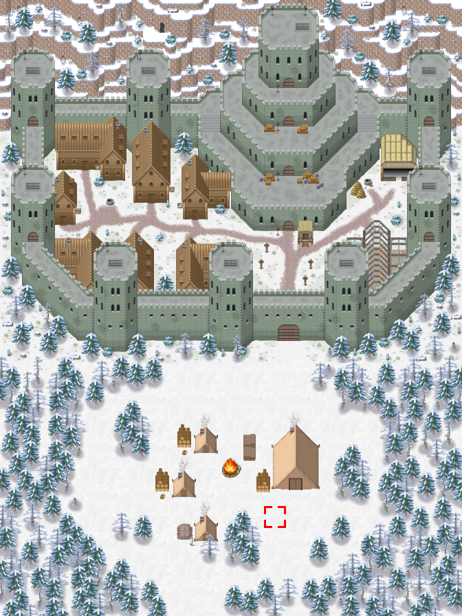
@Topic; Decided to post here again, since the is little to no response when I only post on the games page. Anyway, here are a newer ingame Screenshot of the Town Building System (added backdrops) as well as an eagles eye view of the same Map:
@Archeia_Nessiah: looks good overall, but could benefit from some more backdrop items/plants and same more different ground tiles/shades to mix things up.
@Topic; Decided to post here again, since the is little to no response when I only post on the games page. Anyway, here are a newer ingame Screenshot of the Town Building System (added backdrops) as well as an eagles eye view of the same Map:

The path looks far too 'cut' away. The snow would be all over that shit, especially encroaching on the edges. The path would also likely be most worn away by traffic through the gate into the bigger city and less so by traffic out of the area.
The layout looks okay, though.
The layout looks okay, though.

Hm yeah, you're right, guess ill remove the path completly and only keep the campfire.
Thanks for the feedback.
Edit: Fixed and reuploaded it, thanks again for the quick and usefull feedback.
Thanks for the feedback.
Edit: Fixed and reuploaded it, thanks again for the quick and usefull feedback.


@Ramshackin
Your stairs look a bit off to me. Something like 2 steps too high, and 1 step too low. I'm a relative novice, so I could be seeing it wrong :P.
Your stairs look a bit off to me. Something like 2 steps too high, and 1 step too low. I'm a relative novice, so I could be seeing it wrong :P.
The problem with stairs is they only go up a half tile in height, so you need two stair tiles for every one wall tile if you want the heights to make sense.
I could shift the stairs up and extend the border. Something like:

I could shift the stairs up and extend the border. Something like:
That looks much better in my opinion. :)
Edit:
Shot of Thornoaken Woods from my upcoming game Shallow Lore. You can totes walk behind that waterfall.

Edit:
Shot of Thornoaken Woods from my upcoming game Shallow Lore. You can totes walk behind that waterfall.
@theloathableone Looks good, I like the statues in the water. The waterfall looks like it's a tile to high compared to the cliff though.
@Ramshackin The stairs in the second screenshot looks solid. Good job.
@Ramshackin The stairs in the second screenshot looks solid. Good job.
@theloathableone> I'd agree with Momeka about the falls. Either you move the falls, or the cliff.
@Ramshackin> The angel statue looks rad! Did you make that?
I spent far too much time doing back-end stuff that I almost completely forgot I was working on an rpg maker game, instead of my final project for school...
Everything's functional, but I wanted to know what you think about how it all looks. Anything out of place? Maybe too jarring or hard to see?
This is the battle scene. Only the queue order was added here. The rest is the default for Yanfly's battle system.

This is the equip scene. This one, I built from scratch. Wasn't too difficult, as I pretty much just recycled my old works and put them all together.

@Ramshackin> The angel statue looks rad! Did you make that?
I spent far too much time doing back-end stuff that I almost completely forgot I was working on an rpg maker game, instead of my final project for school...
Everything's functional, but I wanted to know what you think about how it all looks. Anything out of place? Maybe too jarring or hard to see?
This is the battle scene. Only the queue order was added here. The rest is the default for Yanfly's battle system.
This is the equip scene. This one, I built from scratch. Wasn't too difficult, as I pretty much just recycled my old works and put them all together.

